- Power BI forums
- Updates
- News & Announcements
- Get Help with Power BI
- Desktop
- Service
- Report Server
- Power Query
- Mobile Apps
- Developer
- DAX Commands and Tips
- Custom Visuals Development Discussion
- Health and Life Sciences
- Power BI Spanish forums
- Translated Spanish Desktop
- Power Platform Integration - Better Together!
- Power Platform Integrations (Read-only)
- Power Platform and Dynamics 365 Integrations (Read-only)
- Training and Consulting
- Instructor Led Training
- Dashboard in a Day for Women, by Women
- Galleries
- Community Connections & How-To Videos
- COVID-19 Data Stories Gallery
- Themes Gallery
- Data Stories Gallery
- R Script Showcase
- Webinars and Video Gallery
- Quick Measures Gallery
- 2021 MSBizAppsSummit Gallery
- 2020 MSBizAppsSummit Gallery
- 2019 MSBizAppsSummit Gallery
- Events
- Ideas
- Custom Visuals Ideas
- Issues
- Issues
- Events
- Upcoming Events
- Community Blog
- Power BI Community Blog
- Custom Visuals Community Blog
- Community Support
- Community Accounts & Registration
- Using the Community
- Community Feedback
Register now to learn Fabric in free live sessions led by the best Microsoft experts. From Apr 16 to May 9, in English and Spanish.
- Power BI forums
- Forums
- Get Help with Power BI
- Desktop
- Need Help! im trying to visually display the many ...
- Subscribe to RSS Feed
- Mark Topic as New
- Mark Topic as Read
- Float this Topic for Current User
- Bookmark
- Subscribe
- Printer Friendly Page
- Mark as New
- Bookmark
- Subscribe
- Mute
- Subscribe to RSS Feed
- Permalink
- Report Inappropriate Content
Need Help! im trying to visually display the many expiry dates for an item (examples inside)
Hi Guys,
Ive been asked to visually show a lot expiry dates of an asset,
Ive been playing around with a the custom calanders but im not sure if i can do that or if i should be trying something else or if im doing it wrong (im semi new to powerbi)
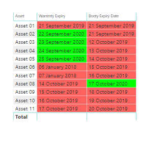
Id like to build something like this (my data is also in the same format however its from sharepoint online)
and id also like to build a calander with all the dates displayed on a calander and i can click on the date for all the info such as what type of expiry and asset etc.
Could anyone help me out, there is zero tutorials or guides i can find on this
Thankyou
- Mark as New
- Bookmark
- Subscribe
- Mute
- Subscribe to RSS Feed
- Permalink
- Report Inappropriate Content
@Anonymous There are two parts to your problem I have tried to individually address them.
1) Table with Multiple expiry dates which is conditionally formatted :
To create a visual which is similar to what is shown in the excel snapshot, you need to create a measure for each column (expiry date).
Purpose of these measures is to calculate the difference between Today’s date and date of Warranty Expiry (other columns also follow same logic)
Warranty Expiry days = DATEDIFF(TODAY(),MAX('Data Table'[Warranty Expiry]),DAY)
Booty Expiry days = DATEDIFF(TODAY(),MAX('Data Table'[Booty Expiry Date]),DAY)
Now above measures will provide the days difference which will be used for conditional formatting. Next, you need to apply conditional formatting for an individual column
You should be able to get a similar result.
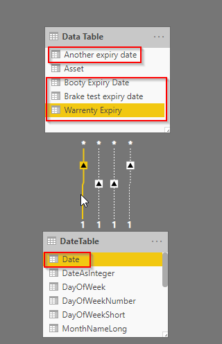
2) Creating a calendar visual: You need to first create a DateTable which has continuous dates in it. Now create a relationship between newly made Datetable Date field and each expiry date as shown below.
Note the cardinality and direction of the relationship. The solid line will always be the active relationship and the dotted one is an inactive relationship that can be made active using DAX.
For an active relationship, create the measure in the following way.
Warranty assets = CALCULATE(COUNTROWS('Data Table'))
I have aggregated the measure to show the number of asset which will be expired you can change it according to your need.
For inactive relationships create the measure in the following way.
Booty expiry assets = CALCULATE(COUNTROWS('Data Table'),USERELATIONSHIP(DateTable[Date],'Data Table'[Booty Expiry Date]))
Break test expiry assets = CALCULATE(COUNTROWS('Data Table'),USERELATIONSHIP(DateTable[Date],'Data Table'[Brake test expiry date]))
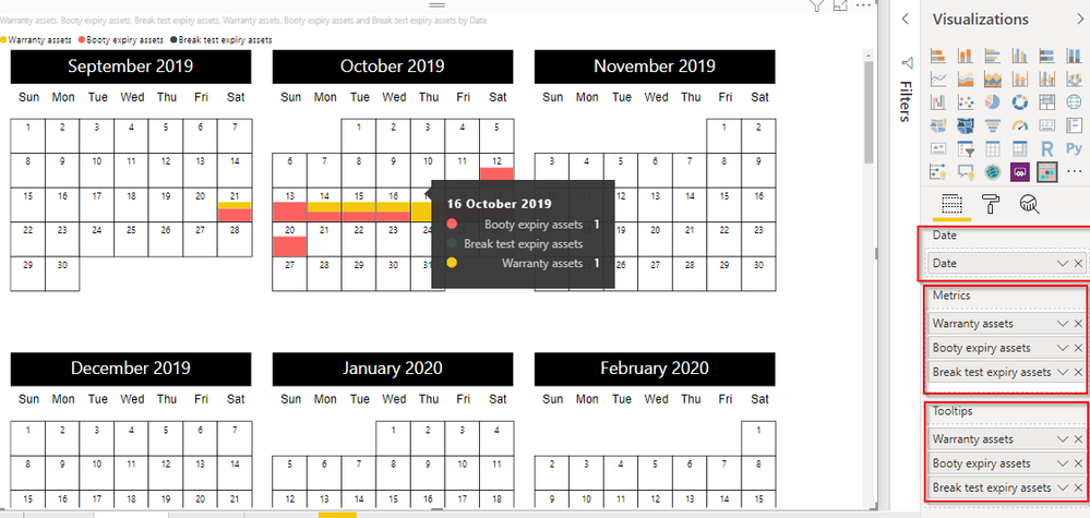
Follow similar logic for all dates. By doing this we have mapped all expiry date to single date column in DateTable[Date] field. Now in your calendar visual keep DateTable[Date] field as Date and rest of the fields as shown in the snapshot.
I hope this solves both the queries you asked.
Did I answer your question? Mark my post as a solution.
PS: If you want to know how to create DateTable you can find a lot of tutorials on the internet. If you still face a challenge in creating one let me know I will provide steps to create a Date table. Also, do not forget to mark it as Date Table under the modeling section.
- Mark as New
- Bookmark
- Subscribe
- Mute
- Subscribe to RSS Feed
- Permalink
- Report Inappropriate Content
@AmanBedwal wrote:@Anonymous There are two parts to your problem I have tried to individually address them.
1) Table with Multiple expiry dates which is conditionally formatted :
To create a visual which is similar to what is shown in the excel snapshot, you need to create a measure for each column (expiry date).
Purpose of these measures is to calculate the difference between Today’s date and date of Warranty Expiry (other columns also follow same logic)
Warranty Expiry days = DATEDIFF(TODAY(),MAX('Data Table'[Warranty Expiry]),DAY)
Booty Expiry days = DATEDIFF(TODAY(),MAX('Data Table'[Booty Expiry Date]),DAY)
Now above measures will provide the days difference which will be used for conditional formatting. Next, you need to apply conditional formatting for an individual column
You should be able to get a similar result.
2) Creating a calendar visual: You need to first create a DateTable which has continuous dates in it. Now create a relationship between newly made Datetable Date field and each expiry date as shown below.
Note the cardinality and direction of the relationship. The solid line will always be the active relationship and the dotted one is an inactive relationship that can be made active using DAX.
For an active relationship, create the measure in the following way.
Warranty assets = CALCULATE(COUNTROWS('Data Table'))
I have aggregated the measure to show the number of asset which will be expired you can change it according to your need.
For inactive relationships create the measure in the following way.
Booty expiry assets = CALCULATE(COUNTROWS('Data Table'),USERELATIONSHIP(DateTable[Date],'Data Table'[Booty Expiry Date]))
Break test expiry assets = CALCULATE(COUNTROWS('Data Table'),USERELATIONSHIP(DateTable[Date],'Data Table'[Brake test expiry date]))
Follow similar logic for all dates. By doing this we have mapped all expiry date to single date column in DateTable[Date] field. Now in your calendar visual keep DateTable[Date] field as Date and rest of the fields as shown in the snapshot.
I hope this solves both the queries you asked.
Did I answer your question? Mark my post as a solution.
PS: If you want to know how to create DateTable you can find a lot of tutorials on the internet. If you still face a challenge in creating one let me know I will provide steps to create a Date table. Also, do not forget to mark it as Date Table under the modeling section.
Perfect, Thankyou so much for your reply just a quick question.
I was able to achieve what i wanted by following your beautiful instructions (thankyou), but am i able to click on the calander and see what asset has what expiry on it? ie. if Asset01 and Asset09 was due today can i somehow expand on it by clicking on the date and it shows what assets are expiring? at the moment i can only see that something is expiring and seperate the type by color?
@AmanBedwal wrote:Note the cardinality and direction of the relationship. The solid line will always be the active relationship and the dotted one is an inactive relationship that can be made active using DAX.
For an active relationship, create the measure in the following way.
Warranty assets = CALCULATE(COUNTROWS('Data Table'))
I have aggregated the measure to show the number of asset which will be expired you can change it according to your need.
For inactive relationships create the measure in the following way.
Also for my own learning what do you mean by aggregating the measure? and with the relationships you talked about active and inactive? does it matter which dates i make the active one? im confused to "the cardinality and direction of the relationship"
Helpful resources

Microsoft Fabric Learn Together
Covering the world! 9:00-10:30 AM Sydney, 4:00-5:30 PM CET (Paris/Berlin), 7:00-8:30 PM Mexico City

Power BI Monthly Update - April 2024
Check out the April 2024 Power BI update to learn about new features.

| User | Count |
|---|---|
| 108 | |
| 97 | |
| 79 | |
| 67 | |
| 60 |
| User | Count |
|---|---|
| 148 | |
| 113 | |
| 97 | |
| 84 | |
| 67 |


