- Power BI forums
- Updates
- News & Announcements
- Get Help with Power BI
- Desktop
- Service
- Report Server
- Power Query
- Mobile Apps
- Developer
- DAX Commands and Tips
- Custom Visuals Development Discussion
- Health and Life Sciences
- Power BI Spanish forums
- Translated Spanish Desktop
- Power Platform Integration - Better Together!
- Power Platform Integrations (Read-only)
- Power Platform and Dynamics 365 Integrations (Read-only)
- Training and Consulting
- Instructor Led Training
- Dashboard in a Day for Women, by Women
- Galleries
- Community Connections & How-To Videos
- COVID-19 Data Stories Gallery
- Themes Gallery
- Data Stories Gallery
- R Script Showcase
- Webinars and Video Gallery
- Quick Measures Gallery
- 2021 MSBizAppsSummit Gallery
- 2020 MSBizAppsSummit Gallery
- 2019 MSBizAppsSummit Gallery
- Events
- Ideas
- Custom Visuals Ideas
- Issues
- Issues
- Events
- Upcoming Events
- Community Blog
- Power BI Community Blog
- Custom Visuals Community Blog
- Community Support
- Community Accounts & Registration
- Using the Community
- Community Feedback
Register now to learn Fabric in free live sessions led by the best Microsoft experts. From Apr 16 to May 9, in English and Spanish.
- Power BI forums
- Forums
- Get Help with Power BI
- Desktop
- Need Help displaying duration based on 2 values
- Subscribe to RSS Feed
- Mark Topic as New
- Mark Topic as Read
- Float this Topic for Current User
- Bookmark
- Subscribe
- Printer Friendly Page
- Mark as New
- Bookmark
- Subscribe
- Mute
- Subscribe to RSS Feed
- Permalink
- Report Inappropriate Content
Need Help displaying duration based on 2 values
Guys, i have a question concerning the way to display the duration of permits.
I have, for example, permit A which is active between 01-01-2020 till 06-06-2020
I have 1 colum with values Permit A, Permit B etc
Then i have 1 colum with a date when the permit is given
And a column with a date when it expires
So basically
Type permit given permit expires
Permit A 01-01-2020 06-06-2020
Permit B 15-01-2020 01-07-2020
I want those values to be shown in a visual with a bar between 01-01-20 and 06-06-20 so i think i need a data table and then i need to mark those permits in that table or something but i dont know how, can you guys help me ?
Solved! Go to Solution.
- Mark as New
- Bookmark
- Subscribe
- Mute
- Subscribe to RSS Feed
- Permalink
- Report Inappropriate Content
i want to thank you both for your help so far.
When i searched the internet for possible solutions i came across this custom visual
Gantt Chart By MAQ Software
And that is exactly what i need to fix the problem because i have a start date and sometimes an enddate and this visual displays it beautifully see the picture below
- Mark as New
- Bookmark
- Subscribe
- Mute
- Subscribe to RSS Feed
- Permalink
- Report Inappropriate Content
Hi, @RonaldvdH
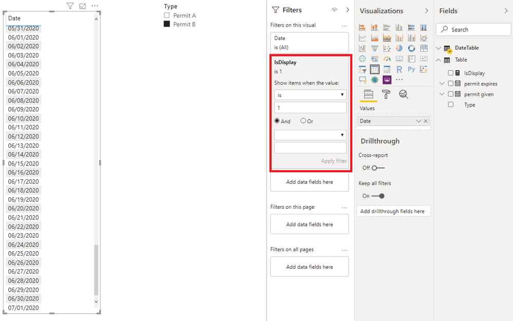
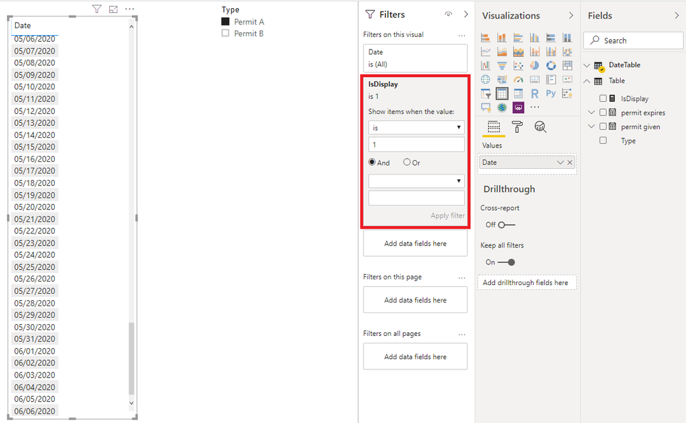
Based on my research, I failed to solve it with a bar chart. Because when you put the date column in the 'Value' area of the visual, Power BI desktop operates an aggregation on it by default. As a workaround, you may use a table visual to show the duration.
You may create a data table as follows.
DateTable = CALENDARAUTO()
Then you can create a measure as below.
IsDisplay =
var _type = SELECTEDVALUE('Table'[Type])
var _date = MAX(DateTable[Date])

return
IF(
    HASONEVALUE('Table'[Type]),
    IF(
        _date<=VALUES('Table'[permit expires])&&
        _date>=VALUES('Table'[permit given]),
        1,
        0
    ),0
)
Finally you may use the data column from data table to create a table visual and put the measure on the visual level filter. You can use the 'Type' column as a slicer to filter the result.
Best Regards
Allan
If this post helps, then please consider Accept it as the solution to help the other members find it more quickly.
- Mark as New
- Bookmark
- Subscribe
- Mute
- Subscribe to RSS Feed
- Permalink
- Report Inappropriate Content
@v-alq-msft thanks for the help, ive made some progress but we are not there yet
The formula youve provided calculates and shows the dates between the dates permit given and permit expires
but somehow my result based on the actual data doesn't show the same result as your example data
IsDisplay =


- Mark as New
- Bookmark
- Subscribe
- Mute
- Subscribe to RSS Feed
- Permalink
- Report Inappropriate Content
- Mark as New
- Bookmark
- Subscribe
- Mute
- Subscribe to RSS Feed
- Permalink
- Report Inappropriate Content
Hi, @RonaldvdH
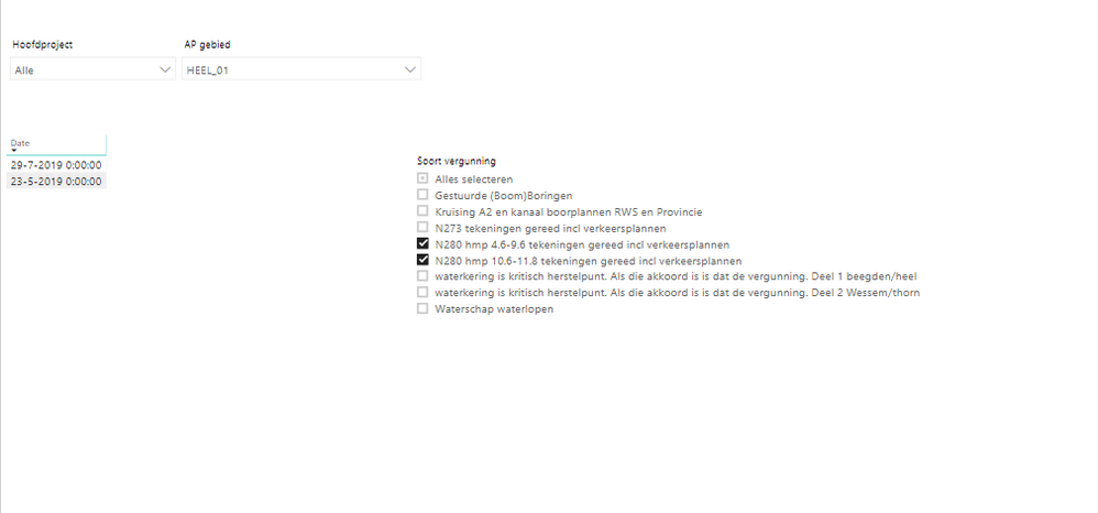
The previous measure works only when you select one value and both Datum verleend and Vergunning geldig tot are not null. I wonder what the duration will be if there is one item selected and Vergunning geldig tot is null. I alse want to know the duration when you have two items selected.
Best Regards
Allan
- Mark as New
- Bookmark
- Subscribe
- Mute
- Subscribe to RSS Feed
- Permalink
- Report Inappropriate Content
i want to thank you both for your help so far.
When i searched the internet for possible solutions i came across this custom visual
Gantt Chart By MAQ Software
And that is exactly what i need to fix the problem because i have a start date and sometimes an enddate and this visual displays it beautifully see the picture below
- Mark as New
- Bookmark
- Subscribe
- Mute
- Subscribe to RSS Feed
- Permalink
- Report Inappropriate Content
Refer my blog how deal with two dates (start and end)
Appreciate your Kudos. In case, this is the solution you are looking for, mark it as the Solution.
In case it does not help, please provide additional information and mark me with @
Thanks. My Recent Blogs -Decoding Direct Query - Time Intelligence, Winner Coloring on MAP, HR Analytics, Power BI Working with Non-Standard TimeAnd Comparing Data Across Date Ranges
Connect on Linkedin
Microsoft Power BI Learning Resources, 2023 !!
Learn Power BI - Full Course with Dec-2022, with Window, Index, Offset, 100+ Topics !!
Did I answer your question? Mark my post as a solution! Appreciate your Kudos !! Proud to be a Super User! !!
- Mark as New
- Bookmark
- Subscribe
- Mute
- Subscribe to RSS Feed
- Permalink
- Report Inappropriate Content
@amitchandak that kinda helped but didn't solve my problem (yet)
The idea is pretty much the same but still some formulas don't work or don't provide the desired outcome
In your example the formula's are based on a value in the first or the second column (start date or end date)
My question is more displaying the duration of a certain permit and seeing when a permit is about to expire given i only have a start and enddate.
- Mark as New
- Bookmark
- Subscribe
- Mute
- Subscribe to RSS Feed
- Permalink
- Report Inappropriate Content
datediff can you duration and if you use end date relation then you can tell permits expiring in a month.
Can you share better sample data and sample output. If possible please share a sample pbix file after removing sensitive information.Thanks.
My Recent Blog -
https://community.powerbi.com/t5/Community-Blog/HR-Analytics-Active-Employee-Hire-and-Termination-tr...
Microsoft Power BI Learning Resources, 2023 !!
Learn Power BI - Full Course with Dec-2022, with Window, Index, Offset, 100+ Topics !!
Did I answer your question? Mark my post as a solution! Appreciate your Kudos !! Proud to be a Super User! !!
- Mark as New
- Bookmark
- Subscribe
- Mute
- Subscribe to RSS Feed
- Permalink
- Report Inappropriate Content
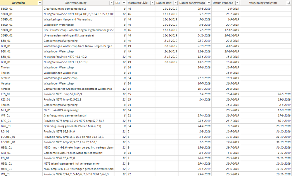
Here you can see some sample data
The type of permit is in column 'Soort vergunning' and 'Datum aangevraagd' is the date on which the permit has been requested and the column 'Datum verleend' is the column on which date the permit has been approved.
The column 'Vergunning geldig tot' is the date on which the permit expires
this visual isn't correct (i know) but what i want is that the Y-axis has the types of permits and the X-axis has the dates/weeks (start/end/duration) so that i can visualise the duration of the permits
Helpful resources

Microsoft Fabric Learn Together
Covering the world! 9:00-10:30 AM Sydney, 4:00-5:30 PM CET (Paris/Berlin), 7:00-8:30 PM Mexico City

Power BI Monthly Update - April 2024
Check out the April 2024 Power BI update to learn about new features.

| User | Count |
|---|---|
| 109 | |
| 98 | |
| 77 | |
| 66 | |
| 54 |
| User | Count |
|---|---|
| 144 | |
| 104 | |
| 100 | |
| 86 | |
| 64 |


