- Power BI forums
- Updates
- News & Announcements
- Get Help with Power BI
- Desktop
- Service
- Report Server
- Power Query
- Mobile Apps
- Developer
- DAX Commands and Tips
- Custom Visuals Development Discussion
- Health and Life Sciences
- Power BI Spanish forums
- Translated Spanish Desktop
- Power Platform Integration - Better Together!
- Power Platform Integrations (Read-only)
- Power Platform and Dynamics 365 Integrations (Read-only)
- Training and Consulting
- Instructor Led Training
- Dashboard in a Day for Women, by Women
- Galleries
- Community Connections & How-To Videos
- COVID-19 Data Stories Gallery
- Themes Gallery
- Data Stories Gallery
- R Script Showcase
- Webinars and Video Gallery
- Quick Measures Gallery
- 2021 MSBizAppsSummit Gallery
- 2020 MSBizAppsSummit Gallery
- 2019 MSBizAppsSummit Gallery
- Events
- Ideas
- Custom Visuals Ideas
- Issues
- Issues
- Events
- Upcoming Events
- Community Blog
- Power BI Community Blog
- Custom Visuals Community Blog
- Community Support
- Community Accounts & Registration
- Using the Community
- Community Feedback
Register now to learn Fabric in free live sessions led by the best Microsoft experts. From Apr 16 to May 9, in English and Spanish.
- Power BI forums
- Forums
- Get Help with Power BI
- Desktop
- Need Help: How to group by multiple conditions and...
- Subscribe to RSS Feed
- Mark Topic as New
- Mark Topic as Read
- Float this Topic for Current User
- Bookmark
- Subscribe
- Printer Friendly Page
- Mark as New
- Bookmark
- Subscribe
- Mute
- Subscribe to RSS Feed
- Permalink
- Report Inappropriate Content
Need Help: How to group by multiple conditions and calculate aggregated contribution
Hi,
I'm here seeking for the wisdom of PowerBI masters.
I would like to plot a chart in PowerBI that could give the % contribution for a multiple conditional grouping.
To illustrate the issue, please find the table below:
| Component | Project | Type | Area Used by Component | Total Area available for Project | Submiter |
| X | A1 | NORMAL | 10 | 30 | FAB |
| Y | B1 | EXTRA | 12 | 40 | IT |
| Z | C1 | NORMAL | 11 | 30 | IT |
| K | D1 | EXTRA | 15 | 40 | FAB |
| M | A1 | NORMAL | 17 | 30 | IT |
| N | B1 | EXTRA | 10 | 40 | FAB |
| O | C1 | NORMAL | 12 | 30 | FAB |
| P | D1 | EXTRA | 13 | 40 | IT |
Based on a table like this, I would like to have the agreggated % contribution per Project Type and Submitter.
For the above example, if doing the calculations manually, we would have:
| NORMAL | EXTRA | |
| FAB | 22/60 | 25/80 |
| IT | 28/60 | 25/80 |
| UNUSED AREA | 10/60 | 30/80 |
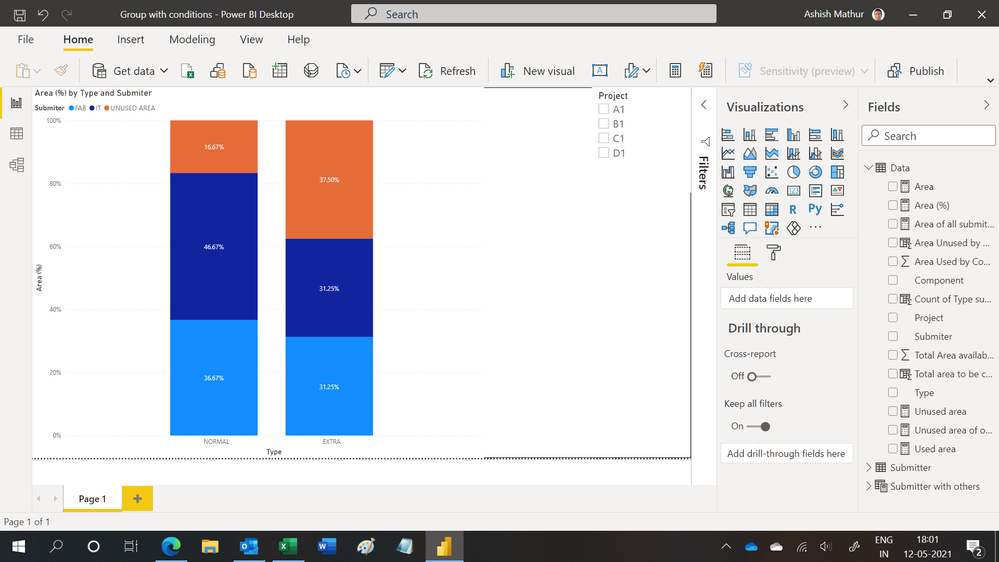
The resulting chart should be like below:
However, I could not find a way in Power BI to dynamically perform this operation...
Any help or suggestion is very welcome.
Thanks!
Solved! Go to Solution.
- Mark as New
- Bookmark
- Subscribe
- Mute
- Subscribe to RSS Feed
- Permalink
- Report Inappropriate Content
Hi, @unkuser
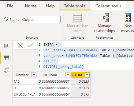
According to your description, I can roughly understand your requirement, I think your requirement can be separated into two parts, one part is the table and another is the column chart because the columns in the output table can’t be placed as the axis and value of the column chart, you can try my steps:
- Create a calculated table:
Output =

SUMMARIZE('Table',[Submiter])- Create two calculated columns in the table like this:
NORMAL =

var _total=SUMX(FILTER(ALL('Table'),[Submiter]=EARLIER([Submiter])&&[Type]="Normal"),[Total Area available for Project])

var _area= SUMX(FILTER(ALL('Table'),[Submiter]=EARLIER([Submiter])&&[Type]="Normal"),[Area Used by Component])

return

DIVIDE(_area,_total)
EXTRA =
var _total=SUMX(FILTER(ALL('Table'),[Submiter]=EARLIER([Submiter])&&[Type]="Extra"),[Total Area available for Project])
var _area= SUMX(FILTER(ALL('Table'),[Submiter]=EARLIER([Submiter])&&[Type]="Extra"),[Area Used by Component])
return
DIVIDE(_area,_total)This is the output:
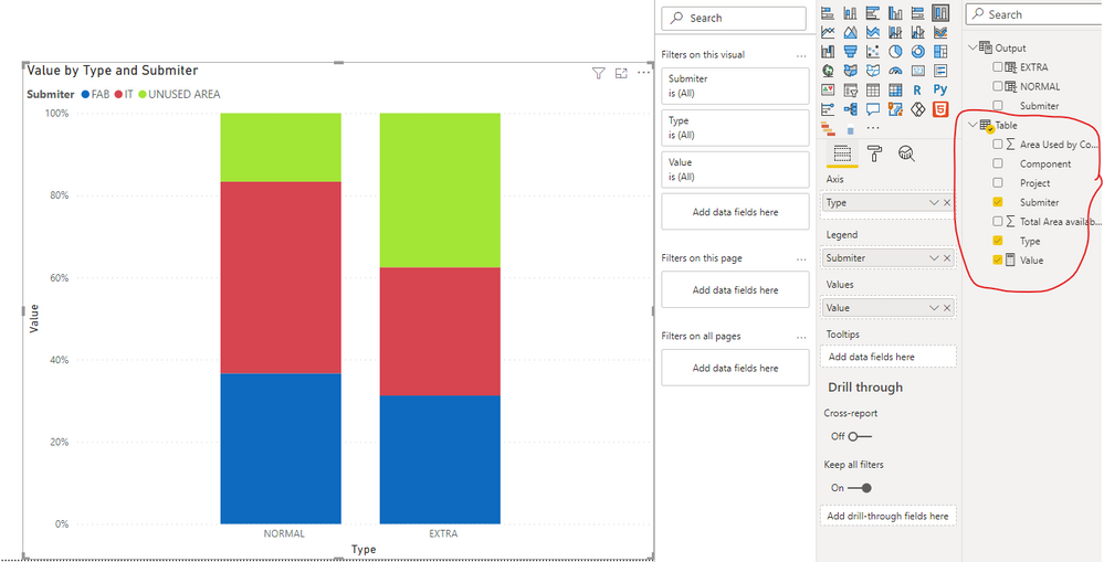
- To get the 100% stacked column chart, you should create a measure in the main table first:
Value =

DIVIDE(

    SUM('Table'[Area Used by Component]),

SUM('Table'[Total Area available for Project]))- Then create a 100% stacked column chart and place it like this:
Then change the data color, and you can get what you want.
You can download my test pbix file below
Thank you very much!
Best Regards,
Community Support Team _Robert Qin
If this post helps, then please consider Accept it as the solution to help the other members find it more quickly.
- Mark as New
- Bookmark
- Subscribe
- Mute
- Subscribe to RSS Feed
- Permalink
- Report Inappropriate Content
Hi,
Will there only be 2 submitter types - FAB and IT?
Regards,
Ashish Mathur
http://www.ashishmathur.com
https://www.linkedin.com/in/excelenthusiasts/
- Mark as New
- Bookmark
- Subscribe
- Mute
- Subscribe to RSS Feed
- Permalink
- Report Inappropriate Content
Hi Ashish,
No. Number of submitters can grow up over time.
Thank you,
- Mark as New
- Bookmark
- Subscribe
- Mute
- Subscribe to RSS Feed
- Permalink
- Report Inappropriate Content
Hi,
You may download my PBI file from here.
Hope this helps.
Regards,
Ashish Mathur
http://www.ashishmathur.com
https://www.linkedin.com/in/excelenthusiasts/
- Mark as New
- Bookmark
- Subscribe
- Mute
- Subscribe to RSS Feed
- Permalink
- Report Inappropriate Content
Hi, Create measures as follows
FAB = CALCULATE(SUM(Matrix[Area Used by Component]), KEEPFILTERS(Matrix[Submiter]="FAB"))
IT = CALCULATE(SUM(Matrix[Area Used by Component]), KEEPFILTERS(Matrix[Submiter]="IT"))
Create a calculated column in your report as below:

- Mark as New
- Bookmark
- Subscribe
- Mute
- Subscribe to RSS Feed
- Permalink
- Report Inappropriate Content
Hi davehus,
Thanks for the hints. It works fine for the types, but not for the Unused Area.
If we try to filter the chart by Project, the Unused Area will not be automatically updated to reflect the filters...
Any ideas ?
Thanks
Helpful resources

Microsoft Fabric Learn Together
Covering the world! 9:00-10:30 AM Sydney, 4:00-5:30 PM CET (Paris/Berlin), 7:00-8:30 PM Mexico City

Power BI Monthly Update - April 2024
Check out the April 2024 Power BI update to learn about new features.

| User | Count |
|---|---|
| 110 | |
| 94 | |
| 82 | |
| 66 | |
| 58 |
| User | Count |
|---|---|
| 151 | |
| 121 | |
| 104 | |
| 87 | |
| 67 |


