- Power BI forums
- Updates
- News & Announcements
- Get Help with Power BI
- Desktop
- Service
- Report Server
- Power Query
- Mobile Apps
- Developer
- DAX Commands and Tips
- Custom Visuals Development Discussion
- Health and Life Sciences
- Power BI Spanish forums
- Translated Spanish Desktop
- Power Platform Integration - Better Together!
- Power Platform Integrations (Read-only)
- Power Platform and Dynamics 365 Integrations (Read-only)
- Training and Consulting
- Instructor Led Training
- Dashboard in a Day for Women, by Women
- Galleries
- Community Connections & How-To Videos
- COVID-19 Data Stories Gallery
- Themes Gallery
- Data Stories Gallery
- R Script Showcase
- Webinars and Video Gallery
- Quick Measures Gallery
- 2021 MSBizAppsSummit Gallery
- 2020 MSBizAppsSummit Gallery
- 2019 MSBizAppsSummit Gallery
- Events
- Ideas
- Custom Visuals Ideas
- Issues
- Issues
- Events
- Upcoming Events
- Community Blog
- Power BI Community Blog
- Custom Visuals Community Blog
- Community Support
- Community Accounts & Registration
- Using the Community
- Community Feedback
Register now to learn Fabric in free live sessions led by the best Microsoft experts. From Apr 16 to May 9, in English and Spanish.
- Power BI forums
- Forums
- Get Help with Power BI
- Desktop
- Need Help Formatting Vizulaizaitons Using Mutiple ...
- Subscribe to RSS Feed
- Mark Topic as New
- Mark Topic as Read
- Float this Topic for Current User
- Bookmark
- Subscribe
- Printer Friendly Page
- Mark as New
- Bookmark
- Subscribe
- Mute
- Subscribe to RSS Feed
- Permalink
- Report Inappropriate Content
Need Help Formatting Vizulaizaitons Using Mutiple Response Survey Data as Percentage of Respondents
Hi Everyone!
I just started working with Power BI last week, so apologies if what I'm about to ask is super basic.
I have some survey data that have a number of questions of the "select all that apply" variety. This means that each possible response to those questions appears in the data as a separate column (value = 1 if option is selected, value = 0 if option is not selected). Ultimately what I would like to do is be able to create bar charts summarizing each of these variables individually, but to also have them interact with one another and filter each other based on the response selected.
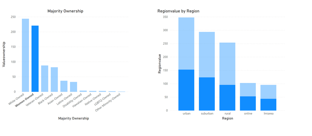
In the example below, I'd like to create two bar charts, one summarizing the ownership of each business (white, women, black, etc.) and one summarizing the region of operation (urban, suburban, online, etc.). And when I click on say the women-owned bar, the region figure would automatically highlight the distribution of women-owned businesses by region.
Simplified Example of Original Data:
| ID | White-owned | Women-Owned | Black-Owned | Urban | Suburban | Online |
| 1 | 1 | 1 | 0 | 0 | 1 | 0 |
| 2 | 0 | 1 | 0 | 1 | 0 | 1 |
| 3 | 0 | 0 | 1 | 0 | 1 | 1 |
I've had some luck creating separate sheets of data with each question (Region or Group) unpivoted and filtered so that only checked responses (value = 1) are included, and then creating a many to many relationship between the sheets based on the respondent ID. I'm able to create bar charts for each of the different multiple response questions and these bar charts do indeed filter one another when different responses are selected. This is what it looks like:
This is almost exactly what I want. The only thing holding me back now is that the bar charts are displaying the frequency of each response, and I want to have them displayed as a percentage of all responses.
I've tried the "show value as percent of grand total" option, but since respondents can select more than one option (and therefore can show up more than once in the transformed data) I'm getting skewed percentages for that. I can get the figures formatted as percentages if I change the summation to average and the format to percentage and do not filter the data on only checked responses (so I include the 0's as well). This gets me what I need, BUT I lose the interactive filtering functionality that I originally had. Is there any way to bridge these two methods?
Hopefully this makes sense. Any suggestions you can provide would be much appreciated!
Thanks
- Mark as New
- Bookmark
- Subscribe
- Mute
- Subscribe to RSS Feed
- Permalink
- Report Inappropriate Content
hi @Anonymous
It seems that it could not achieve in power bi for now.
And you may create two sets of bar visuals as a workround.
Regards,
Lin
If this post helps, then please consider Accept it as the solution to help the other members find it more quickly.
Helpful resources

Microsoft Fabric Learn Together
Covering the world! 9:00-10:30 AM Sydney, 4:00-5:30 PM CET (Paris/Berlin), 7:00-8:30 PM Mexico City

Power BI Monthly Update - April 2024
Check out the April 2024 Power BI update to learn about new features.

| User | Count |
|---|---|
| 107 | |
| 99 | |
| 76 | |
| 64 | |
| 58 |
| User | Count |
|---|---|
| 148 | |
| 113 | |
| 97 | |
| 84 | |
| 67 |

