- Power BI forums
- Updates
- News & Announcements
- Get Help with Power BI
- Desktop
- Service
- Report Server
- Power Query
- Mobile Apps
- Developer
- DAX Commands and Tips
- Custom Visuals Development Discussion
- Health and Life Sciences
- Power BI Spanish forums
- Translated Spanish Desktop
- Power Platform Integration - Better Together!
- Power Platform Integrations (Read-only)
- Power Platform and Dynamics 365 Integrations (Read-only)
- Training and Consulting
- Instructor Led Training
- Dashboard in a Day for Women, by Women
- Galleries
- Community Connections & How-To Videos
- COVID-19 Data Stories Gallery
- Themes Gallery
- Data Stories Gallery
- R Script Showcase
- Webinars and Video Gallery
- Quick Measures Gallery
- 2021 MSBizAppsSummit Gallery
- 2020 MSBizAppsSummit Gallery
- 2019 MSBizAppsSummit Gallery
- Events
- Ideas
- Custom Visuals Ideas
- Issues
- Issues
- Events
- Upcoming Events
- Community Blog
- Power BI Community Blog
- Custom Visuals Community Blog
- Community Support
- Community Accounts & Registration
- Using the Community
- Community Feedback
Register now to learn Fabric in free live sessions led by the best Microsoft experts. From Apr 16 to May 9, in English and Spanish.
- Power BI forums
- Forums
- Get Help with Power BI
- Desktop
- Re: Need Assistance In Writing Conditional Stateme...
- Subscribe to RSS Feed
- Mark Topic as New
- Mark Topic as Read
- Float this Topic for Current User
- Bookmark
- Subscribe
- Printer Friendly Page
- Mark as New
- Bookmark
- Subscribe
- Mute
- Subscribe to RSS Feed
- Permalink
- Report Inappropriate Content
Need Assistance In Writing Conditional Statement to Achieve The Desired Results. Please Read Below
Any help with this is greatly appreciated.
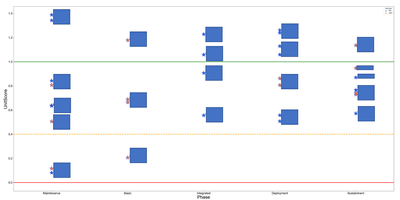
I have a chart (Strip plot) I created using Python in Power BI. The markers (Stars) represent schools. The data points are values (Y-Axis) that range from -3.0 to 3.0. The data points are aligned on the X-Axis to the phase of training based on minimum and maximum thresholds. There are 6 phases (Maintenance, Basic, Intermediate, Advance, and the last phase ia a catch all (NA) for all schools that do not align to the other phases. I want to add a different color border around the markers that have a Rating with a value less than or equal to zero. If the schools have Ratings with values greater than zero then return the markers with a fill of Blue for West Coast schools and a fill of Gold for East Coast schools. Is there a way to add conditional formatting to a marker in Seaborn? Here is the code that have written so far. #
The following code to create a dataframe and remove duplicated rows is always executed and acts as a preamble for your script:
# dataset = pandas.DataFrame(UnitType, UnitScore)
# dataset = dataset.drop_duplicates()
# Paste or type your script code here:
import matplotlib.pyplot as plt
import seaborn as sns
import pandas as pd
from matplotlib.pyplot import text
plt.figure(figsize=(45,22))
st=sns.stripplot(x='Phase', y='UnitScore', hue='UnitCoast', data=dataset, size=28, marker="*", edgecolor=('Blue'), linewidth=1, alpha=1, jitter=.0)
plt.yticks(fontsize=30) sns.set(font_scale=1.6)
plt.axhline(1, color="Green", linewidth=3)
matplotlib.pyplot.text(x=-.9, y=1, s='Deployment', fontsize=20)
plt.axhline(.4, color="Orange", linestyle='dashed', linewidth=3)
matplotlib.pyplot.text(x=-.9, y=.4, s='Min Target', fontsize=20)
plt.axhline(0, color="Red", label='Hard Deck', linewidth=3)
matplotlib.pyplot.text(x=-.9, y=0, s='Hard Deck', fontsize=20)
plt.xlabel('Phase', fontsize=30); plt.ylabel('UnitScore', fontsize=30); lt.tick_params(axis='both', which='major', labelsize=20)
x=dataset['Phase'].values
y=dataset['UnitScore'].values
z=dataset['Unit'].values
for ph, us, un in zip(x, y, z
plt.annotate(un, (ph,us), xytext=(10,2), textcoords="offset points") plt.show()
- Mark as New
- Bookmark
- Subscribe
- Mute
- Subscribe to RSS Feed
- Permalink
- Report Inappropriate Content
Hi @bkanderso ,
Please review the following links, hope they can help you.
Stripplot using Seaborn in Python
seaborn.set(style = 'whitegrid')

tips = seaborn.load_dataset("tips")

seaborn.stripplot(x="day", y="total_bill", hue="smoker",
                  data=tips, palette="Set1", size=20,
                  marker="s", alpha=0.2)

plt.show()
Conditional formatting of plotly scatterplot markers
trace = go.Scatter(
    x=df['x'],
    y=df['y'],
    mode='markers',
    marker=dict(
        size=42,
        # I want the color to be green if lower_limit ≤ y ≤ upper_limit
        # else red
        color=np.where(np.logical_and(df['lower_limit'] <= df['y'], df['y']  <= df['upper_limit']), 'green', 'red'),
    )
)
And you can provide some raw data in the field [UnitType] and [UnitScore] and your expected result with the screenshot, later we will check on it and give you a suitable solution. Thank you.
Best Regards
If this post helps, then please consider Accept it as the solution to help the other members find it more quickly.
- Mark as New
- Bookmark
- Subscribe
- Mute
- Subscribe to RSS Feed
- Permalink
- Report Inappropriate Content
Rena
I appreciate you taking the time to look at this.
I tried your suggestion (code) and it still is not giving me what I need. I am attaching the code with my attempt to get the desired results. I believe I need to create a data frame for Unit and Rating and Unit Score of <= 0, and then insert the data frame into the strip plot code using an conditional statement. I do not know where or how to do this. West coast units (markers) will be blue in color with blue border, East coast markers will be gold with blue border. If a unit has a rating less than or equal to (<=) zero I want the border for those markers (units) to be red, else West coast units (markers) will be blue in color with blue border, East coast markers will be gold with blue border. If a unit has a payband with a score less than or equal to (<=) zero I want the fill for those markers (units) to be a hatch pattern (++) with blue border, else West coast units (markers) will be blue in color with blue border, East coast markers will be gold with blue border. My attempt to write the data frame and conditional statements is incorrect and I am hoping you can help me get this over the finish line.
Here is the code:

Here is a screenshot of the visual in Power BI without the conditional statement.
Helpful resources

Microsoft Fabric Learn Together
Covering the world! 9:00-10:30 AM Sydney, 4:00-5:30 PM CET (Paris/Berlin), 7:00-8:30 PM Mexico City

Power BI Monthly Update - April 2024
Check out the April 2024 Power BI update to learn about new features.

| User | Count |
|---|---|
| 113 | |
| 99 | |
| 80 | |
| 70 | |
| 59 |
| User | Count |
|---|---|
| 150 | |
| 119 | |
| 104 | |
| 87 | |
| 67 |

