- Power BI forums
- Updates
- News & Announcements
- Get Help with Power BI
- Desktop
- Service
- Report Server
- Power Query
- Mobile Apps
- Developer
- DAX Commands and Tips
- Custom Visuals Development Discussion
- Health and Life Sciences
- Power BI Spanish forums
- Translated Spanish Desktop
- Power Platform Integration - Better Together!
- Power Platform Integrations (Read-only)
- Power Platform and Dynamics 365 Integrations (Read-only)
- Training and Consulting
- Instructor Led Training
- Dashboard in a Day for Women, by Women
- Galleries
- Community Connections & How-To Videos
- COVID-19 Data Stories Gallery
- Themes Gallery
- Data Stories Gallery
- R Script Showcase
- Webinars and Video Gallery
- Quick Measures Gallery
- 2021 MSBizAppsSummit Gallery
- 2020 MSBizAppsSummit Gallery
- 2019 MSBizAppsSummit Gallery
- Events
- Ideas
- Custom Visuals Ideas
- Issues
- Issues
- Events
- Upcoming Events
- Community Blog
- Power BI Community Blog
- Custom Visuals Community Blog
- Community Support
- Community Accounts & Registration
- Using the Community
- Community Feedback
Register now to learn Fabric in free live sessions led by the best Microsoft experts. From Apr 16 to May 9, in English and Spanish.
- Power BI forums
- Forums
- Get Help with Power BI
- Desktop
- Multiple variables on x axis? Stacked column visua...
- Subscribe to RSS Feed
- Mark Topic as New
- Mark Topic as Read
- Float this Topic for Current User
- Bookmark
- Subscribe
- Printer Friendly Page
- Mark as New
- Bookmark
- Subscribe
- Mute
- Subscribe to RSS Feed
- Permalink
- Report Inappropriate Content
Multiple variables on x axis? Stacked column visualization
I have data that is from a SharePoint list that is similar to a test you would take. Columns are Name, Test Date and then another 30 columns that are the test questions. Each test question column can have say 5 answers.
I'm hoping to to create a stacked column chart that shows the answers to each question. For example, the first bar would show Question 1 with the total count of the 5 answers. Then next to that bar would be question 2 and so on. That way, one visualization would show all the questions and quickly show me which question is the worst performing one.
Being able to show these as a % would also be good as well as a cluster chart to show different dates.
I'm thinking the way my data is set up is causing the issue. Below is how the data is laid out
Name Test Date Question 1 Question 2 Question 3 Question 4
Bill 12/1/2018 Red Truck Tire Tuesday
- Mark as New
- Bookmark
- Subscribe
- Mute
- Subscribe to RSS Feed
- Permalink
- Report Inappropriate Content
Hello, I have a similar doubt. I would like to create a graphic with 4 variables::
1. Number of people (#)
2. Time, i.e., "1st quarter", "2nd quarter", "3rd quarter" and "4th quarter"
2.1 Within each quarter there would be 3 buckets, i.e., "Bucket 1", "Bucket 2" and "Bucket 3".
2.1.1 Every bucket within all quarters would be a column divided into 3 categories (like stacked bars): "Orange", "Yellow" and "Green".
Below you can find a draft of the graph 🙂
I appreaciate any hint.
- Mark as New
- Bookmark
- Subscribe
- Mute
- Subscribe to RSS Feed
- Permalink
- Report Inappropriate Content
Hi @bryanc78,
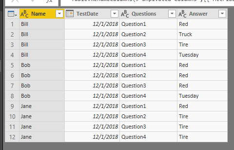
In Query Editor mode, please unpivot table to convert its structure to below format.
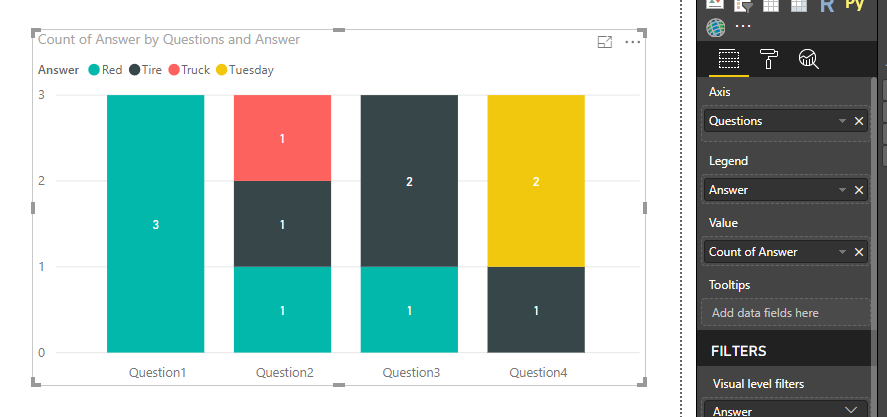
Place [Questions] onto X-axis and place [Answer] into legend of a stacked column chart.
Best regards,
Yuliana Gu
If this post helps, then please consider Accept it as the solution to help the other members find it more quickly.
- Mark as New
- Bookmark
- Subscribe
- Mute
- Subscribe to RSS Feed
- Permalink
- Report Inappropriate Content
So, I got it to work but now that it created multiple rows, it shows each person took the test multiple times instead of just once. Any way to get the non unpivot columns to only show a value once?
For example, if bob took 1 test with 30 questions, I need Bob to show only 1 test and not 30 tests. Hope this makes sense
Can I make a copy of the table, strip out everything but name, test date and the new unpivot column and value column then use that new table to get visualizations on the test questions? That way my other visualizations are not impacted?
- Mark as New
- Bookmark
- Subscribe
- Mute
- Subscribe to RSS Feed
- Permalink
- Report Inappropriate Content
Hi @bryanc78,
For example, if bob took 1 test with 30 questions, I need Bob to show only 1 test and not 30 tests. Hope this makes sense
Not very clear about your requirement. Does DISTINCTCOUNT meet your requirement? Please illustrate your scenario with some sample data.
Can I make a copy of the table, strip out everything but name, test date and the new unpivot column and value column then use that new table to get visualizations on the test questions? That way my other visualizations are not impacted?
Of course you can.
Regards,
Yuliana Gu
If this post helps, then please consider Accept it as the solution to help the other members find it more quickly.
- Mark as New
- Bookmark
- Subscribe
- Mute
- Subscribe to RSS Feed
- Permalink
- Report Inappropriate Content
So this has been working well for me but now my refresh times are taking an hour to complete and I'm thinking it's because of the duplicate tables being updated at the same time. Could that be a reason?
- Mark as New
- Bookmark
- Subscribe
- Mute
- Subscribe to RSS Feed
- Permalink
- Report Inappropriate Content
That looks good
I'll have to research this more as when I just unpivoted one column, my entire table is now showing Error for the values
DataSource.Error: We couldn't parse OData response result. Error: A value without a type name was found and no expected type is available. When the model is specified, each value in the payload must have a type which can be either specified in the payload, explicitly by the caller or implicitly inferred from the parent value.
Helpful resources

Microsoft Fabric Learn Together
Covering the world! 9:00-10:30 AM Sydney, 4:00-5:30 PM CET (Paris/Berlin), 7:00-8:30 PM Mexico City

Power BI Monthly Update - April 2024
Check out the April 2024 Power BI update to learn about new features.

| User | Count |
|---|---|
| 111 | |
| 100 | |
| 80 | |
| 64 | |
| 58 |
| User | Count |
|---|---|
| 146 | |
| 110 | |
| 93 | |
| 84 | |
| 67 |


