- Power BI forums
- Updates
- News & Announcements
- Get Help with Power BI
- Desktop
- Service
- Report Server
- Power Query
- Mobile Apps
- Developer
- DAX Commands and Tips
- Custom Visuals Development Discussion
- Health and Life Sciences
- Power BI Spanish forums
- Translated Spanish Desktop
- Power Platform Integration - Better Together!
- Power Platform Integrations (Read-only)
- Power Platform and Dynamics 365 Integrations (Read-only)
- Training and Consulting
- Instructor Led Training
- Dashboard in a Day for Women, by Women
- Galleries
- Community Connections & How-To Videos
- COVID-19 Data Stories Gallery
- Themes Gallery
- Data Stories Gallery
- R Script Showcase
- Webinars and Video Gallery
- Quick Measures Gallery
- 2021 MSBizAppsSummit Gallery
- 2020 MSBizAppsSummit Gallery
- 2019 MSBizAppsSummit Gallery
- Events
- Ideas
- Custom Visuals Ideas
- Issues
- Issues
- Events
- Upcoming Events
- Community Blog
- Power BI Community Blog
- Custom Visuals Community Blog
- Community Support
- Community Accounts & Registration
- Using the Community
- Community Feedback
Register now to learn Fabric in free live sessions led by the best Microsoft experts. From Apr 16 to May 9, in English and Spanish.
- Power BI forums
- Forums
- Get Help with Power BI
- Desktop
- Multiple Running Total Line Chart
- Subscribe to RSS Feed
- Mark Topic as New
- Mark Topic as Read
- Float this Topic for Current User
- Bookmark
- Subscribe
- Printer Friendly Page
- Mark as New
- Bookmark
- Subscribe
- Mute
- Subscribe to RSS Feed
- Permalink
- Report Inappropriate Content
Multiple Running Total Line Chart
I have a data set containing information used for reporting planned .vs. actual for a scrum burnup chart.
The pertainent columns consist of:
- Sprint Planned - The sprint in which a user story is intended to be worked
- Points Planned - The point value of the user story.
- Sprint Closed - The sprint in which the user story was actually completed
- Points Closed - The point value of the user story.
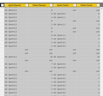
Sample data:
I have also added Running Total quick measures for Points Planned and Points Closed.
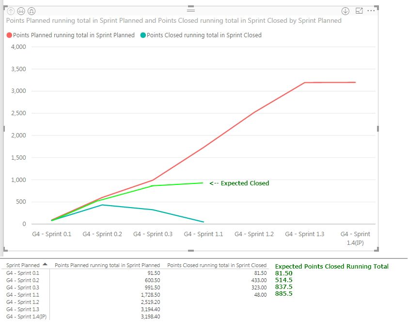
When attempting to graph the Running Totals for Points Planned and Points Closed against Sprint Planned and Sprint Closed respectively, I am seeing that only the Planned series is displayed as a running total. The Closed series is displayed as totals by Sprint.:


It appears that the issue is related to the multiple values applied to the axis. The data values in each axis series are of a common fixed set, but since they are contained in different series, it prevents different values from being plotted on a common axis.
My expectation was that the Closed line would be like:

My initial workaround was to overlay separate line charts - each plotting points over sprints, but the problem then becomes that the overlayed charts do not scale uniformly over time.
Any suggestions or ideas would be greatly appreciated.
Thank you in advance.
Ross
Solved! Go to Solution.
- Mark as New
- Bookmark
- Subscribe
- Mute
- Subscribe to RSS Feed
- Permalink
- Report Inappropriate Content
 Final Solution
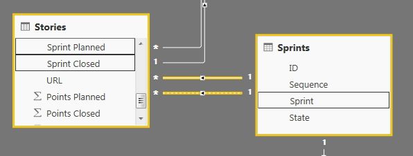
The solution to your problem is add a new 'Sprint' table that contains a distinct list of sprints. You can then link this table to both the Sprint Planned and Sprint Closed columns. This will allow you to use this new table as the shared axis between the planned and closed running total of points.
After importing the new 'Sprint' table, you will want to create 2 relationships between the 'Planned vs Closed' table and the 'Sprint' table. One relationship should link the Planned Sprint column to the Sprint table, and the other should link the Closed Sprint column to the Sprint table. Note that one of these two relationships will be a hashed line instead of a solid line. The hashed line means that the second relationship is inactive. More on this later.
After creating the relationships, you can create a new Line Chart. Make sure to use the column from the 'Sprint' table as the axis. You can add the Points Planned and Points Closed to the Values, and create the 2 running value quick measures.
Since Power BI only allows one relationship between 2 tables to be active at once, you will need to slightly change one of the measures. After being created, both measures will be using the active relationship. This means one of the running total measures will be incorrect when it is first created. For example, if the Sprint Planned relationship is the active one, the Points Closed measure will be using the Planned Sprint sprint names to sum.
To change this, you need to force this incorrect measure to use the inactive relationship rather than the active one. You can do this by changing the DAX of the incorrect measure. In my case, the Points Closed was the incorrect measure (summing by Planned Sprint). The initial DAX created by the quick measure was as follows:
- Mark as New
- Bookmark
- Subscribe
- Mute
- Subscribe to RSS Feed
- Permalink
- Report Inappropriate Content
 Final Solution
The solution to your problem is add a new 'Sprint' table that contains a distinct list of sprints. You can then link this table to both the Sprint Planned and Sprint Closed columns. This will allow you to use this new table as the shared axis between the planned and closed running total of points.
After importing the new 'Sprint' table, you will want to create 2 relationships between the 'Planned vs Closed' table and the 'Sprint' table. One relationship should link the Planned Sprint column to the Sprint table, and the other should link the Closed Sprint column to the Sprint table. Note that one of these two relationships will be a hashed line instead of a solid line. The hashed line means that the second relationship is inactive. More on this later.
After creating the relationships, you can create a new Line Chart. Make sure to use the column from the 'Sprint' table as the axis. You can add the Points Planned and Points Closed to the Values, and create the 2 running value quick measures.
Since Power BI only allows one relationship between 2 tables to be active at once, you will need to slightly change one of the measures. After being created, both measures will be using the active relationship. This means one of the running total measures will be incorrect when it is first created. For example, if the Sprint Planned relationship is the active one, the Points Closed measure will be using the Planned Sprint sprint names to sum.
To change this, you need to force this incorrect measure to use the inactive relationship rather than the active one. You can do this by changing the DAX of the incorrect measure. In my case, the Points Closed was the incorrect measure (summing by Planned Sprint). The initial DAX created by the quick measure was as follows:
- Mark as New
- Bookmark
- Subscribe
- Mute
- Subscribe to RSS Feed
- Permalink
- Report Inappropriate Content
Hi @Anonymous,
From what I know, the issue is not caused by the quick measure. Please create a two line chart visuals, one display the Running Totals for Points Planned against Sprint Planned, and another one displays the Running Totals for Points Closed and Sprint Closed respectively. If that works, it will be caused by mutiple axis fields.
If this still does not resolve the problem, do you mind share more details or sample data for further analysis?
Best Regards,
Angelia
- Mark as New
- Bookmark
- Subscribe
- Mute
- Subscribe to RSS Feed
- Permalink
- Report Inappropriate Content
@v-huizhn-msft Angelia,
Thank you for taking the time to respond.
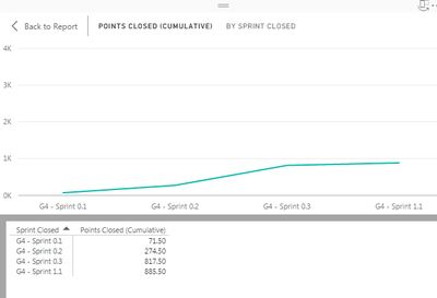
As you suspect, the independent graphing of running total to sprint yields the expected results:


Since the Planned and Closed Sprints are not always the same, it is not possible to plot both series over a common axis.
- Mark as New
- Bookmark
- Subscribe
- Mute
- Subscribe to RSS Feed
- Permalink
- Report Inappropriate Content
Hi @Anonymous,
After test and research, it is impossible to plot both series over a common axis. Because the measure will be effected by the axis value. Thanks for understanding.
Best Regards,
Angelia
- Mark as New
- Bookmark
- Subscribe
- Mute
- Subscribe to RSS Feed
- Permalink
- Report Inappropriate Content
@v-huizhn-msft As documented in my posted solution, the limitation you identified is resolved by normalizing the relationship to a common value. The measures can then be defined in terms of the normalized reference data.

- Mark as New
- Bookmark
- Subscribe
- Mute
- Subscribe to RSS Feed
- Permalink
- Report Inappropriate Content
Hi @Anonymous,
Got it. I learned new things. Thanks for sharing.
Best Regards,
Angelia
Helpful resources

Microsoft Fabric Learn Together
Covering the world! 9:00-10:30 AM Sydney, 4:00-5:30 PM CET (Paris/Berlin), 7:00-8:30 PM Mexico City

Power BI Monthly Update - April 2024
Check out the April 2024 Power BI update to learn about new features.

| User | Count |
|---|---|
| 110 | |
| 94 | |
| 82 | |
| 66 | |
| 58 |
| User | Count |
|---|---|
| 151 | |
| 121 | |
| 104 | |
| 87 | |
| 67 |

