- Power BI forums
- Updates
- News & Announcements
- Get Help with Power BI
- Desktop
- Service
- Report Server
- Power Query
- Mobile Apps
- Developer
- DAX Commands and Tips
- Custom Visuals Development Discussion
- Health and Life Sciences
- Power BI Spanish forums
- Translated Spanish Desktop
- Power Platform Integration - Better Together!
- Power Platform Integrations (Read-only)
- Power Platform and Dynamics 365 Integrations (Read-only)
- Training and Consulting
- Instructor Led Training
- Dashboard in a Day for Women, by Women
- Galleries
- Community Connections & How-To Videos
- COVID-19 Data Stories Gallery
- Themes Gallery
- Data Stories Gallery
- R Script Showcase
- Webinars and Video Gallery
- Quick Measures Gallery
- 2021 MSBizAppsSummit Gallery
- 2020 MSBizAppsSummit Gallery
- 2019 MSBizAppsSummit Gallery
- Events
- Ideas
- Custom Visuals Ideas
- Issues
- Issues
- Events
- Upcoming Events
- Community Blog
- Power BI Community Blog
- Custom Visuals Community Blog
- Community Support
- Community Accounts & Registration
- Using the Community
- Community Feedback
Register now to learn Fabric in free live sessions led by the best Microsoft experts. From Apr 16 to May 9, in English and Spanish.
- Power BI forums
- Forums
- Get Help with Power BI
- Desktop
- Re: Month data not displaying properly in line cha...
- Subscribe to RSS Feed
- Mark Topic as New
- Mark Topic as Read
- Float this Topic for Current User
- Bookmark
- Subscribe
- Printer Friendly Page
- Mark as New
- Bookmark
- Subscribe
- Mute
- Subscribe to RSS Feed
- Permalink
- Report Inappropriate Content
Month data not displaying properly in line chart
I am trying to compare activity in hours on a platform across 2020 with 2019 activity, by month. I have two separate tables, one for 2019 figures, and one for 2020, which are aggregated by month. They look like this:
Start Date End Date Hours of activity
01/01/2019 31/01/2019 250.2
01/02/2019 28/02/2019 315.4
...and so on. I'm trying to do a simple line chart, using Start Date at the Month hierarchy level. However, the 2019 data is showing Jan, Feb and March only with all other months grouped under Blank. I can't figure out why. No filters on the chart.
https://www.flickr.com/photos/192824306@N06/51128104110/ Pic of chart
Bonus points for being able to do a "last 12 months" (i.e. 1st April 2020 to 31st March 2021) compared to the 12 months previous comparison.
How can I do this previous year comparison most effectively? It seems like it should be simple but I can't quite get it to work.
Solved! Go to Solution.
- Mark as New
- Bookmark
- Subscribe
- Mute
- Subscribe to RSS Feed
- Permalink
- Report Inappropriate Content
To get a last 12 months, you should have a single table for both years. Append table2019 to table2020 using Power Query.
Then, relate that table to a dimensional Calendar table. You may use DAX to do that table using eg: CALENDARAUTO()
To display the last 12 months values, use a matrix visual with the dates in the rows and the folloing calculated measure in values:
Last12 months = CALCULATE(SUM(Hours), DATESINPERIOD('Calendar'[Date], MAX('Calendar'[Date], -12, MONTH)
- Mark as New
- Bookmark
- Subscribe
- Mute
- Subscribe to RSS Feed
- Permalink
- Report Inappropriate Content
Thanks, I have now been able to do exactly what I wanted to do by appending the tables with the right column names and calculating a PY Hours variable using DATEADD.
- Mark as New
- Bookmark
- Subscribe
- Mute
- Subscribe to RSS Feed
- Permalink
- Report Inappropriate Content
In order to append tables in Power Query correctly, all the columns from all the tables must contain the same names and the same data types.
Otherwise, you'll experience blank values as per your screenshot.
- Mark as New
- Bookmark
- Subscribe
- Mute
- Subscribe to RSS Feed
- Permalink
- Report Inappropriate Content
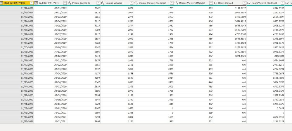
Thanks for the suggestion. I tried it, but I'm now more perplexed. When I appended the 2020 data to the 2021, the "hours of activity" data disappeared from Apr 2020 on downwards, although it is there in the separate tables. See null fields here. They are not nulls in the separate table - I went back and checked.
- Mark as New
- Bookmark
- Subscribe
- Mute
- Subscribe to RSS Feed
- Permalink
- Report Inappropriate Content
To get a last 12 months, you should have a single table for both years. Append table2019 to table2020 using Power Query.
Then, relate that table to a dimensional Calendar table. You may use DAX to do that table using eg: CALENDARAUTO()
To display the last 12 months values, use a matrix visual with the dates in the rows and the folloing calculated measure in values:
Last12 months = CALCULATE(SUM(Hours), DATESINPERIOD('Calendar'[Date], MAX('Calendar'[Date], -12, MONTH)
Helpful resources

Microsoft Fabric Learn Together
Covering the world! 9:00-10:30 AM Sydney, 4:00-5:30 PM CET (Paris/Berlin), 7:00-8:30 PM Mexico City

Power BI Monthly Update - April 2024
Check out the April 2024 Power BI update to learn about new features.

| User | Count |
|---|---|
| 111 | |
| 100 | |
| 80 | |
| 64 | |
| 58 |
| User | Count |
|---|---|
| 148 | |
| 111 | |
| 93 | |
| 84 | |
| 66 |


