- Power BI forums
- Updates
- News & Announcements
- Get Help with Power BI
- Desktop
- Service
- Report Server
- Power Query
- Mobile Apps
- Developer
- DAX Commands and Tips
- Custom Visuals Development Discussion
- Health and Life Sciences
- Power BI Spanish forums
- Translated Spanish Desktop
- Power Platform Integration - Better Together!
- Power Platform Integrations (Read-only)
- Power Platform and Dynamics 365 Integrations (Read-only)
- Training and Consulting
- Instructor Led Training
- Dashboard in a Day for Women, by Women
- Galleries
- Community Connections & How-To Videos
- COVID-19 Data Stories Gallery
- Themes Gallery
- Data Stories Gallery
- R Script Showcase
- Webinars and Video Gallery
- Quick Measures Gallery
- 2021 MSBizAppsSummit Gallery
- 2020 MSBizAppsSummit Gallery
- 2019 MSBizAppsSummit Gallery
- Events
- Ideas
- Custom Visuals Ideas
- Issues
- Issues
- Events
- Upcoming Events
- Community Blog
- Power BI Community Blog
- Custom Visuals Community Blog
- Community Support
- Community Accounts & Registration
- Using the Community
- Community Feedback
Register now to learn Fabric in free live sessions led by the best Microsoft experts. From Apr 16 to May 9, in English and Spanish.
- Power BI forums
- Forums
- Get Help with Power BI
- Desktop
- Re: Mixed graph: bar and line, but with different ...
- Subscribe to RSS Feed
- Mark Topic as New
- Mark Topic as Read
- Float this Topic for Current User
- Bookmark
- Subscribe
- Printer Friendly Page
- Mark as New
- Bookmark
- Subscribe
- Mute
- Subscribe to RSS Feed
- Permalink
- Report Inappropriate Content
Mixed graph: bar and line, but with different behaviour
Hi all,
I am new at Power BI but I want to built a mixed graph: a line and a bar.
But the line should not react on the slicer, and the bar should react on the slicer.
See my example below:
This is my table with info
| Week code | In_base |
| 202046 | 120.800 |
| 202045 | 119.050 |
| 202044 | 117.300 |
| 202043 | 115.550 |
| 202042 | 113.800 |
| 202041 | 112.050 |
| 202040 | 110.300 |
| 202039 | 105.000 |
| 202038 | 100.000 |
| 202037 | 95.000 |
| 202036 | 90.000 |
| 202035 | 80.000 |
| 202034 | 75.000 |
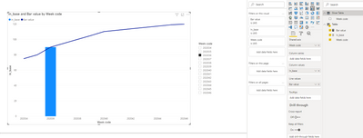
And I would like to built the graph as below. So when I use the slicer on week code, the line should stay as is, but the bar should change:
Can anyone help me out on this?
Thanks very much!
Solved! Go to Solution.
- Mark as New
- Bookmark
- Subscribe
- Mute
- Subscribe to RSS Feed
- Permalink
- Report Inappropriate Content
Hi, @Anonymous
As mentioned by @amitchandak ,you need to create a dimension table of week code and establish a relationship with the fact table
Slicer Table = DISTINCT(SELECTCOLUMNS('Table',"Week code",'Table'[Week code]))Create the following measure and aplply it to the "line value" of chart.
Bar value = CALCULATE(SUM('Table'[In_base]),ALLEXCEPT('Table','Table'[Week code]))The result will show as below:
Best Regards,
Community Support Team _ Eason
- Mark as New
- Bookmark
- Subscribe
- Mute
- Subscribe to RSS Feed
- Permalink
- Report Inappropriate Content
Please consider this solution and leave feedback …
Try using 2 calendar tables.
One for the sliders and one for the graph x axis.
Then create 2 measures
Block graph qty =
SUM(Sales[Qty])
Line graph qty =
CALCULATE(SUM(Sales[Qty]),
ALL(SlicerCalendar)
)
- Mark as New
- Bookmark
- Subscribe
- Mute
- Subscribe to RSS Feed
- Permalink
- Report Inappropriate Content
@Anonymous , the best way to do is to have an independent table with Week and use that in the slicer. Create a measure (for the bar) that uses this filter
measure = calculate(sum(Table[in_base]), filter(Table, Table[Week code] in allselected(week[week])))
Microsoft Power BI Learning Resources, 2023 !!
Learn Power BI - Full Course with Dec-2022, with Window, Index, Offset, 100+ Topics !!
Did I answer your question? Mark my post as a solution! Appreciate your Kudos !! Proud to be a Super User! !!
Helpful resources

Microsoft Fabric Learn Together
Covering the world! 9:00-10:30 AM Sydney, 4:00-5:30 PM CET (Paris/Berlin), 7:00-8:30 PM Mexico City

Power BI Monthly Update - April 2024
Check out the April 2024 Power BI update to learn about new features.

| User | Count |
|---|---|
| 106 | |
| 94 | |
| 77 | |
| 65 | |
| 53 |
| User | Count |
|---|---|
| 145 | |
| 105 | |
| 104 | |
| 90 | |
| 63 |


