- Power BI forums
- Updates
- News & Announcements
- Get Help with Power BI
- Desktop
- Service
- Report Server
- Power Query
- Mobile Apps
- Developer
- DAX Commands and Tips
- Custom Visuals Development Discussion
- Health and Life Sciences
- Power BI Spanish forums
- Translated Spanish Desktop
- Power Platform Integration - Better Together!
- Power Platform Integrations (Read-only)
- Power Platform and Dynamics 365 Integrations (Read-only)
- Training and Consulting
- Instructor Led Training
- Dashboard in a Day for Women, by Women
- Galleries
- Community Connections & How-To Videos
- COVID-19 Data Stories Gallery
- Themes Gallery
- Data Stories Gallery
- R Script Showcase
- Webinars and Video Gallery
- Quick Measures Gallery
- 2021 MSBizAppsSummit Gallery
- 2020 MSBizAppsSummit Gallery
- 2019 MSBizAppsSummit Gallery
- Events
- Ideas
- Custom Visuals Ideas
- Issues
- Issues
- Events
- Upcoming Events
- Community Blog
- Power BI Community Blog
- Custom Visuals Community Blog
- Community Support
- Community Accounts & Registration
- Using the Community
- Community Feedback
Register now to learn Fabric in free live sessions led by the best Microsoft experts. From Apr 16 to May 9, in English and Spanish.
- Power BI forums
- Forums
- Get Help with Power BI
- Desktop
- Re: Mirror reflection of a clustered bar chart
- Subscribe to RSS Feed
- Mark Topic as New
- Mark Topic as Read
- Float this Topic for Current User
- Bookmark
- Subscribe
- Printer Friendly Page
- Mark as New
- Bookmark
- Subscribe
- Mute
- Subscribe to RSS Feed
- Permalink
- Report Inappropriate Content
Mirror reflection of a clustered bar chart
Hello,
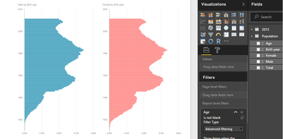
I've created two clustered bar charts, for male and female age structure.
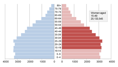
But I would like something more like this:
Is it possible to make a "mirror reflection" of the blue chart?
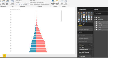
Or maby it is possible to place both male and female in one chart.
- Mark as New
- Bookmark
- Subscribe
- Mute
- Subscribe to RSS Feed
- Permalink
- Report Inappropriate Content
Hello,
I would to use two gauge diagram (with other data) look like a circle. The first gauge diagram is top of the second gauge diagram. Is it possible to make a "mirror reflection" of the second gauge diagram?
Thnx
- Mark as New
- Bookmark
- Subscribe
- Mute
- Subscribe to RSS Feed
- Permalink
- Report Inappropriate Content
Can Anyone please help, Tornado charts is used when both side having same digits numbers, time suppose if I want to Display hourly Temperature v/s NetSale for a day suppose 20180110, here Tornado chart will not work. Please suggest me a chart which display Temperature, Netsale as per Hourly basis.
- Mark as New
- Bookmark
- Subscribe
- Mute
- Subscribe to RSS Feed
- Permalink
- Report Inappropriate Content
- Mark as New
- Bookmark
- Subscribe
- Mute
- Subscribe to RSS Feed
- Permalink
- Report Inappropriate Content
That looks quite interesting.
I'll try.
Thank you 🙂
- Mark as New
- Bookmark
- Subscribe
- Mute
- Subscribe to RSS Feed
- Permalink
- Report Inappropriate Content
The problem is... it doesn't fit the screen 😞
I can see only a part of the data. I have to scroll down to see the rest.
- Mark as New
- Bookmark
- Subscribe
- Mute
- Subscribe to RSS Feed
- Permalink
- Report Inappropriate Content
Yes granted its not as customizable as I would like.
However what you could do is create a Column (for buckets) like this...
Period Slicer COLUMN =
SWITCH (
    TRUE (),
    'Calendar'[Year] >= 2007 && 'Calendar'[Year] <= 2010, "2007 - 2010",
    'Calendar'[Year] >= 2011 && 'Calendar'[Year] <= 2013, "2011 - 2013",
    'Calendar'[Year] >= 2014, "2014 - Now"
)
You'll sacrifice some detail but you'll fit all on one page - depending on how many years you'll have to include per bar!
And use this column (which with the above example will be 3 Years of Data per Bar)
You may have to do 5 or 10 depending on what screen/page size you are working on...
Hope this helps! ![]()
- Mark as New
- Bookmark
- Subscribe
- Mute
- Subscribe to RSS Feed
- Permalink
- Report Inappropriate Content
I need separate bars for each year.
From 1911 😛
- Mark as New
- Bookmark
- Subscribe
- Mute
- Subscribe to RSS Feed
- Permalink
- Report Inappropriate Content
Yes I use it quite a bit actually! And since its a Microsoft Visual I really hope they just incorporate it in PBI as standard visual.
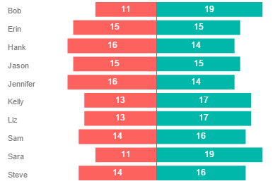
Here's a sample...
Good Luck! ![]()
Helpful resources

Microsoft Fabric Learn Together
Covering the world! 9:00-10:30 AM Sydney, 4:00-5:30 PM CET (Paris/Berlin), 7:00-8:30 PM Mexico City

Power BI Monthly Update - April 2024
Check out the April 2024 Power BI update to learn about new features.

| User | Count |
|---|---|
| 109 | |
| 98 | |
| 77 | |
| 66 | |
| 54 |
| User | Count |
|---|---|
| 144 | |
| 104 | |
| 101 | |
| 86 | |
| 64 |


