- Power BI forums
- Updates
- News & Announcements
- Get Help with Power BI
- Desktop
- Service
- Report Server
- Power Query
- Mobile Apps
- Developer
- DAX Commands and Tips
- Custom Visuals Development Discussion
- Health and Life Sciences
- Power BI Spanish forums
- Translated Spanish Desktop
- Power Platform Integration - Better Together!
- Power Platform Integrations (Read-only)
- Power Platform and Dynamics 365 Integrations (Read-only)
- Training and Consulting
- Instructor Led Training
- Dashboard in a Day for Women, by Women
- Galleries
- Community Connections & How-To Videos
- COVID-19 Data Stories Gallery
- Themes Gallery
- Data Stories Gallery
- R Script Showcase
- Webinars and Video Gallery
- Quick Measures Gallery
- 2021 MSBizAppsSummit Gallery
- 2020 MSBizAppsSummit Gallery
- 2019 MSBizAppsSummit Gallery
- Events
- Ideas
- Custom Visuals Ideas
- Issues
- Issues
- Events
- Upcoming Events
- Community Blog
- Power BI Community Blog
- Custom Visuals Community Blog
- Community Support
- Community Accounts & Registration
- Using the Community
- Community Feedback
Register now to learn Fabric in free live sessions led by the best Microsoft experts. From Apr 16 to May 9, in English and Spanish.
- Power BI forums
- Forums
- Get Help with Power BI
- Desktop
- Re: Migration of reports to Power BI
- Subscribe to RSS Feed
- Mark Topic as New
- Mark Topic as Read
- Float this Topic for Current User
- Bookmark
- Subscribe
- Printer Friendly Page
- Mark as New
- Bookmark
- Subscribe
- Mute
- Subscribe to RSS Feed
- Permalink
- Report Inappropriate Content
Migration of reports to Power BI
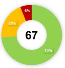
- donut chart, where in the middle is calculated some valuethe value is calculated as difference between the green and red %(these are some defined categories/bins). I have done it, so that I have calculated the value separately, and display it in a card, which I have put to the middle of the inner circle. It looks the same, but when I click on the donut chart, the card is moved backward.
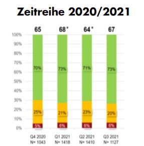
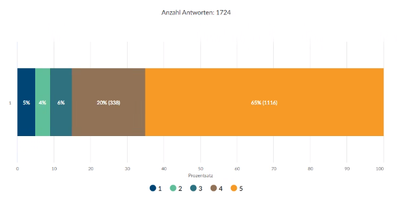
- 100% stacked chart
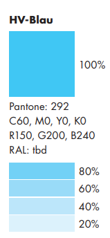
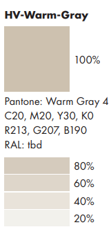
20% will be used for category 1,... 100% for category 5,
- Mark as New
- Bookmark
- Subscribe
- Mute
- Subscribe to RSS Feed
- Permalink
- Report Inappropriate Content
Hi @tomas12344 ,
Picking up on this you just need to make some adjustments to your visuals:
Donut Chart
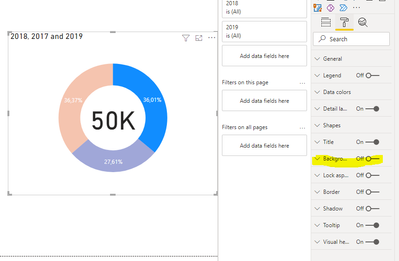
If you place the donut chart in front of the card and set the background to off on the donut chart it will work has expected:
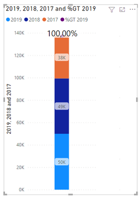
2. For the 100% stacked chart you can use a combo chart of Line and column then create a measure to calculate the percentage for columns and use the other measure for the lines, then changing the options on the data labels you can show the result has you need.
On the values of the bottom not really sure if I understand what you need but you can add a matrix visualization with that count:
This is inverted but is just a proof of concept
The last part you should use a condittional formatting, you can define the transparecy using a syntax similar to this one:
"#FFFFFF00"
Where the first 6 digits are for the colour and the last two for the level of transparency. Depending on the way you have everything setup you can do a condittional formatting using a table, but again depends on your setup.
Regards
Miguel Félix
Did I answer your question? Mark my post as a solution!
Proud to be a Super User!
Check out my blog: Power BI em Português- Mark as New
- Bookmark
- Subscribe
- Mute
- Subscribe to RSS Feed
- Permalink
- Report Inappropriate Content
HI Miguel
Thanks for the answer. The first part was help. But for the conditional formating, i think this will not work. the conditional formating is working, only when the categories are set to axis (i found many other stream with this problem). When i'm using the legend, the conditional formatig disaper. The second thimg is, that i want to have all the values in one chart column, not 5 columns, when using the categories on axis. Is there any other solution.
Thanks
Tomas
- Mark as New
- Bookmark
- Subscribe
- Mute
- Subscribe to RSS Feed
- Permalink
- Report Inappropriate Content
Hi @tomas12344,
I had the feeling that you would get some issues on condittional formatting that is why I added it without examples has I did for the other visualizations. One workaround can be to create a measure for each of your five categories and then use them on the charts and make the selection of the colour per each measure.
Then using a HEX calculator you can check what are the colours corresponding to those 20% decreasein each one.
I have also did a post with a calculation using a disconnected table (it's in portuguese but google translator works preety well)
https://pbiportugal.com/2021/02/04/graficos-com-varias-colunas-como-legendas/
I don't understand is the part that you say:
@tomas12344 wrote:
The second thimg is, that i want to have all the values in one chart column, not 5 columns, when using the categories on axis. Is there any other solution.
Thanks
Tomas
Can you please share a mockup data or sample of your PBIX file. You can use a onedrive, google drive, we transfer or similar link to upload your files.
If the information is sensitive please share it trough private message.
Regards
Miguel Félix
Did I answer your question? Mark my post as a solution!
Proud to be a Super User!
Check out my blog: Power BI em Português- Mark as New
- Bookmark
- Subscribe
- Mute
- Subscribe to RSS Feed
- Permalink
- Report Inappropriate Content
Hi Miguel
The data for the last chart are simple, there is a date column and answer(satisfaction of customer of the service)
Interview End Date qCSatlabelbar_1
2020-11-01 5
2020-11-01 3
2020-11-01 3
2020-11-02 4
2020-11-02 4
2020-11-02 2
2020-11-02 4
2020-11-03 4
the chart should looks like this
i have used 100% stacked chart, with valuse and legend. the date is not relevat(should cover all historical answers)
Yes, the color can be set by each category, it is litle bit not practical, and the colorpicker is not so usefull.
- Mark as New
- Bookmark
- Subscribe
- Mute
- Subscribe to RSS Feed
- Permalink
- Report Inappropriate Content
Hi @tomas12344 ,
This chart type cannot have condittional formatting based on the legend or more than one measure. Believe that to have this visualization with a custom colour you need to use the colour picker.
Regards
Miguel Félix
Did I answer your question? Mark my post as a solution!
Proud to be a Super User!
Check out my blog: Power BI em Português- Mark as New
- Bookmark
- Subscribe
- Mute
- Subscribe to RSS Feed
- Permalink
- Report Inappropriate Content
HI @tomas12344,
AFAIk, the conditional formatting feature does not work when you enable the legend fields. They will ignore the formatting settings and use the current theme datacolor sets to setting data label colors.
Regards,
Xiaoxin Sheng
If this post helps, please consider accept as solution to help other members find it more quickly.
Helpful resources

Microsoft Fabric Learn Together
Covering the world! 9:00-10:30 AM Sydney, 4:00-5:30 PM CET (Paris/Berlin), 7:00-8:30 PM Mexico City

Power BI Monthly Update - April 2024
Check out the April 2024 Power BI update to learn about new features.

| User | Count |
|---|---|
| 117 | |
| 107 | |
| 70 | |
| 70 | |
| 43 |
| User | Count |
|---|---|
| 148 | |
| 106 | |
| 104 | |
| 89 | |
| 65 |
