- Power BI forums
- Updates
- News & Announcements
- Get Help with Power BI
- Desktop
- Service
- Report Server
- Power Query
- Mobile Apps
- Developer
- DAX Commands and Tips
- Custom Visuals Development Discussion
- Health and Life Sciences
- Power BI Spanish forums
- Translated Spanish Desktop
- Power Platform Integration - Better Together!
- Power Platform Integrations (Read-only)
- Power Platform and Dynamics 365 Integrations (Read-only)
- Training and Consulting
- Instructor Led Training
- Dashboard in a Day for Women, by Women
- Galleries
- Community Connections & How-To Videos
- COVID-19 Data Stories Gallery
- Themes Gallery
- Data Stories Gallery
- R Script Showcase
- Webinars and Video Gallery
- Quick Measures Gallery
- 2021 MSBizAppsSummit Gallery
- 2020 MSBizAppsSummit Gallery
- 2019 MSBizAppsSummit Gallery
- Events
- Ideas
- Custom Visuals Ideas
- Issues
- Issues
- Events
- Upcoming Events
- Community Blog
- Power BI Community Blog
- Custom Visuals Community Blog
- Community Support
- Community Accounts & Registration
- Using the Community
- Community Feedback
Register now to learn Fabric in free live sessions led by the best Microsoft experts. From Apr 16 to May 9, in English and Spanish.
- Power BI forums
- Forums
- Get Help with Power BI
- Desktop
- Merging files with different format and creating a...
- Subscribe to RSS Feed
- Mark Topic as New
- Mark Topic as Read
- Float this Topic for Current User
- Bookmark
- Subscribe
- Printer Friendly Page
- Mark as New
- Bookmark
- Subscribe
- Mute
- Subscribe to RSS Feed
- Permalink
- Report Inappropriate Content
Merging files with different format and creating a chart
Hi, Power BI Community!
I am looking for a solution to below problem and would highly appreciate
the solution to this.
I have excel files of prices of a company's product at every store
that they sell at. I have an excel file for each month.
What I would like to do is for Power BI to show
the evolution of prices of each product that the company sells
at every store they sell at.
For instance, if I select a brand A at a store 1, I would like to have a chart
that shows the price of a product every month.
Please find the sample data below.
Here is how to read the files.
Row 1 shows the names of brand (A,B,C,D...)
Row 2 shows the names of product under each brand (ビオDrink脂肪0プレーン加糖, etc.)
Column E (店舗コード) is a store number
Column F (店舗名)is a store name
Column L to the rest of the column is the price that we sell each product at.
Essentially, I want to have a chart where X axis is month and Y asix is price.
I want to have a filter visual above the chart so I can filter by brand and by product.
The problem that I have is that
1) a number of product that the company sells varies depending on the month so the file format is not always the same.
Also, what I would like to do is that
1) Distinctively count the number of stores we sell at (Column F: 店舗名), so that I know how many stores the company sells the product at every month.
Much appreciate your support on this.
Many thanks,
H
Solved! Go to Solution.
- Mark as New
- Bookmark
- Subscribe
- Mute
- Subscribe to RSS Feed
- Permalink
- Report Inappropriate Content
Hi @hidenseek9,
The current table structure is not proper to create a chart visual in Power BI. So, please refer to below steps to convert table structure.
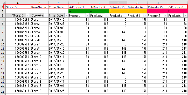
Insert one row on the top of the excel sheet. Specify column headers as shown in below screenshot. Make this modification to excel file.
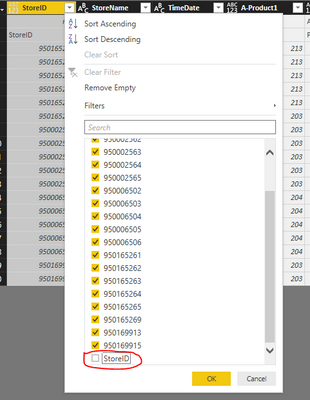
Then, load all data files into Power BI desktop one by one. Take the "2016 Jan" as an example, locate to Query Editor mode, set the first row as column headers (Transform-> Use first row as headers). Then, filter out some records where the value under [StoreID] in null or "StoreID".
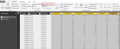
Unpivot columns like below:
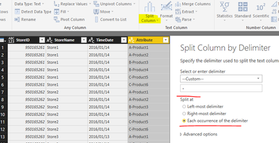
Split column, then rename the new columns with meaningful aliases.
Apply all above changes to "2017 May", then, append these two tables. (Home->Append queries->Append queries as new).
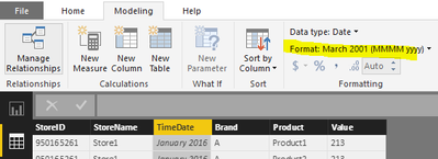
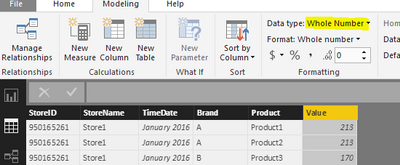
Save and apply all changes, return back to report view mode. Please check to make sure the [DateTime] is set to date type and [Value] is set to numeric.
Now, you can insert a line chart into report page, add corresponding fields from the appended table into chart and slicer.
I have uploaded the .pbix file for your reference.
By the way, please mask sensitive data before uploading.
Best regards,
Yuliana Gu
If this post helps, then please consider Accept it as the solution to help the other members find it more quickly.
- Mark as New
- Bookmark
- Subscribe
- Mute
- Subscribe to RSS Feed
- Permalink
- Report Inappropriate Content
Thank you so much for a thorough explanation step by step.
I will try your way to see if it works!
Many thanks,
H
Helpful resources

Microsoft Fabric Learn Together
Covering the world! 9:00-10:30 AM Sydney, 4:00-5:30 PM CET (Paris/Berlin), 7:00-8:30 PM Mexico City

Power BI Monthly Update - April 2024
Check out the April 2024 Power BI update to learn about new features.

| User | Count |
|---|---|
| 109 | |
| 96 | |
| 77 | |
| 66 | |
| 53 |
| User | Count |
|---|---|
| 144 | |
| 105 | |
| 102 | |
| 89 | |
| 63 |
