- Power BI forums
- Updates
- News & Announcements
- Get Help with Power BI
- Desktop
- Service
- Report Server
- Power Query
- Mobile Apps
- Developer
- DAX Commands and Tips
- Custom Visuals Development Discussion
- Health and Life Sciences
- Power BI Spanish forums
- Translated Spanish Desktop
- Power Platform Integration - Better Together!
- Power Platform Integrations (Read-only)
- Power Platform and Dynamics 365 Integrations (Read-only)
- Training and Consulting
- Instructor Led Training
- Dashboard in a Day for Women, by Women
- Galleries
- Community Connections & How-To Videos
- COVID-19 Data Stories Gallery
- Themes Gallery
- Data Stories Gallery
- R Script Showcase
- Webinars and Video Gallery
- Quick Measures Gallery
- 2021 MSBizAppsSummit Gallery
- 2020 MSBizAppsSummit Gallery
- 2019 MSBizAppsSummit Gallery
- Events
- Ideas
- Custom Visuals Ideas
- Issues
- Issues
- Events
- Upcoming Events
- Community Blog
- Power BI Community Blog
- Custom Visuals Community Blog
- Community Support
- Community Accounts & Registration
- Using the Community
- Community Feedback
Register now to learn Fabric in free live sessions led by the best Microsoft experts. From Apr 16 to May 9, in English and Spanish.
- Power BI forums
- Forums
- Get Help with Power BI
- Desktop
- Merge/Overlay two line charts
- Subscribe to RSS Feed
- Mark Topic as New
- Mark Topic as Read
- Float this Topic for Current User
- Bookmark
- Subscribe
- Printer Friendly Page
- Mark as New
- Bookmark
- Subscribe
- Mute
- Subscribe to RSS Feed
- Permalink
- Report Inappropriate Content
Merge/Overlay two line charts
Hello,

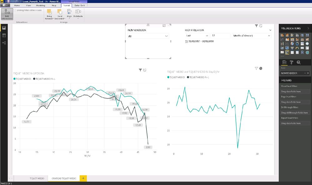
We want to show into a single line chart a combined data from two line charts with different filters/interactions in each of them.
This line charts represent the average per ticket/receipt per day.
The bottom left is a line chart per seller.
The bottom right us a line chart with the store average per day.
The selected field is used to filter the sellers and filter the data from the chart on the bottom left.
This slicer is blocked in the line chart from the bottom right.
The data source and table is the same for both.
Can we do something to display this combined data in one line chart?
Thanks.
Solved! Go to Solution.
- Mark as New
- Bookmark
- Subscribe
- Mute
- Subscribe to RSS Feed
- Permalink
- Report Inappropriate Content
Hi @IMPBI,
I don't have any information regarding you setup so I made a table with 3 columns:
- Date
- Values
- Vendor
Also created a date table to create the PY calculation.
Based on this setup I have made 3 measures:
Average Current Year = AVERAGE(Fact_table[Value])

Average Pryor Year = CALCULATE(AVERAGE(Fact_table[Value]); DATEADD('Calendar'[Date]; -1 ;YEAR))

Average no Sellers = CALCULATE([Average Current Year];ALL(Fact_table[Vendor]))
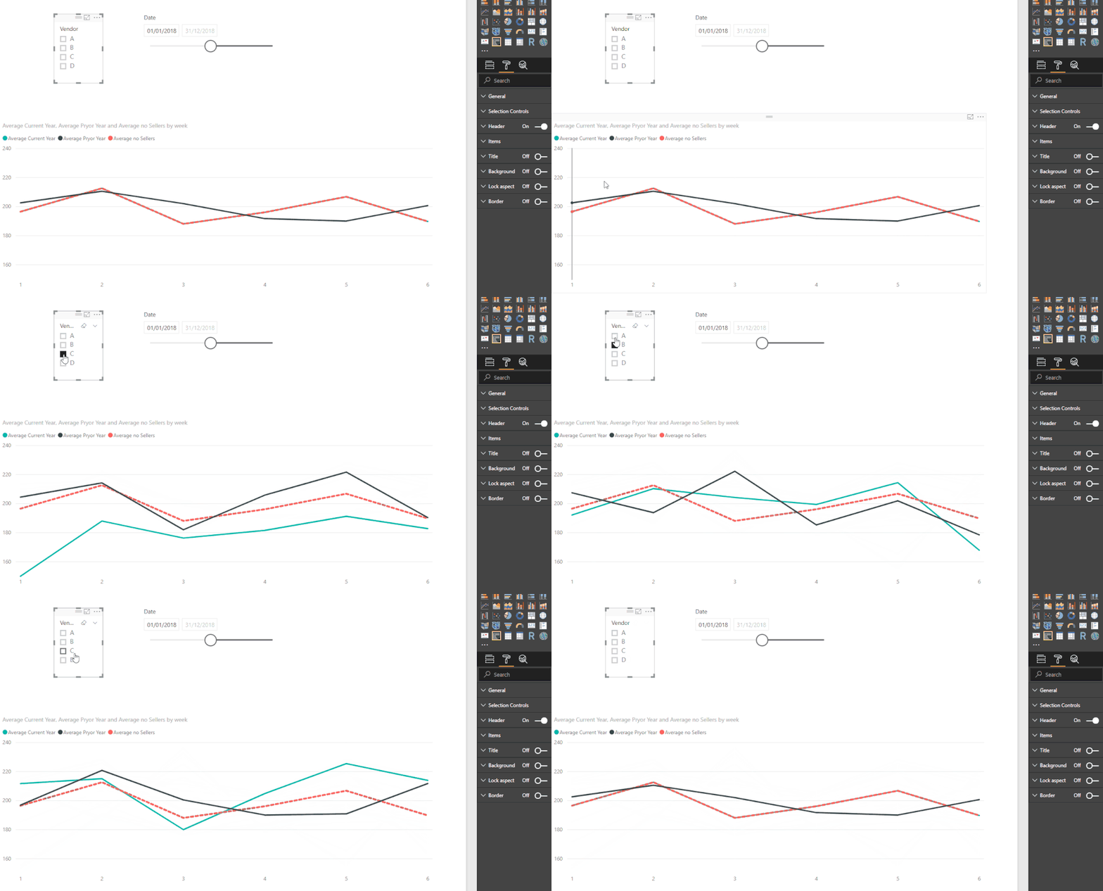
Be aware that this 3 measures may not correspond to what you have in your model, again without any addtional information is difficult to help you better, The first and third measure if no seller is select gives the exact same result so in the image below you will see the value overlaped.
Then just add this measures to your charts, look at the red line it doesn't move although I'm changing the slicer for vendor.
To have the result you need to the calculations you are asking you just need to use the ALL as a filter in your measure.
Regards,
MFelix
Regards
Miguel Félix
Did I answer your question? Mark my post as a solution!
Proud to be a Super User!
Check out my blog: Power BI em Português- Mark as New
- Bookmark
- Subscribe
- Mute
- Subscribe to RSS Feed
- Permalink
- Report Inappropriate Content
- Mark as New
- Bookmark
- Subscribe
- Mute
- Subscribe to RSS Feed
- Permalink
- Report Inappropriate Content
Hi @IMPBI,
Without any data it's difficult to give an answer but based on your assumptions if you create different measure for each of the lines in your line chart it's possible to make it all into one I',m assuming that the X-axis are the same in both charts.
Can you post a sample of the data and a expected result (image is very low resolution) so that I can try and make the measures for you to add.
Regards,
MFelix
Regards
Miguel Félix
Did I answer your question? Mark my post as a solution!
Proud to be a Super User!
Check out my blog: Power BI em Português- Mark as New
- Bookmark
- Subscribe
- Mute
- Subscribe to RSS Feed
- Permalink
- Report Inappropriate Content
Hello @MFelix,
The image is really terrible (I'll upload a new version). I will try to explain in more detail our situation and our requirements.
The X axis should be same in both line charts (now we are making test with de week number too). We are working with the day number of a calendar table. And the measure is the same too. It is the average amount in euros per ticket/day.
In the bottom left there are this measure compared vs same measure of the same period of last year. All this information could be filtered per seller (slicer in top/left).
The second one has the same info but with a different tratment: we do not want it to be affected by the seller filter (this way it will show the store's average and serve as a basis for comparison). With a separated licne chart we can do dat. We are blocking this filtering editing the interactions between elements.
Our goal is merge this charts into a new one with three lines (or knowing how to do that if it is possible). One for the current average amounts, year -1 and current average without seller filter applyied.
I hope I've explained our needs better.
Thank you very much.
- Mark as New
- Bookmark
- Subscribe
- Mute
- Subscribe to RSS Feed
- Permalink
- Report Inappropriate Content
Hello, everybody,
Let me return to this subject from another point of view and see if it is more accurate: we need three measures, one of which is not affected by the VENDORS/SELLERS slicer filter at the top.
Could the ALLEXECEPT function works in the new measure?
Would it be better to create a new table without that field? If so, better in the modeling phase or in Power Query?
Many thanks. We are stuck at this point...
- Mark as New
- Bookmark
- Subscribe
- Mute
- Subscribe to RSS Feed
- Permalink
- Report Inappropriate Content
Hi @IMPBI,
I don't have any information regarding you setup so I made a table with 3 columns:
- Date
- Values
- Vendor
Also created a date table to create the PY calculation.
Based on this setup I have made 3 measures:
Average Current Year = AVERAGE(Fact_table[Value])

Average Pryor Year = CALCULATE(AVERAGE(Fact_table[Value]); DATEADD('Calendar'[Date]; -1 ;YEAR))

Average no Sellers = CALCULATE([Average Current Year];ALL(Fact_table[Vendor]))
Be aware that this 3 measures may not correspond to what you have in your model, again without any addtional information is difficult to help you better, The first and third measure if no seller is select gives the exact same result so in the image below you will see the value overlaped.
Then just add this measures to your charts, look at the red line it doesn't move although I'm changing the slicer for vendor.
To have the result you need to the calculations you are asking you just need to use the ALL as a filter in your measure.
Regards,
MFelix
Regards
Miguel Félix
Did I answer your question? Mark my post as a solution!
Proud to be a Super User!
Check out my blog: Power BI em Português- Mark as New
- Bookmark
- Subscribe
- Mute
- Subscribe to RSS Feed
- Permalink
- Report Inappropriate Content
what did you use as Axis in this solution?
- Mark as New
- Bookmark
- Subscribe
- Mute
- Subscribe to RSS Feed
- Permalink
- Report Inappropriate Content
Hi @aznariy,
The axis is the month on the calendar table.
Regards,
MFelix
Regards
Miguel Félix
Did I answer your question? Mark my post as a solution!
Proud to be a Super User!
Check out my blog: Power BI em Português- Mark as New
- Bookmark
- Subscribe
- Mute
- Subscribe to RSS Feed
- Permalink
- Report Inappropriate Content
then you may be able to help me with the problem that I'm facing
appreciate your help!
- Mark as New
- Bookmark
- Subscribe
- Mute
- Subscribe to RSS Feed
- Permalink
- Report Inappropriate Content
Hi @aznariy,
Just posted the answer on the post,
See attach the PBIX file I created.
Regards,
MFelix
Regards
Miguel Félix
Did I answer your question? Mark my post as a solution!
Proud to be a Super User!
Check out my blog: Power BI em Português- Mark as New
- Bookmark
- Subscribe
- Mute
- Subscribe to RSS Feed
- Permalink
- Report Inappropriate Content
Hello @MFelix,
Your solution has been of great help to us and has allowed us to understand better the concept of context filters.
In our model we have the an internal code for each seller and a related table with the attributes of these vendors. We have use the field NAMESELLER (same field used in the slicer) in the ALL function and now it's working (previously we had use SELLERID of the fact table and the results weren't as expected).
We are very grateful for your help.
Many thanks.
- Mark as New
- Bookmark
- Subscribe
- Mute
- Subscribe to RSS Feed
- Permalink
- Report Inappropriate Content
Regards, MFelix
Regards
Miguel Félix
Did I answer your question? Mark my post as a solution!
Proud to be a Super User!
Check out my blog: Power BI em PortuguêsHelpful resources

Microsoft Fabric Learn Together
Covering the world! 9:00-10:30 AM Sydney, 4:00-5:30 PM CET (Paris/Berlin), 7:00-8:30 PM Mexico City

Power BI Monthly Update - April 2024
Check out the April 2024 Power BI update to learn about new features.

| User | Count |
|---|---|
| 112 | |
| 99 | |
| 73 | |
| 72 | |
| 49 |
| User | Count |
|---|---|
| 145 | |
| 109 | |
| 109 | |
| 90 | |
| 64 |

