- Power BI forums
- Updates
- News & Announcements
- Get Help with Power BI
- Desktop
- Service
- Report Server
- Power Query
- Mobile Apps
- Developer
- DAX Commands and Tips
- Custom Visuals Development Discussion
- Health and Life Sciences
- Power BI Spanish forums
- Translated Spanish Desktop
- Power Platform Integration - Better Together!
- Power Platform Integrations (Read-only)
- Power Platform and Dynamics 365 Integrations (Read-only)
- Training and Consulting
- Instructor Led Training
- Dashboard in a Day for Women, by Women
- Galleries
- Community Connections & How-To Videos
- COVID-19 Data Stories Gallery
- Themes Gallery
- Data Stories Gallery
- R Script Showcase
- Webinars and Video Gallery
- Quick Measures Gallery
- 2021 MSBizAppsSummit Gallery
- 2020 MSBizAppsSummit Gallery
- 2019 MSBizAppsSummit Gallery
- Events
- Ideas
- Custom Visuals Ideas
- Issues
- Issues
- Events
- Upcoming Events
- Community Blog
- Power BI Community Blog
- Custom Visuals Community Blog
- Community Support
- Community Accounts & Registration
- Using the Community
- Community Feedback
Register now to learn Fabric in free live sessions led by the best Microsoft experts. From Apr 16 to May 9, in English and Spanish.
- Power BI forums
- Forums
- Get Help with Power BI
- Desktop
- Measures not returning the same values on chart as...
- Subscribe to RSS Feed
- Mark Topic as New
- Mark Topic as Read
- Float this Topic for Current User
- Bookmark
- Subscribe
- Printer Friendly Page
- Mark as New
- Bookmark
- Subscribe
- Mute
- Subscribe to RSS Feed
- Permalink
- Report Inappropriate Content
Measures not returning the same values on chart as card.
Hi all,
I am trying to get the averages for date differences of when certain emails are sent. The difference being from completion date/time to the trigger run date/time. I have built in flags for the particular trigger run date/times in question. They are flagged either 1 or 0 for OSR and OIF respectively.
The measure to get OSR times is as follows:
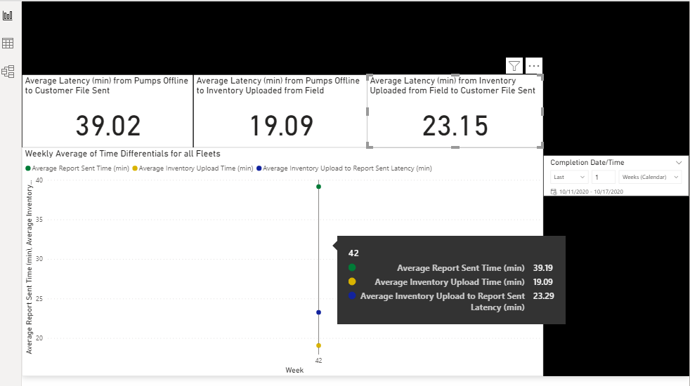
The card returns 39.02, the line chart returns 39.19, and excel (after exporting the data) returns 38.99 for Average Report Sent Time.
Oddly though, the chart and the card does return the same value for Average Inventory Upload Time (19.09). The measures for those are as follows:
Solved! Go to Solution.
- Mark as New
- Bookmark
- Subscribe
- Mute
- Subscribe to RSS Feed
- Permalink
- Report Inappropriate Content
Hi @Farank ,
Based on your description, I tried to re-build the data sample but seems like could not reproduce it, the measure in the card shows the same value in the chart visual. You can check my sample file in the below.
All of the measures are the same as your posted measure, perhaps I could miss something that you can share more details about it or modify directly in my sample so that I could help you better. In addition, you can also sharing your sample file if it is convenient.
Best Regards,
Yingjie Li
- Mark as New
- Bookmark
- Subscribe
- Mute
- Subscribe to RSS Feed
- Permalink
- Report Inappropriate Content
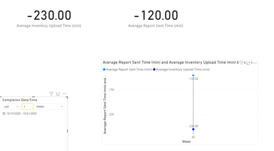
I'm attaching my sample, please see link below. I've tried Average vs Averagex and several different filters. Everything seems to return different values even if I set the week filter on the chart to just week 42.
- Mark as New
- Bookmark
- Subscribe
- Mute
- Subscribe to RSS Feed
- Permalink
- Report Inappropriate Content
Hi @Farank ,
It is caused by the filters.
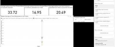
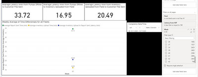
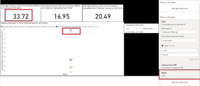
I found that you have set the week filter in the line chart in 'Filters on this visual'
It will only filter the values on the line chart visual, but actually the card visuals show the value based on week 42 and 41 in this case.
To solve this issue, you can just click the data point in the line chart to use the visual level filter to show the same result or put the week field in 'Filters on all pages'.
Please check the attached sample file in the below, hopes to help you.
In addition, you can refer this document about filter types:
https://docs.microsoft.com/en-us/power-bi/create-reports/power-bi-report-add-filter
Best Regards,
Yingjie Li
If this post helps then please consider Accept it as the solution to help the other members find it more quickly.
- Mark as New
- Bookmark
- Subscribe
- Mute
- Subscribe to RSS Feed
- Permalink
- Report Inappropriate Content
Hello again @v-yingjl .
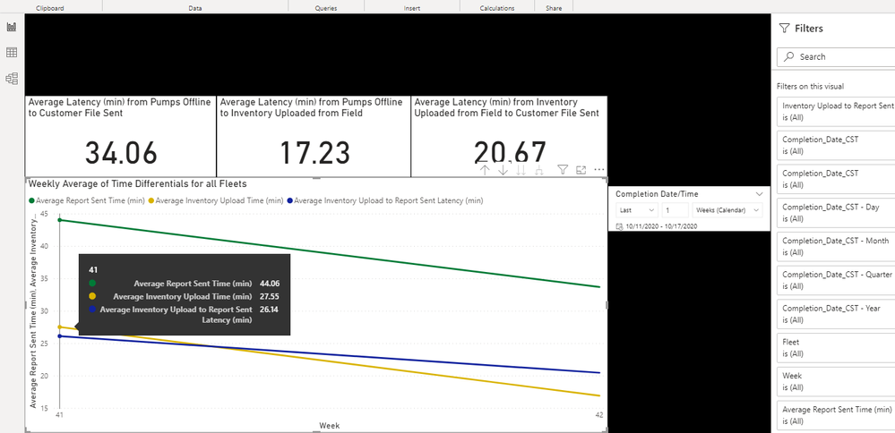
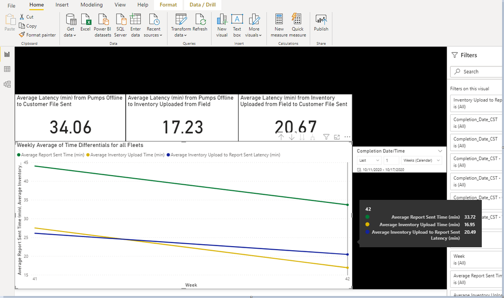
So, if I'm understanding this correctly, the cards are showing the values for two weeks and not just the last calender week as determined by the slicer? The line chart shows both values for those two weeks. Clicking on the week in question drills the cards down to that week? I assume the cards values for those two weeks are not the same as averaging the values from the two weeks on the chart.
So (44.06 + 33.72 ) / 2 = 38.89 and not 34.06 like the card says. I assume this is because it averages the two weeks as a whole on the card.
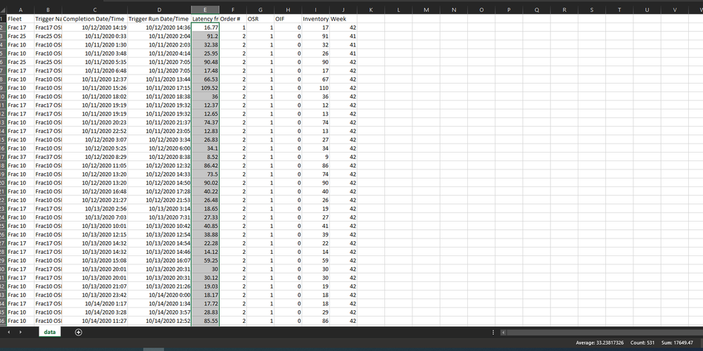
If I use the table on the second report page and export all the data for the last calender week where OSR = 1, the average in excel is 33.24. All things appear to be equal and the excel value doesn't match the card like I would expect.
I'm just trying to understand the difference. I would think the card would match the excel value.
I thank you again for any clarity you can provide.
- Mark as New
- Bookmark
- Subscribe
- Mute
- Subscribe to RSS Feed
- Permalink
- Report Inappropriate Content
Hi @Farank ,
First I'm sorry about that I forgot to attach the file in the below yesterday. Please check the file under this post and refer it with my previous post.
"So (44.06 + 33.72 ) / 2 = 38.89 and not 34.06 like the card says. "
The average could not just add the two weeks value and divide 2.
About the average in excel that shows different values, in your picture you have selected the ISIP column to calculate the average directly but in power bi, you have used averagex() function and quotes [Pump] measure, it will affect the accuracy of the decimal point.
Since the average measure filter [Pumps] measure > 0, when I put the [Pumps] measure in page2 and set its value > 0 in the table visual filter, after I export data from this table and cacluate the average in excel based on the [Pumps] field, it will get the same result as the average measure in power bi:
Hopes it could help you better to understand.
Best Regards,
Yingjie Li
If this post helps then please consider Accept it as the solution to help the other members find it more quickly.
- Mark as New
- Bookmark
- Subscribe
- Mute
- Subscribe to RSS Feed
- Permalink
- Report Inappropriate Content
@v-yingjl Haha. You are correct. Sometimes you just need another set of eyes. Thanks for your help.
Helpful resources

Microsoft Fabric Learn Together
Covering the world! 9:00-10:30 AM Sydney, 4:00-5:30 PM CET (Paris/Berlin), 7:00-8:30 PM Mexico City

Power BI Monthly Update - April 2024
Check out the April 2024 Power BI update to learn about new features.

| User | Count |
|---|---|
| 109 | |
| 99 | |
| 77 | |
| 66 | |
| 54 |
| User | Count |
|---|---|
| 144 | |
| 104 | |
| 102 | |
| 87 | |
| 64 |
