- Power BI forums
- Updates
- News & Announcements
- Get Help with Power BI
- Desktop
- Service
- Report Server
- Power Query
- Mobile Apps
- Developer
- DAX Commands and Tips
- Custom Visuals Development Discussion
- Health and Life Sciences
- Power BI Spanish forums
- Translated Spanish Desktop
- Power Platform Integration - Better Together!
- Power Platform Integrations (Read-only)
- Power Platform and Dynamics 365 Integrations (Read-only)
- Training and Consulting
- Instructor Led Training
- Dashboard in a Day for Women, by Women
- Galleries
- Community Connections & How-To Videos
- COVID-19 Data Stories Gallery
- Themes Gallery
- Data Stories Gallery
- R Script Showcase
- Webinars and Video Gallery
- Quick Measures Gallery
- 2021 MSBizAppsSummit Gallery
- 2020 MSBizAppsSummit Gallery
- 2019 MSBizAppsSummit Gallery
- Events
- Ideas
- Custom Visuals Ideas
- Issues
- Issues
- Events
- Upcoming Events
- Community Blog
- Power BI Community Blog
- Custom Visuals Community Blog
- Community Support
- Community Accounts & Registration
- Using the Community
- Community Feedback
Register now to learn Fabric in free live sessions led by the best Microsoft experts. From Apr 16 to May 9, in English and Spanish.
- Power BI forums
- Forums
- Get Help with Power BI
- Desktop
- Re: Measures in X-axis of bar chart
- Subscribe to RSS Feed
- Mark Topic as New
- Mark Topic as Read
- Float this Topic for Current User
- Bookmark
- Subscribe
- Printer Friendly Page
- Mark as New
- Bookmark
- Subscribe
- Mute
- Subscribe to RSS Feed
- Permalink
- Report Inappropriate Content
Measures in X-axis of bar chart
I have data with all measures like below, how can I create a simple bar chart with column1, column2, column3 is X-axis and the sum of the values in Y-axis
| column1 | coulm2 | column3 |
| 1 | 1 | 7 |
| 2 | 2 | 8 |
| 3 | 3 | 9 |
| 4 | 4 | 4 |
| 5 | 0 | 5 |
Another chart needed is stacked bar chart (X-axis of Sold and Remaining Capacity reflecting Total Capacity.
| Resource Pool Manager | Total Capacity current calendar month | Sold current calendar month | Remaining current calendar month | Total Capacity current calendar month +1 | Sold current calendar month + 1 | Remaining Capacity current calendar month + 1 |
| Product 1 | 100 | 42 | 58 | 110 | 35 | 75 |
| Product 2 | 100 | 42 | 58 | 110 | 35 | 75 |
| Product 3 | 100 | 42 | 58 | 110 | 35 | 75 |
| Product 4 | 200 | 142 | 58 | 210 | 135 | 75 |
| Product 5 | 200 | 142 | 58 | 210 | 135 | 75 |
| Product 6 | 200 | 142 | 58 | 210 | 135 | 75 |
| Product 7 | 300 | 242 | 58 | 310 | 235 | 75 |
| Product 8 | 300 | 242 | 58 | 310 | 235 | 75 |
| Product 9 | 300 | 242 | 58 | 310 | 235 | 75 |
| Product 10 | 400 | 342 | 58 | 410 | 335 | 75 |
| Product 11 | 400 | 342 | 58 | 410 | 335 | 75 |
| Product 12 | 400 | 342 | 58 | 410 | 335 | 75 |
| Product 13 | 400 | 342 | 58 | 410 | 335 | 75 |
| Product 14 | 500 | 442 | 58 | 510 | 435 | 75 |
| Product 15 | 500 | 442 | 58 | 510 | 435 | 75 |
| Product 16 | 500 | 442 | 58 | 510 | 435 | 75 |
| Product 17 | 500 | 442 | 58 | 510 | 435 | 75 |
| Product 18 | 600 | 542 | 58 | 610 | 535 | 75 |
| Product 19 | 600 | 542 | 58 | 610 | 535 | 75 |
- Mark as New
- Bookmark
- Subscribe
- Mute
- Subscribe to RSS Feed
- Permalink
- Report Inappropriate Content
- Mark as New
- Bookmark
- Subscribe
- Mute
- Subscribe to RSS Feed
- Permalink
- Report Inappropriate Content
Hi @Anonymous, please see the updated table. Hope this helps.
| May | June | July | |
| Product A Sold | 1 | 1 | 7 |
| Product B Sold | 2 | 2 | 8 |
| Product C Sold | 3 | 3 | 9 |
| Product D Sold | 4 | 4 | 4 |
| Product E Sold | 5 | 0 | 5 |
- Mark as New
- Bookmark
- Subscribe
- Mute
- Subscribe to RSS Feed
- Permalink
- Report Inappropriate Content
@SillyJam123 wrote:
Hi @Anonymous, please see the updated table. Hope this helps.
May June July Product A Sold 1 1 7 Product B Sold 2 2 8 Product C Sold 3 3 9 Product D Sold 4 4 4 Product E Sold 5 0 5
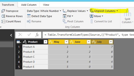
You may unpivot the data at first.
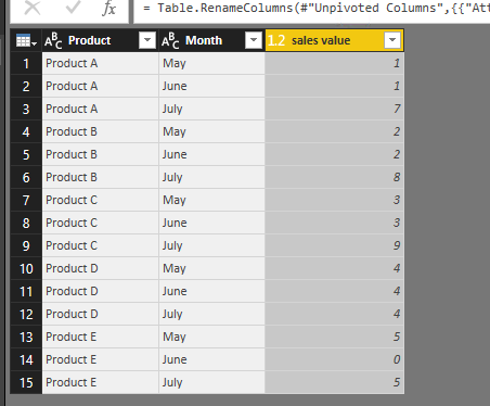
Then get a table as below
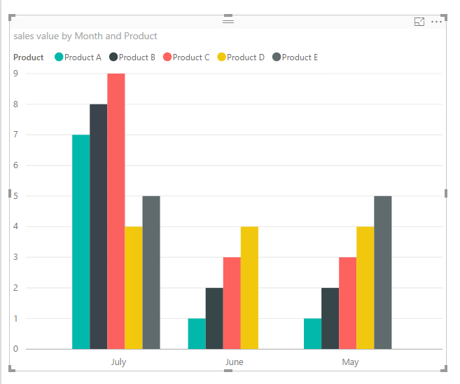
After that it would be easy to create a visual as below.
- Mark as New
- Bookmark
- Subscribe
- Mute
- Subscribe to RSS Feed
- Permalink
- Report Inappropriate Content
Thank you @Eric_Zhang.
I am able to achive the first chart is as you and @Anonymous shared using unpivot. I got [Sold current month] & [Sold current month +1] in X-axis.
I am updating original post as well.
- Mark as New
- Bookmark
- Subscribe
- Mute
- Subscribe to RSS Feed
- Permalink
- Report Inappropriate Content
@Anonymous @Eric_Zhang I am trying to transform data in below format for the "second chart", but not able to attain this in power bi
| Resource Pool Manager | Total Capacity current calendar month | Attribute Current Month | Value Current Month | Total Capacity current calendar month +1 | Attribute Current Month+1 | Value Current Month+1 |
| Product 1 | 100 | Sold current calendar month | 42 | 110 | Sold current calendar month + 1 | 35 |
| Product 1 | 0 | Remaining current calendar month | 58 | 0 | Remaining Capacity current calendar month + 1 | 75 |
| Product 2 | 100 | Sold current calendar month | 42 | 110 | Sold current calendar month + 1 | 35 |
| Product 2 | 0 | Remaining current calendar month | 58 | 0 | Remaining Capacity current calendar month + 1 | 75 |
- Mark as New
- Bookmark
- Subscribe
- Mute
- Subscribe to RSS Feed
- Permalink
- Report Inappropriate Content
- Mark as New
- Bookmark
- Subscribe
- Mute
- Subscribe to RSS Feed
- Permalink
- Report Inappropriate Content
@Anonymous Yes I could achieve it by breaking the table into two, one for sold data and other with remaining data. Then unpivot both separately, union the unpivot tables.
- Mark as New
- Bookmark
- Subscribe
- Mute
- Subscribe to RSS Feed
- Permalink
- Report Inappropriate Content
Awesome, I'm glad about that. Can you accept a solution then, so it can benefit others?
- Mark as New
- Bookmark
- Subscribe
- Mute
- Subscribe to RSS Feed
- Permalink
- Report Inappropriate Content
@SillyJam123 and I have corresponded by e-mail. though a good solution, this is not exactly the end goal. I'm not sure if I'm allowed to share a pitcure of the end goal. But basically it is to have one bar for sold current month and one for sold current month +1. Then also have a stacked bar chart, with one color for sold and different color for remaining. It isn't clear from the post itself, and you would probably need the data to realize this as well. I'm writing with @SillyJam123 by e-mail at the moment to figure out what the we have to do to accommodate the end goal.
- Mark as New
- Bookmark
- Subscribe
- Mute
- Subscribe to RSS Feed
- Permalink
- Report Inappropriate Content
hi @SillyJam123
Thank you for the reply. I might have a solution, but I need to know more.
Could you possibly share the report or data with me?
- Mark as New
- Bookmark
- Subscribe
- Mute
- Subscribe to RSS Feed
- Permalink
- Report Inappropriate Content
Thank you @Anonymous. I will not be able to share the actual data, but it basically Products solds every month. The expected report is a bar chart showing Months in X-axis and sum of values in Y-axis. Products are not required to be shown in the chart.
- Mark as New
- Bookmark
- Subscribe
- Mute
- Subscribe to RSS Feed
- Permalink
- Report Inappropriate Content
@SillyJam123 I understand. My solution depends on how the data is stored. Could you provide an example of it then?
If the data is stored like this, with these columns: [Date], [Product], [Value], you can just plot it into a bar chart, where you have date on the x-axis, value on y-axis and product in the legend.
If your data is stored differently, please let me know. The goal would then be to make sure it's stored this way. Or go in a different direction.
Best
Martin
- Mark as New
- Bookmark
- Subscribe
- Mute
- Subscribe to RSS Feed
- Permalink
- Report Inappropriate Content
That's correct. Data is stored the way I have mentioned. But when I use Column chart, I dont get separate bars. May I have your email address I can send you the chart I am getting v/s what is expected
- Mark as New
- Bookmark
- Subscribe
- Mute
- Subscribe to RSS Feed
- Permalink
- Report Inappropriate Content
Absolutly, my e-mail is: martin@valubi.dk. I think I know how to solve your challenge. I will be awaiting your e-mail.
Helpful resources

Microsoft Fabric Learn Together
Covering the world! 9:00-10:30 AM Sydney, 4:00-5:30 PM CET (Paris/Berlin), 7:00-8:30 PM Mexico City

Power BI Monthly Update - April 2024
Check out the April 2024 Power BI update to learn about new features.

| User | Count |
|---|---|
| 117 | |
| 107 | |
| 70 | |
| 70 | |
| 43 |
| User | Count |
|---|---|
| 148 | |
| 106 | |
| 104 | |
| 89 | |
| 65 |


