- Power BI forums
- Updates
- News & Announcements
- Get Help with Power BI
- Desktop
- Service
- Report Server
- Power Query
- Mobile Apps
- Developer
- DAX Commands and Tips
- Custom Visuals Development Discussion
- Health and Life Sciences
- Power BI Spanish forums
- Translated Spanish Desktop
- Power Platform Integration - Better Together!
- Power Platform Integrations (Read-only)
- Power Platform and Dynamics 365 Integrations (Read-only)
- Training and Consulting
- Instructor Led Training
- Dashboard in a Day for Women, by Women
- Galleries
- Community Connections & How-To Videos
- COVID-19 Data Stories Gallery
- Themes Gallery
- Data Stories Gallery
- R Script Showcase
- Webinars and Video Gallery
- Quick Measures Gallery
- 2021 MSBizAppsSummit Gallery
- 2020 MSBizAppsSummit Gallery
- 2019 MSBizAppsSummit Gallery
- Events
- Ideas
- Custom Visuals Ideas
- Issues
- Issues
- Events
- Upcoming Events
- Community Blog
- Power BI Community Blog
- Custom Visuals Community Blog
- Community Support
- Community Accounts & Registration
- Using the Community
- Community Feedback
Register now to learn Fabric in free live sessions led by the best Microsoft experts. From Apr 16 to May 9, in English and Spanish.
- Power BI forums
- Forums
- Get Help with Power BI
- Desktop
- Re: Measures from two sources will not display tog...
- Subscribe to RSS Feed
- Mark Topic as New
- Mark Topic as Read
- Float this Topic for Current User
- Bookmark
- Subscribe
- Printer Friendly Page
- Mark as New
- Bookmark
- Subscribe
- Mute
- Subscribe to RSS Feed
- Permalink
- Report Inappropriate Content
Measures from two sources will not display together.
I've got two sources of data. when combining the result of their measure, the excel data drops off the visualization.
Does anyone know why that is?
Example:
1st source is from Dynamics Business Central
Dynamics = sum(sales[total]) (100.00)
2nd source is from Excel
Excel = sum(sales[total]) (100.00)
Result = [Dynamics] + [Excel]
The result should be 200.00, but the visualization only shows the $100.00 from the Dynamics side.
- Mark as New
- Bookmark
- Subscribe
- Mute
- Subscribe to RSS Feed
- Permalink
- Report Inappropriate Content
Hello @Anonymous ,
Are these two tables related?
Cheers!
Vivek
https://www.vivran.in/
Connect on LinkedIn
- Mark as New
- Bookmark
- Subscribe
- Mute
- Subscribe to RSS Feed
- Permalink
- Report Inappropriate Content
They're connected to the dates table, and they have an indirect relationship through the value entries table.
Shared Table:
Dynamics 'OpensalesOrders'[orderdate]--> Dates[dates] < --Excel'PostingDate'[Date]
Indirect:
Dynamics: 'OpenSalesOrders'[Salespeople] <-- 'Salespeople'[Salespeople] --> 'Value Entries'[DocNO] <-- 'GL'[DocNO] --> 'Excel'[DocNO]
I noticed that one measure shows up like this in the formal bar [Total] and another one shows up like this 'Excel'[Total]
e.g. Combined total = [total] + 'Excel'[total]
All my other measures show: Combined total = [total] + [total] and they're all from the same data source (Dynamics) the only foreign table is the Excel file.
- Mark as New
- Bookmark
- Subscribe
- Mute
- Subscribe to RSS Feed
- Permalink
- Report Inappropriate Content
Hi, @Anonymous
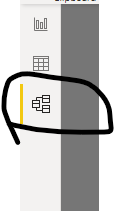
Not very clear. Can you click here to share your model view?
In fact , sample data/pbix file will make it easier for us to understand and solve your problem.
Best Regards,
Community Support Team _ Eason
- Mark as New
- Bookmark
- Subscribe
- Mute
- Subscribe to RSS Feed
- Permalink
- Report Inappropriate Content
Hi Guys!
Thanks for the help with this. I've created this sample PBIX file for you guys to tinker with.
https://drive.google.com/open?id=1c9m-x6BIdqXHZOsnwYdjWR51YKwG1P-a
- Mark as New
- Bookmark
- Subscribe
- Mute
- Subscribe to RSS Feed
- Permalink
- Report Inappropriate Content
@Anonymous how you are visualizing the data, if you are visualizing on date dimension then it should you correctly. Can you share sample data along with the relationship diagram and also how you are visualizing the data. There are many factors why it is not working or giving weird results.
Subscribe to the @PowerBIHowTo YT channel for an upcoming video on List and Record functions in Power Query!!
Learn Power BI and Fabric - subscribe to our YT channel - Click here: @PowerBIHowTo
If my solution proved useful, I'd be delighted to receive Kudos. When you put effort into asking a question, it's equally thoughtful to acknowledge and give Kudos to the individual who helped you solve the problem. It's a small gesture that shows appreciation and encouragement! ❤
Did I answer your question? Mark my post as a solution. Proud to be a Super User! Appreciate your Kudos 🙂
Feel free to email me with any of your BI needs.
Helpful resources

Microsoft Fabric Learn Together
Covering the world! 9:00-10:30 AM Sydney, 4:00-5:30 PM CET (Paris/Berlin), 7:00-8:30 PM Mexico City

Power BI Monthly Update - April 2024
Check out the April 2024 Power BI update to learn about new features.

| User | Count |
|---|---|
| 114 | |
| 99 | |
| 82 | |
| 70 | |
| 61 |
| User | Count |
|---|---|
| 149 | |
| 114 | |
| 107 | |
| 89 | |
| 67 |

