- Power BI forums
- Updates
- News & Announcements
- Get Help with Power BI
- Desktop
- Service
- Report Server
- Power Query
- Mobile Apps
- Developer
- DAX Commands and Tips
- Custom Visuals Development Discussion
- Health and Life Sciences
- Power BI Spanish forums
- Translated Spanish Desktop
- Power Platform Integration - Better Together!
- Power Platform Integrations (Read-only)
- Power Platform and Dynamics 365 Integrations (Read-only)
- Training and Consulting
- Instructor Led Training
- Dashboard in a Day for Women, by Women
- Galleries
- Community Connections & How-To Videos
- COVID-19 Data Stories Gallery
- Themes Gallery
- Data Stories Gallery
- R Script Showcase
- Webinars and Video Gallery
- Quick Measures Gallery
- 2021 MSBizAppsSummit Gallery
- 2020 MSBizAppsSummit Gallery
- 2019 MSBizAppsSummit Gallery
- Events
- Ideas
- Custom Visuals Ideas
- Issues
- Issues
- Events
- Upcoming Events
- Community Blog
- Power BI Community Blog
- Custom Visuals Community Blog
- Community Support
- Community Accounts & Registration
- Using the Community
- Community Feedback
Register now to learn Fabric in free live sessions led by the best Microsoft experts. From Apr 16 to May 9, in English and Spanish.
- Power BI forums
- Forums
- Get Help with Power BI
- Desktop
- Re: Measure to isolate specific field
- Subscribe to RSS Feed
- Mark Topic as New
- Mark Topic as Read
- Float this Topic for Current User
- Bookmark
- Subscribe
- Printer Friendly Page
- Mark as New
- Bookmark
- Subscribe
- Mute
- Subscribe to RSS Feed
- Permalink
- Report Inappropriate Content
Measure to isolate specific field
Hi all - new to this! have been using Qlikview for years and now we are transferring over to PowerBI so need to brush up on syntax used for certain measures.
I use the measure = DISTINCTCOUNT('Test Python Exam'[AD_Event_Key]) to calculate the count of clients but there are two elements to this count - Activity and Demand. if I just use the above measure, it counts everything and what I need is to show tables with separated out counts for Activity and separate counts for Demand as this is how we measure everything! A total count actually doesn't make any sense at all for us.
My Qlikview set analysis would look like this:
=count({<Activity_or_Demand={'Activity'},Financial_Year-={'2099'},Room-={'CTSIM','CTSIM2'},Individual_Exam_Parts_Per_Event-={'CLDTH'}>}Event_Key)
The above is exactly what I need, but in Power BI talk! Anyone able to shed some light? Once this is cracked, it's out bread and butter for measuring everything really.
many thanks peeps!
Solved! Go to Solution.
- Mark as New
- Bookmark
- Subscribe
- Mute
- Subscribe to RSS Feed
- Permalink
- Report Inappropriate Content
Please see the attached PBIX, created a measure that could work
I hope this helps,
Richard
Did I answer your question? Mark my post as a solution! Kudos Appreciated!
Proud to be a Super User!
- Mark as New
- Bookmark
- Subscribe
- Mute
- Subscribe to RSS Feed
- Permalink
- Report Inappropriate Content
Hi @Creative_tree88 ,
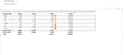
I have created a rank measure which I used to apply conditional formatting of a measure value, see below
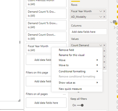
you find conditional formatting in the values area, drop down of value.
modified pbix attached
I hope this helps,
Richard
Did I answer your question? Mark my post as a solution! Kudos Appreciated!
Proud to be a Super User!
- Mark as New
- Bookmark
- Subscribe
- Mute
- Subscribe to RSS Feed
- Permalink
- Report Inappropriate Content
@richbenmintz - many thanks for your help with this, having used Qlikview for so long it's difficult to know where everything is and the subtle differences can actually be quite large when you come to use them! Really appreciate your time with this - I'll study this sample file and hopefully get to grips with it all. If I have any problems, is it OK to call on you? Kind regards
- Mark as New
- Bookmark
- Subscribe
- Mute
- Subscribe to RSS Feed
- Permalink
- Report Inappropriate Content
@richbenmintz
I've created some tables, based on this formatting and works well. However, I'd like to try and take this a step further by creating some sort of text box with the highest month-on-month change in numbers (not %) - current full month to previous month would be ideal as looking for peaks / stresses in terms of spiking demand within our business. Rather than sifting through lots of tables and clicking, how can I create more of a headline dashboard text box type thing which basically says 'MRI has increased the most this month - x vs y last month'...? I can then re-create this for the specialty and exam fields (which are not included in the sample data, but which I can do myself, once I know how to do it for AD_Modality in the same data I linked for you.
Once I can see which areas have spiked the most, in numbers terms, month on month, it will allow me to focus in on this specific area, without trying to find it manually by clicking on the table to find it. These tables are fantastic, but a headline text box telling me exactly where the month on month demand growth is (current to previous month) is perfect.
I've got this so far, but all it does really is show me the highest change per month overall, not on a 'current month to previous month' basis...?
Really hope you can help! Rgds
- Mark as New
- Bookmark
- Subscribe
- Mute
- Subscribe to RSS Feed
- Permalink
- Report Inappropriate Content
@richbenmintz - is there any chance you could help me with this current problem, regarding creating a 'card' on the report which tells users which modality (AD_Modality) has increased the most, based on current to previous month change? Kind regards
- Mark as New
- Bookmark
- Subscribe
- Mute
- Subscribe to RSS Feed
- Permalink
- Report Inappropriate Content
Hi @Creative_tree88 ,
Will try to have a look today
I hope this helps,
Richard
Did I answer your question? Mark my post as a solution! Kudos Appreciated!
Proud to be a Super User!
- Mark as New
- Bookmark
- Subscribe
- Mute
- Subscribe to RSS Feed
- Permalink
- Report Inappropriate Content
- Mark as New
- Bookmark
- Subscribe
- Mute
- Subscribe to RSS Feed
- Permalink
- Report Inappropriate Content
- Mark as New
- Bookmark
- Subscribe
- Mute
- Subscribe to RSS Feed
- Permalink
- Report Inappropriate Content
@richbenmintz - that solution works really well! Many thanks indeed. I guess I can tailor it to show fields other than modality i.e. Specialty, Exam etc etc....just by tweaking the script? Very much appreciate all your help. Kind regards
- Mark as New
- Bookmark
- Subscribe
- Mute
- Subscribe to RSS Feed
- Permalink
- Report Inappropriate Content
@richbenmintz
Thank you so much! So close...yet so far. Really appreciate your help. All the best.
Helpful resources

Microsoft Fabric Learn Together
Covering the world! 9:00-10:30 AM Sydney, 4:00-5:30 PM CET (Paris/Berlin), 7:00-8:30 PM Mexico City

Power BI Monthly Update - April 2024
Check out the April 2024 Power BI update to learn about new features.

| User | Count |
|---|---|
| 115 | |
| 100 | |
| 88 | |
| 68 | |
| 61 |
| User | Count |
|---|---|
| 150 | |
| 120 | |
| 100 | |
| 87 | |
| 68 |


