- Power BI forums
- Updates
- News & Announcements
- Get Help with Power BI
- Desktop
- Service
- Report Server
- Power Query
- Mobile Apps
- Developer
- DAX Commands and Tips
- Custom Visuals Development Discussion
- Health and Life Sciences
- Power BI Spanish forums
- Translated Spanish Desktop
- Power Platform Integration - Better Together!
- Power Platform Integrations (Read-only)
- Power Platform and Dynamics 365 Integrations (Read-only)
- Training and Consulting
- Instructor Led Training
- Dashboard in a Day for Women, by Women
- Galleries
- Community Connections & How-To Videos
- COVID-19 Data Stories Gallery
- Themes Gallery
- Data Stories Gallery
- R Script Showcase
- Webinars and Video Gallery
- Quick Measures Gallery
- 2021 MSBizAppsSummit Gallery
- 2020 MSBizAppsSummit Gallery
- 2019 MSBizAppsSummit Gallery
- Events
- Ideas
- Custom Visuals Ideas
- Issues
- Issues
- Events
- Upcoming Events
- Community Blog
- Power BI Community Blog
- Custom Visuals Community Blog
- Community Support
- Community Accounts & Registration
- Using the Community
- Community Feedback
Register now to learn Fabric in free live sessions led by the best Microsoft experts. From Apr 16 to May 9, in English and Spanish.
- Power BI forums
- Forums
- Get Help with Power BI
- Desktop
- Re: Measure to display percentage
- Subscribe to RSS Feed
- Mark Topic as New
- Mark Topic as Read
- Float this Topic for Current User
- Bookmark
- Subscribe
- Printer Friendly Page
- Mark as New
- Bookmark
- Subscribe
- Mute
- Subscribe to RSS Feed
- Permalink
- Report Inappropriate Content
Measure to display percentage
Hello all,
my issue is a little complex:
I created a report in which you can change what a visual displays via a slicer, similiar to this post:
Dynamically change the information within a visual via a slicer - oxcrx34285 (powerbi.com)
Anyway, now I want to be able to switch between a visual being displayed in total and percent.
However, if I just change the display type to percent", 610 just becomes 61000% so no real solution.
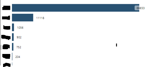
The visuals affected all have a legend, what makes it even more difficult, look here:
So right now I have no idea how to display it. I can't just change the data labels to percent or load the values as %GT as in the end of the day in the report it is intended that the user just presses a button and it changes from total to percent.
Right now I have two ideas:
1. Creating a bookmark but that complicates the report structure for my successors and also everytime you change something you have to take care to change it in the bookmark too.
2. Creating calculated columns. Same: complicates the structure and adds a bunch of calculated columns as I have to do this for all my visuals so it will also affect loading time.
So maybe if there is an expression that calculates the value displayed per category, divides it through all values displayed and shows the outcome in percent, that would be what I'm looking for.
Any help would be much appreciated.
EDIT: I can't just Divide through the sum of the column as through many slicers& filters, not all values are displayed.
Solved! Go to Solution.
- Mark as New
- Bookmark
- Subscribe
- Mute
- Subscribe to RSS Feed
- Permalink
- Report Inappropriate Content
Hi @Anonymous ,
You need to use the Calculation groups to do this .
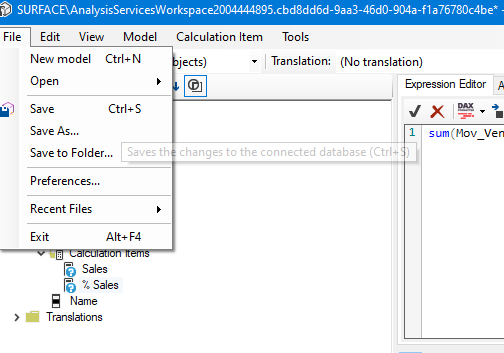
Even in live connection you can use calculation groups and create this changes, follow the step below:
- Assuming you already have Sales Measure
- On external tools execute the Tabular editor
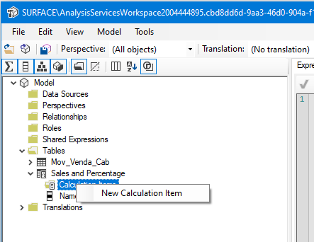
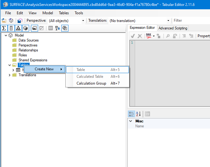
- Rigth Click on Tables
- New Calculation Group
- Rename as you need
- Rigth click
- New Calculation Item
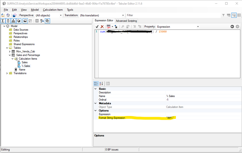
- Rename it sales and write the folllowing code:
SELECTEDMEASURE()- Add two new calculation items with the formulas you have in the Power BI for the other two measures, if your measure in Power BI is for example: DIVIDE(SUM(Table[Column]), SUM(Table[Column2]) this is the formula you must place on the calculation item.
- On the Percentage formula make your formatting as %
- Save the model
- Go back to Power BI and refresh the model you should see your new table in the model
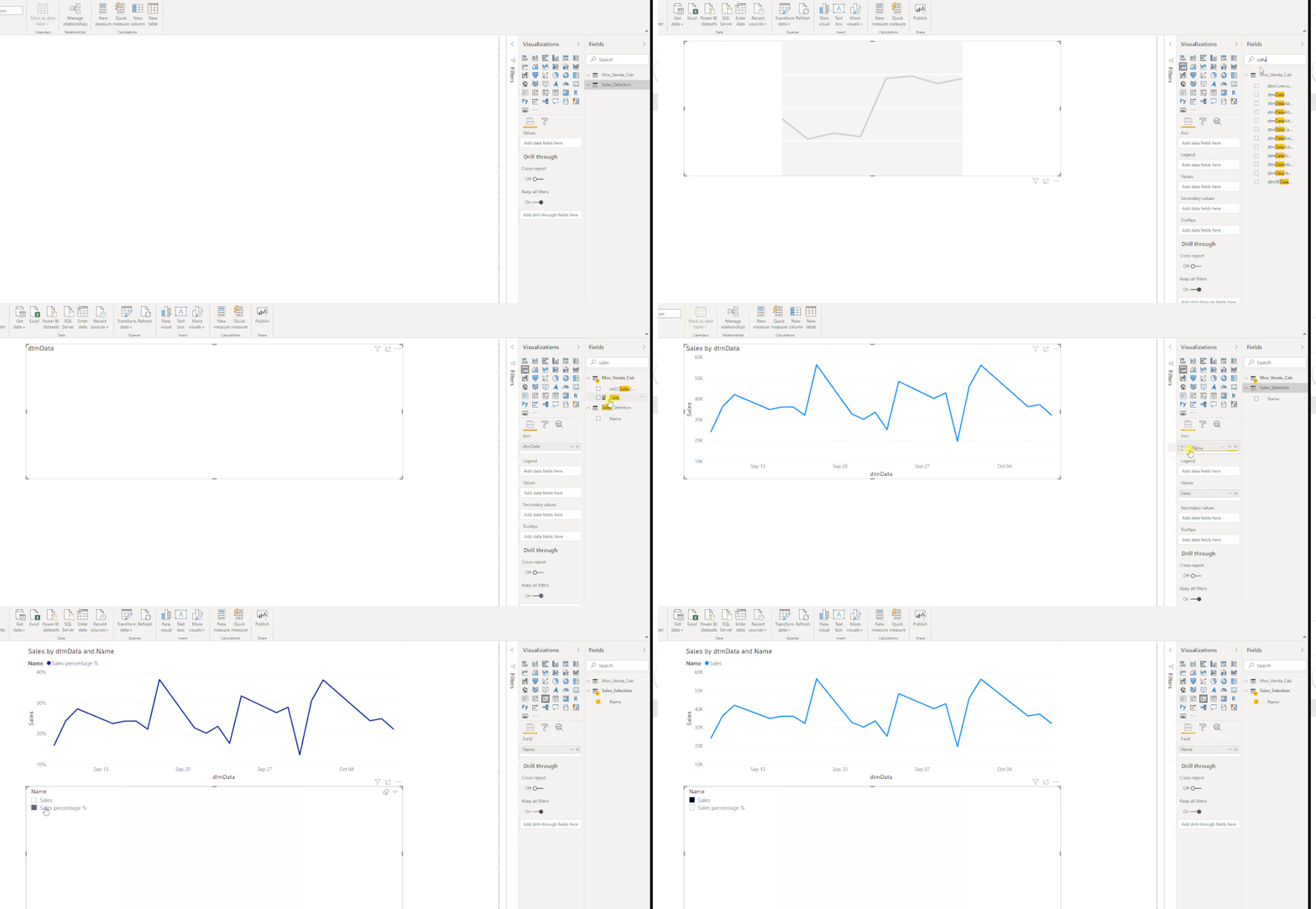
- Now create your line chart with the following setup:.
- Axis: Column you need
- Values: Measure Sales
- Legend: Column from the calculated group table
- Slicer: Column from calculated group table
Check result below:
Regards
Miguel Félix
Did I answer your question? Mark my post as a solution!
Proud to be a Super User!
Check out my blog: Power BI em Português- Mark as New
- Bookmark
- Subscribe
- Mute
- Subscribe to RSS Feed
- Permalink
- Report Inappropriate Content
Hi @Anonymous ,
You need to use the Calculation groups to do this .
Even in live connection you can use calculation groups and create this changes, follow the step below:
- Assuming you already have Sales Measure
- On external tools execute the Tabular editor
- Rigth Click on Tables
- New Calculation Group
- Rename as you need
- Rigth click
- New Calculation Item
- Rename it sales and write the folllowing code:
SELECTEDMEASURE()- Add two new calculation items with the formulas you have in the Power BI for the other two measures, if your measure in Power BI is for example: DIVIDE(SUM(Table[Column]), SUM(Table[Column2]) this is the formula you must place on the calculation item.
- On the Percentage formula make your formatting as %
- Save the model
- Go back to Power BI and refresh the model you should see your new table in the model
- Now create your line chart with the following setup:.
- Axis: Column you need
- Values: Measure Sales
- Legend: Column from the calculated group table
- Slicer: Column from calculated group table
Check result below:
Regards
Miguel Félix
Did I answer your question? Mark my post as a solution!
Proud to be a Super User!
Check out my blog: Power BI em PortuguêsHelpful resources

Microsoft Fabric Learn Together
Covering the world! 9:00-10:30 AM Sydney, 4:00-5:30 PM CET (Paris/Berlin), 7:00-8:30 PM Mexico City

Power BI Monthly Update - April 2024
Check out the April 2024 Power BI update to learn about new features.

| User | Count |
|---|---|
| 111 | |
| 100 | |
| 80 | |
| 64 | |
| 58 |
| User | Count |
|---|---|
| 148 | |
| 111 | |
| 93 | |
| 84 | |
| 66 |
