- Power BI forums
- Updates
- News & Announcements
- Get Help with Power BI
- Desktop
- Service
- Report Server
- Power Query
- Mobile Apps
- Developer
- DAX Commands and Tips
- Custom Visuals Development Discussion
- Health and Life Sciences
- Power BI Spanish forums
- Translated Spanish Desktop
- Power Platform Integration - Better Together!
- Power Platform Integrations (Read-only)
- Power Platform and Dynamics 365 Integrations (Read-only)
- Training and Consulting
- Instructor Led Training
- Dashboard in a Day for Women, by Women
- Galleries
- Community Connections & How-To Videos
- COVID-19 Data Stories Gallery
- Themes Gallery
- Data Stories Gallery
- R Script Showcase
- Webinars and Video Gallery
- Quick Measures Gallery
- 2021 MSBizAppsSummit Gallery
- 2020 MSBizAppsSummit Gallery
- 2019 MSBizAppsSummit Gallery
- Events
- Ideas
- Custom Visuals Ideas
- Issues
- Issues
- Events
- Upcoming Events
- Community Blog
- Power BI Community Blog
- Custom Visuals Community Blog
- Community Support
- Community Accounts & Registration
- Using the Community
- Community Feedback
Register now to learn Fabric in free live sessions led by the best Microsoft experts. From Apr 16 to May 9, in English and Spanish.
- Power BI forums
- Forums
- Get Help with Power BI
- Desktop
- Measure that uses selected time range in its calcu...
- Subscribe to RSS Feed
- Mark Topic as New
- Mark Topic as Read
- Float this Topic for Current User
- Bookmark
- Subscribe
- Printer Friendly Page
- Mark as New
- Bookmark
- Subscribe
- Mute
- Subscribe to RSS Feed
- Permalink
- Report Inappropriate Content
Measure that uses selected time range in its calculation
Hello,
I want to try out a new ratio for my area (Number of A x Months of the period/...) and I was wondering if it is possible. My idea is that the time would be selected here:
And then the number of months in the time range selected would go into the measure, this is a ratio that's going to go from 0 to 1 and get a color depending on the ratio value, but it has to be adjusted to the time frame.
Any ideas on how to get it done or what is my best option?
TIA
Solved! Go to Solution.
- Mark as New
- Bookmark
- Subscribe
- Mute
- Subscribe to RSS Feed
- Permalink
- Report Inappropriate Content
Hi, @Anonymous
You can try this measure to calculate the percentage of days you selected:
Percentage =
var _datediff=DATEDIFF(MINX(ALL('Calendar'),'Calendar'[Date]),MAXX(ALL('Calendar'),'Calendar'[Date]),MONTH)

var _SelectedDateDiff=DATEDIFF(MINX(ALLSELECTED('Calendar'),'Calendar'[Date]),MAXX(ALLSELECTED('Calendar'),'Calendar'[Date]),MONTH)

Var _percentage=DIVIDE(_SelectedDateDiff,_datediff)

return _percentage
If this measure doesn’t meet your requirement, maybe you can show me your expected result and some sample data(without sensitive data).
And if you want the background color of this measure data changes depending on its value(from 0 to 1), you can follow my steps:
- create a table visual, and add this measure to the value field, then create a slicer, add [date] column to the value field.
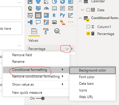
- click conditional formatting, like this:
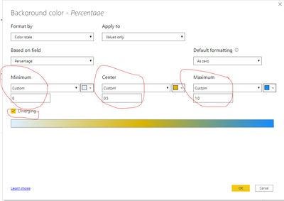
- change the setting, like this:
- And click OK, you can get what you want, like this:
Best Regards,
Community Support Team _Robert Qin
If this post helps, then please consider Accept it as the solution to help the other members find it more quickly.
- Mark as New
- Bookmark
- Subscribe
- Mute
- Subscribe to RSS Feed
- Permalink
- Report Inappropriate Content
@Anonymous ,
You can get date diff like
Measure =
var _min = minx(Allselected(Date), Date[Date])
var _max = maxx(Allselected(Date), Date[Date])
return
datediff(_min, _max , Month())
You can use Day, Qtr, year diff
For color measure example
color =
switch ( true(),
FIRSTNONBLANK('Table'[commodity],"NA") ="commodity1" && sum('Table'[Value]) >500,"lightgreen",
FIRSTNONBLANK('Table'[commodity],"NA") ="commodity2" && sum('Table'[Value]) >1000,"lightgreen",
// Add more conditions
"red"
)
You can use these in coditional formatting using "Field Value" Option
https://radacad.com/dax-and-conditional-formatting-better-together-find-the-biggest-and-smallest-numbers-in-the-column
https://docs.microsoft.com/en-us/power-bi/desktop-conditional-table-formatting#color-by-color-values
Microsoft Power BI Learning Resources, 2023 !!
Learn Power BI - Full Course with Dec-2022, with Window, Index, Offset, 100+ Topics !!
Did I answer your question? Mark my post as a solution! Appreciate your Kudos !! Proud to be a Super User! !!
Helpful resources

Microsoft Fabric Learn Together
Covering the world! 9:00-10:30 AM Sydney, 4:00-5:30 PM CET (Paris/Berlin), 7:00-8:30 PM Mexico City

Power BI Monthly Update - April 2024
Check out the April 2024 Power BI update to learn about new features.

| User | Count |
|---|---|
| 110 | |
| 94 | |
| 81 | |
| 66 | |
| 58 |
| User | Count |
|---|---|
| 150 | |
| 119 | |
| 104 | |
| 87 | |
| 67 |


