- Power BI forums
- Updates
- News & Announcements
- Get Help with Power BI
- Desktop
- Service
- Report Server
- Power Query
- Mobile Apps
- Developer
- DAX Commands and Tips
- Custom Visuals Development Discussion
- Health and Life Sciences
- Power BI Spanish forums
- Translated Spanish Desktop
- Power Platform Integration - Better Together!
- Power Platform Integrations (Read-only)
- Power Platform and Dynamics 365 Integrations (Read-only)
- Training and Consulting
- Instructor Led Training
- Dashboard in a Day for Women, by Women
- Galleries
- Community Connections & How-To Videos
- COVID-19 Data Stories Gallery
- Themes Gallery
- Data Stories Gallery
- R Script Showcase
- Webinars and Video Gallery
- Quick Measures Gallery
- 2021 MSBizAppsSummit Gallery
- 2020 MSBizAppsSummit Gallery
- 2019 MSBizAppsSummit Gallery
- Events
- Ideas
- Custom Visuals Ideas
- Issues
- Issues
- Events
- Upcoming Events
- Community Blog
- Power BI Community Blog
- Custom Visuals Community Blog
- Community Support
- Community Accounts & Registration
- Using the Community
- Community Feedback
Register now to learn Fabric in free live sessions led by the best Microsoft experts. From Apr 16 to May 9, in English and Spanish.
- Power BI forums
- Forums
- Get Help with Power BI
- Desktop
- Re: Measure Moving Anual Total for frequency - Sho...
- Subscribe to RSS Feed
- Mark Topic as New
- Mark Topic as Read
- Float this Topic for Current User
- Bookmark
- Subscribe
- Printer Friendly Page
- Mark as New
- Bookmark
- Subscribe
- Mute
- Subscribe to RSS Feed
- Permalink
- Report Inappropriate Content
Measure Moving Anual Total for frequency - Show just a period in a chart
Hello everyone,
I´m using this measure to calculate the Frequency in a Moving Anual Total period.
The database is from 2014 to 2019, i only what to show in the chart a period like 4/2017 to 4/2018. When i plot it in a line char, the measure ignores the visual level filter in the date in the chart, and show all years.
How can i filter a period? Do i have to change the measure?
Frequency MAT =
CALCULATE (
    CALCULATE (
        DIVIDE ( DISTINCTCOUNT ( b_dados[id_order] ); DISTINCTCOUNT ( b_dados[id_client] ) );
        DATESINPERIOD (
            b_dados[ano_mes_dia].[Date];
            LASTDATE ( b_dados[ano_mes_dia].[Date] );
            -1;
            YEAR
        )
    )
)
Thank you
- Mark as New
- Bookmark
- Subscribe
- Mute
- Subscribe to RSS Feed
- Permalink
- Report Inappropriate Content
Hi @rfernandes -
Do you have a table marked as a Date table? Then you should be able to filter as you want.
The measure looks fine, except it appears that your dates refer to a fact table.
Hope this helps,
Nathan
- Mark as New
- Bookmark
- Subscribe
- Mute
- Subscribe to RSS Feed
- Permalink
- Report Inappropriate Content
@Anonymous
I m using the date from the fact table, is the only date in the model. I think when you mark the column as date, it creates automatically date table, but you cant see it.
Other problem is how a date table looks like in a chart, is very different from the column date.
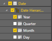
Date column from fact table and chart:
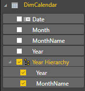
Date table and chart:
By the way, is there a way to show the line chart like the chart with date column?
Thank you
- Mark as New
- Bookmark
- Subscribe
- Mute
- Subscribe to RSS Feed
- Permalink
- Report Inappropriate Content
@rfernandes - It is a best practice to use dates in a separate date table. It looks like you already have DimCalendar? Otherwise, there are many examples online for creating a date table with DAX or M. You can define a column that combines the year and month and put that on the X axis in your line chart. Also, it appears the 2nd chart is drilled down to days.
- Mark as New
- Bookmark
- Subscribe
- Mute
- Subscribe to RSS Feed
- Permalink
- Report Inappropriate Content
I tried to filter with a calendar table and it doesn´t work. If i filter, for example, the calendar[date] from 1/1/2017 to 31/12/2018, it stop using information from 2016 to calculate the MAT of 2017.
The second chart is with year and month from the calendar table, they are categorical. I have to create a new column in the calendar table with month and year, mark as date and use it in the X axis.
Helpful resources

Microsoft Fabric Learn Together
Covering the world! 9:00-10:30 AM Sydney, 4:00-5:30 PM CET (Paris/Berlin), 7:00-8:30 PM Mexico City

Power BI Monthly Update - April 2024
Check out the April 2024 Power BI update to learn about new features.

| User | Count |
|---|---|
| 115 | |
| 100 | |
| 88 | |
| 69 | |
| 61 |
| User | Count |
|---|---|
| 151 | |
| 120 | |
| 103 | |
| 87 | |
| 68 |


