- Power BI forums
- Updates
- News & Announcements
- Get Help with Power BI
- Desktop
- Service
- Report Server
- Power Query
- Mobile Apps
- Developer
- DAX Commands and Tips
- Custom Visuals Development Discussion
- Health and Life Sciences
- Power BI Spanish forums
- Translated Spanish Desktop
- Power Platform Integration - Better Together!
- Power Platform Integrations (Read-only)
- Power Platform and Dynamics 365 Integrations (Read-only)
- Training and Consulting
- Instructor Led Training
- Dashboard in a Day for Women, by Women
- Galleries
- Community Connections & How-To Videos
- COVID-19 Data Stories Gallery
- Themes Gallery
- Data Stories Gallery
- R Script Showcase
- Webinars and Video Gallery
- Quick Measures Gallery
- 2021 MSBizAppsSummit Gallery
- 2020 MSBizAppsSummit Gallery
- 2019 MSBizAppsSummit Gallery
- Events
- Ideas
- Custom Visuals Ideas
- Issues
- Issues
- Events
- Upcoming Events
- Community Blog
- Power BI Community Blog
- Custom Visuals Community Blog
- Community Support
- Community Accounts & Registration
- Using the Community
- Community Feedback
Register now to learn Fabric in free live sessions led by the best Microsoft experts. From Apr 16 to May 9, in English and Spanish.
- Power BI forums
- Forums
- Get Help with Power BI
- Desktop
- Matrix visualization - limitations / alternatives
- Subscribe to RSS Feed
- Mark Topic as New
- Mark Topic as Read
- Float this Topic for Current User
- Bookmark
- Subscribe
- Printer Friendly Page
- Mark as New
- Bookmark
- Subscribe
- Mute
- Subscribe to RSS Feed
- Permalink
- Report Inappropriate Content
Matrix visualization - limitations / alternatives
I'm a pretty new PowerBI user, so I appreciate your patience; I'll try to balance brevity and clarity with specific questions at the end.
We're trying to create a particular report with a matrix visualization, and we've run into a roadblock.
Cases can go through different statuses, and we want to show how many days each case spent in each status, for example:
| Status: | S1 | S2 | S3 | |
| Case: | ||||
| C1 | 3 | 5 | 2 | |
| C2 | 3 | 3 | 1 | |
| C3 | 2 | 9 | 7 |
We're using a matrix because different customers use different statuses (for example, another customer might also use another status S4), and each customer only wants to see columns for their own statuses. The source data is structured like (Case, Status, DaysInStatus).
One additional note, in case it's relevant - our actual matrix visualization includes case attributes, as "Rows", with "Stepped layout" turned off, so it hides the hierarchy and each case still displays as a single row.
| Attr1 | Attr2 | S1 | S2 | S3 | |
| C1 | Green | Red | 3 | 5 | 2 |
Visually, the matrix works fine - it displays the correct status columns for each customer, with the days in each for each case.
However, we've hit a critical roadblock getting business value, finding bottlenecks. We want customers to be able to identify statuses where cases get stuck, and find cases which spent a long time there.
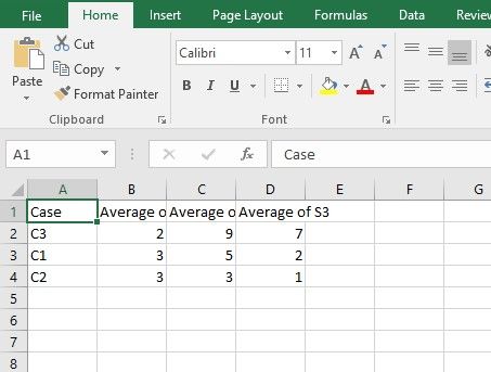
Ideally, we'd like the matrix visualization to 1) show averages per status, and 2) be able to sort the visualization by the status columns. For example, we see the average for S2 is 5.7, and then "Sort descending" S2, so it would bubble C3 to the top, like this:
| S1 | S2 | S3 | ||
| C3 | 2 | 9 | 7 | |
| C1 | 3 | 5 | 2 | |
| C2 | 3 | 3 | 1 | |
| Avg | 2.6 | 5.7 | 3.3 |
However, I can't find how to display a row of averages, and it looks like the matrix visualization doesn't support sorting the way we want; the "Sort" cannot sort on specific status columns, and it doesn't sort the cases (rows) - it only sorts the hidden hierarchy within each case - which in our case looks makes it look like sort is broken.
Question 1: Is there any way to configure the matrix visualization to display averages for the matrix, and allow for sorting cases the way we want to sort?
If we can't get this from the matrix visualization, we can ask our customers to export the data (to Excel, etc) to calculate the averages and sort the cases externally. However, the matrix visualization exports the source data - not the matrix - and our business team said we cannot ask customers to do the pivot themselves - so we cannot use the CSV export of the source data as our solution. Additionally, it seems impossible to simply copy the values from the screen to the clipboard, to be able to paste into Excel.
Question 2: Is there any way to configure the matrix visualization to export the CSV of the matrix seen on-screen (not the source data)?
Question 3: Is there any way to enable selecting/copying the matrix to the clipboard?
Finally, we are open to third-party matrix visualizations or solutions that might require a little coding (i.e., an R or Py visualization), if that's what it takes.
Question 4: Is there any third-party matrix visualization with the capabilities we need?
Question 5: If this would require a custom visualization, is there a quick-start guide specific to creating a matrix? (I'm a skilled dev but no experience in R/Python/visualizations.)
Thank you in advance
-Mitch
Solved! Go to Solution.
- Mark as New
- Bookmark
- Subscribe
- Mute
- Subscribe to RSS Feed
- Permalink
- Report Inappropriate Content
Thank you for your suggestions. The suggestions above regarding using the Average function are correct, but I was blocked by a previous step.
I found the solution for the part that was tripping me up. (With assistance; thank you to Microsoft resource.)
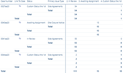
Our matrix looked like this:
When I tried to enable "Row subtotals", it totally messed up the visualization, like this:
...so I just disabled "Row subtotals". That was my mistake.
I needed to enable "Row subtotals", and enable "Per row level", and then disable the subtotal for every row except "Case Number".
Then I finally saw the matrix appear correctly, with the row along the bottom.
Now I was finally ready to make the change suggested above, to change the "Value" from the "[Sum of] DaysInStatus" to the "Average of DaysInStatus". After doing that, and updating the label, it was ready.
(Note, changing that from sum to average affects not only the subtotal row, it also affects the cells in the matrix. That was okay because our source data is already aggregated.)
Final note, regarding the CSV export - I received confirmation (from the Microsoft PowerBI expert) that no, the matrix cannot simply export to CSV directly in the pivoted format.
- Mark as New
- Bookmark
- Subscribe
- Mute
- Subscribe to RSS Feed
- Permalink
- Report Inappropriate Content
Hi @mitchterlisner ,
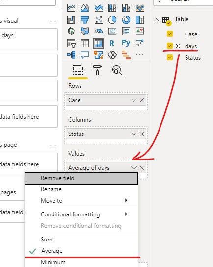
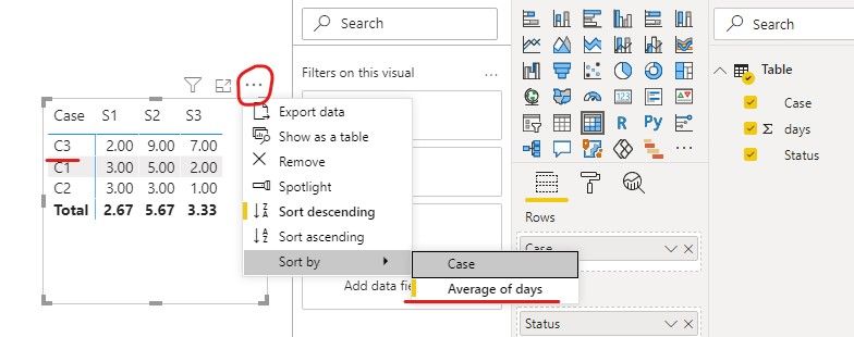
You can configure the average of days and sort by it.
But you cannot export the same structure as the matrix table, you just can export as the source data.
If you want to export the matrix-seen, you need to pivot it in Query Editor.
Then you can export the data like the matrix structure.
If it doesn’t meet your requirement, could you please show the exact expected result based on the table that you have shared?
Best regards,
Community Support Team _ zhenbw
If this post helps, then please consider Accept it as the solution to help the other members find it more quickly.
BTW, pbix as attached.
- Mark as New
- Bookmark
- Subscribe
- Mute
- Subscribe to RSS Feed
- Permalink
- Report Inappropriate Content
Thank you, however, those solutions do not seem to work in our situation. I'll start by mentioning we're not using imported data, we're using liveconnect to AAS; I think that creates limitations for us.
Those steps show how to configure the Value to be an average, but we don't want the Value (displayed in every cell of the matrix) to be an average, we want the row of averages along the bottom.
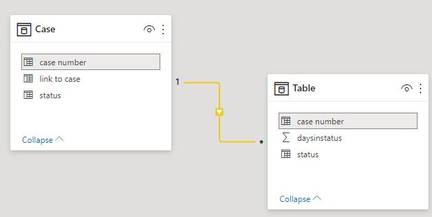
For reference, our source data is shaped like this:
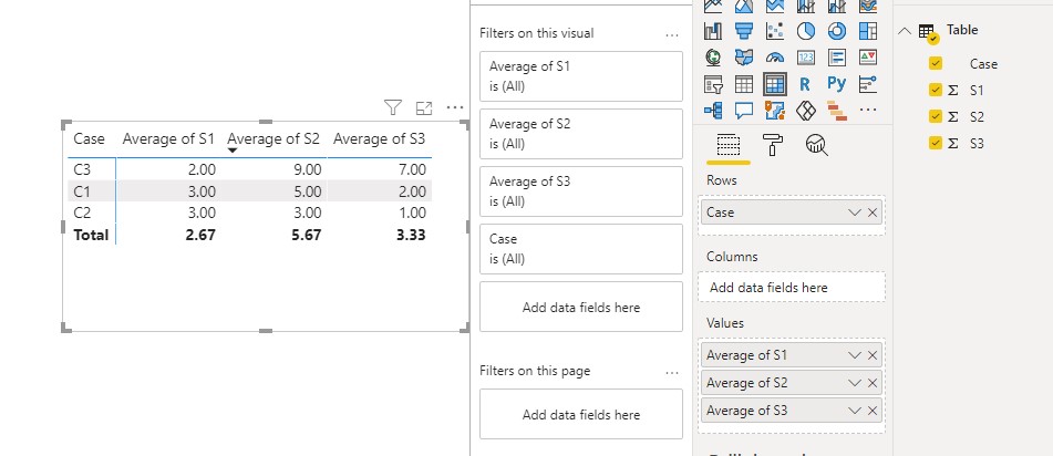
Those steps show in a screenshot a row of averages along the bottom, but we cannot find how to do that.
We've try enabling both "Row subtotals" and "Column subtotals", and neither adds a footer row of averages. Are we missing another configuration step?
Finally, the instructions show how to pivot it in the Query Editor, but we cannot do that, because we're using liveconnect to AAS, not imported data. We control the AAS model and we could reshape the AAS model, but we did not pivot it in the AAS model because in our understanding there's no other PowerBI visualization that could support the dynamic columns, other than the matrix.
- Mark as New
- Bookmark
- Subscribe
- Mute
- Subscribe to RSS Feed
- Permalink
- Report Inappropriate Content
Hi @mitchterlisner ,
We create a sample using your source data.
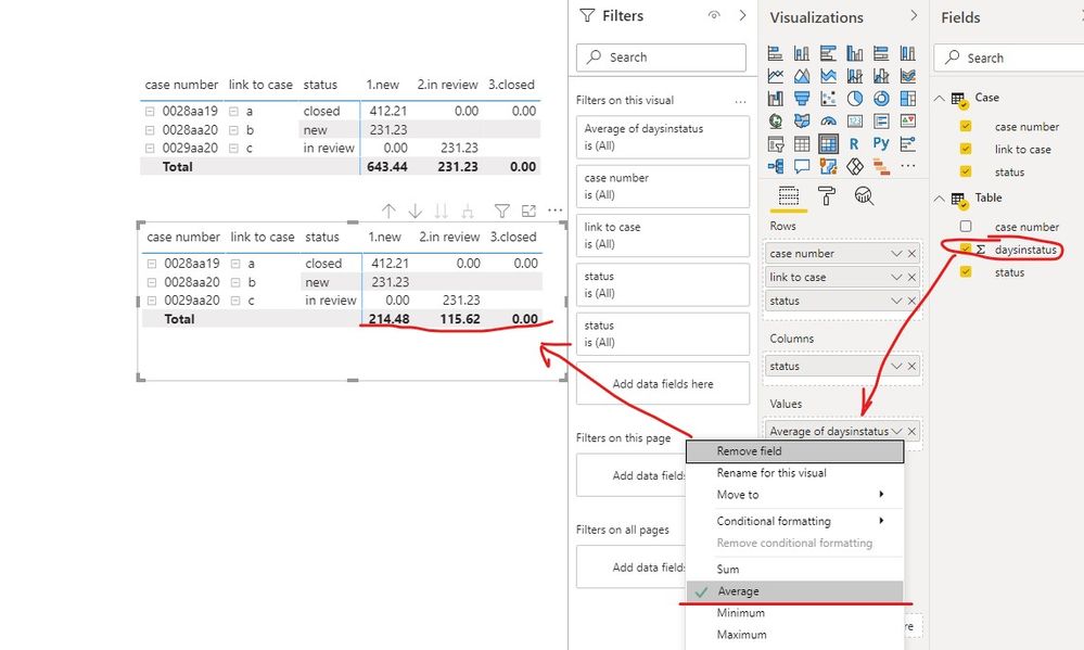
If you want to get the average in Total, you can configure the days in status to be averaging.
Or you can use this measure,
Measure =
IF(
    HASONEVALUE('Case'[case number]),
    SUM('Table'[daysinstatus]),
    AVERAGE('Table'[daysinstatus]))
If it doesn’t meet your requirement, could you please show the exact expected result based on the table that you have shared?
Best regards,
Community Support Team _ zhenbw
If this post helps, then please consider Accept it as the solution to help the other members find it more quickly.
BTW, pbix as attached.
- Mark as New
- Bookmark
- Subscribe
- Mute
- Subscribe to RSS Feed
- Permalink
- Report Inappropriate Content
Thank you for your suggestions. The suggestions above regarding using the Average function are correct, but I was blocked by a previous step.
I found the solution for the part that was tripping me up. (With assistance; thank you to Microsoft resource.)
Our matrix looked like this:
When I tried to enable "Row subtotals", it totally messed up the visualization, like this:
...so I just disabled "Row subtotals". That was my mistake.
I needed to enable "Row subtotals", and enable "Per row level", and then disable the subtotal for every row except "Case Number".
Then I finally saw the matrix appear correctly, with the row along the bottom.
Now I was finally ready to make the change suggested above, to change the "Value" from the "[Sum of] DaysInStatus" to the "Average of DaysInStatus". After doing that, and updating the label, it was ready.
(Note, changing that from sum to average affects not only the subtotal row, it also affects the cells in the matrix. That was okay because our source data is already aggregated.)
Final note, regarding the CSV export - I received confirmation (from the Microsoft PowerBI expert) that no, the matrix cannot simply export to CSV directly in the pivoted format.
- Mark as New
- Bookmark
- Subscribe
- Mute
- Subscribe to RSS Feed
- Permalink
- Report Inappropriate Content
Hi @mitchterlisner ,
Glad to hear that you have solved your issue.
Please kindly mark your reply as a solution to help others find it more quickly and end this thread.
Best regards,
Community Support Team _ zhenbw
If this post helps, then please consider Accept it as the solution to help the other members find it more quickly.
Helpful resources

Microsoft Fabric Learn Together
Covering the world! 9:00-10:30 AM Sydney, 4:00-5:30 PM CET (Paris/Berlin), 7:00-8:30 PM Mexico City

Power BI Monthly Update - April 2024
Check out the April 2024 Power BI update to learn about new features.

| User | Count |
|---|---|
| 109 | |
| 98 | |
| 77 | |
| 66 | |
| 54 |
| User | Count |
|---|---|
| 144 | |
| 104 | |
| 100 | |
| 86 | |
| 64 |

