- Power BI forums
- Updates
- News & Announcements
- Get Help with Power BI
- Desktop
- Service
- Report Server
- Power Query
- Mobile Apps
- Developer
- DAX Commands and Tips
- Custom Visuals Development Discussion
- Health and Life Sciences
- Power BI Spanish forums
- Translated Spanish Desktop
- Power Platform Integration - Better Together!
- Power Platform Integrations (Read-only)
- Power Platform and Dynamics 365 Integrations (Read-only)
- Training and Consulting
- Instructor Led Training
- Dashboard in a Day for Women, by Women
- Galleries
- Community Connections & How-To Videos
- COVID-19 Data Stories Gallery
- Themes Gallery
- Data Stories Gallery
- R Script Showcase
- Webinars and Video Gallery
- Quick Measures Gallery
- 2021 MSBizAppsSummit Gallery
- 2020 MSBizAppsSummit Gallery
- 2019 MSBizAppsSummit Gallery
- Events
- Ideas
- Custom Visuals Ideas
- Issues
- Issues
- Events
- Upcoming Events
- Community Blog
- Power BI Community Blog
- Custom Visuals Community Blog
- Community Support
- Community Accounts & Registration
- Using the Community
- Community Feedback
Register now to learn Fabric in free live sessions led by the best Microsoft experts. From Apr 16 to May 9, in English and Spanish.
- Power BI forums
- Forums
- Get Help with Power BI
- Desktop
- Matrix or table style visualization(s)?
- Subscribe to RSS Feed
- Mark Topic as New
- Mark Topic as Read
- Float this Topic for Current User
- Bookmark
- Subscribe
- Printer Friendly Page
- Mark as New
- Bookmark
- Subscribe
- Mute
- Subscribe to RSS Feed
- Permalink
- Report Inappropriate Content
Matrix or table style visualization(s)?
All,
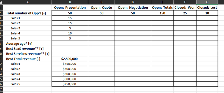
I'm having some difficulty delivering on a client request for a Matrix style or Table style visual in Power BI. What the end user is wanting is based off of CRM data. Columns will consist of business process stage/status. Rows are to consist of Total number of opportunities, based on sales personnel, the age of the opportunity, revenue (3 different types), again all broken down by sales personnel. They want these sections to be collapsable as well (denoted by the plus symbol and minus symbol). They want a very specific design for this. I've attached a picture of what they're wanting:
- Mark as New
- Bookmark
- Subscribe
- Mute
- Subscribe to RSS Feed
- Permalink
- Report Inappropriate Content
Hi @swebb ,
I would suggest you to go with Matrix type of visual .
If you want go for +/- (collapse) then go for Matrix visual.
You can also read more from this link (Which chart type choose) :
https://zebrabi.com/how-to-choose-the-right-chart-power-bi/#:~:text=It%20doesn't%20matter%20whether,....
Thanks ,
Pratyasha Samal
Has this post solved your problem? Please Accept as Solution so that others can find it quickly and to let the community know your problem has been solved.
If you found this post helpful, please give Kudos C
Did I answer your question? Mark my post as a solution!
Proud to be a Super User!
- Mark as New
- Bookmark
- Subscribe
- Mute
- Subscribe to RSS Feed
- Permalink
- Report Inappropriate Content
Yes, I think a Matrix style visualization would work best for this approach. However, the issue I'm running in to is putting the data into the Matrix and having it display in the way they're asking. I'm beginning to wonder if it is due to my data model. I think I'm going to have to redo the data model, as it is mostly a flat one sheet data model. Can you speak on that at all?
- Mark as New
- Bookmark
- Subscribe
- Mute
- Subscribe to RSS Feed
- Permalink
- Report Inappropriate Content
Hi @swebb ,
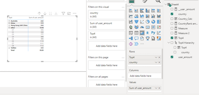
You can simply add the required column to your row , column and value .
For example :-
Thanks,
Pratyasha Samal
Did I answer your question? Mark my post as a solution!
Proud to be a Super User!
- Mark as New
- Bookmark
- Subscribe
- Mute
- Subscribe to RSS Feed
- Permalink
- Report Inappropriate Content
I guess the issue is that I'm just not getting the values I want displayed. Example, I've put sales user name as the rows, some of the sales revenue as rows as well, and one column so far with a certain status in CRM. Well, it's returning the values of those revenue per the user, which... is sort of what I want, but ideally I'd like them grouped up by different rows, like in the example. I'll continue to adjust it and see if I can get it closer to what I am looking for and let you know if I need further assistance.
Helpful resources

Microsoft Fabric Learn Together
Covering the world! 9:00-10:30 AM Sydney, 4:00-5:30 PM CET (Paris/Berlin), 7:00-8:30 PM Mexico City

Power BI Monthly Update - April 2024
Check out the April 2024 Power BI update to learn about new features.

| User | Count |
|---|---|
| 114 | |
| 99 | |
| 83 | |
| 70 | |
| 61 |
| User | Count |
|---|---|
| 149 | |
| 114 | |
| 107 | |
| 89 | |
| 67 |


