- Power BI forums
- Updates
- News & Announcements
- Get Help with Power BI
- Desktop
- Service
- Report Server
- Power Query
- Mobile Apps
- Developer
- DAX Commands and Tips
- Custom Visuals Development Discussion
- Health and Life Sciences
- Power BI Spanish forums
- Translated Spanish Desktop
- Power Platform Integration - Better Together!
- Power Platform Integrations (Read-only)
- Power Platform and Dynamics 365 Integrations (Read-only)
- Training and Consulting
- Instructor Led Training
- Dashboard in a Day for Women, by Women
- Galleries
- Community Connections & How-To Videos
- COVID-19 Data Stories Gallery
- Themes Gallery
- Data Stories Gallery
- R Script Showcase
- Webinars and Video Gallery
- Quick Measures Gallery
- 2021 MSBizAppsSummit Gallery
- 2020 MSBizAppsSummit Gallery
- 2019 MSBizAppsSummit Gallery
- Events
- Ideas
- Custom Visuals Ideas
- Issues
- Issues
- Events
- Upcoming Events
- Community Blog
- Power BI Community Blog
- Custom Visuals Community Blog
- Community Support
- Community Accounts & Registration
- Using the Community
- Community Feedback
Register now to learn Fabric in free live sessions led by the best Microsoft experts. From Apr 16 to May 9, in English and Spanish.
- Power BI forums
- Forums
- Get Help with Power BI
- Desktop
- Matrix grid with 100% bar chart - Date x axis
- Subscribe to RSS Feed
- Mark Topic as New
- Mark Topic as Read
- Float this Topic for Current User
- Bookmark
- Subscribe
- Printer Friendly Page
- Mark as New
- Bookmark
- Subscribe
- Mute
- Subscribe to RSS Feed
- Permalink
- Report Inappropriate Content
Matrix grid with 100% bar chart - Date x axis
Hi,
I'm trying to recreate this Tableau report and not having a lot of luck. I'm still pretty new to Power bi and wondering if a similar report can be created. 2 things I'm having trouble replicating.
1) How can I combine a matrix grid and a 100% stacked bar chart? I've tried the data bars but it isn't being accepted as a solution.
2) How can I produce a 100% stacked bar chart similar to attached and have the x axis be based on a date field? When I try to do a standalone stacked bar chart it wants me to aggregate the dates.
I'm not able to share much data because of being compliant but here is a sample of fake data. Thanks!
| vwRF_ID | vwRF_Team | vwRF_Feature | Release / Date | ChanceColor | ChancetoFinish | Confidence | Timestamp |
| kool-100004 | My Team | #1 feature | Release1 - object1 (2022-05-20) | Red | 3.82 | 2-Med | 12/5/21 4:59 |
| kool-100004 | My Team | #1 feature | Release1 - object1 (2022-05-20) | Red | 61.6 | 2-Med | 12/10/21 4:59 |
| kool-100004 | My Team | #1 feature | Release1 - object1 (2022-05-20) | Yellow | 73.25 | 2-Med | 12/20/21 16:59 |
| kool-100004 | My Team | #1 feature | Release1 - object1 (2022-05-20) | Red | 0.25 | 2-Med | 12/28/21 16:59 |
| kool-100004 | My Team | #1 feature | Release1 - object1 (2022-05-20) | Green | 99.98 | 2-Med | 10/26/21 16:59 |
| kool-100004 | My Team | #1 feature | Release1 - object1 (2022-05-20) | Red | 35.64 | 2-Med | 12/27/21 16:59 |
Solved! Go to Solution.
- Mark as New
- Bookmark
- Subscribe
- Mute
- Subscribe to RSS Feed
- Permalink
- Report Inappropriate Content
Hi @linebergeras ,
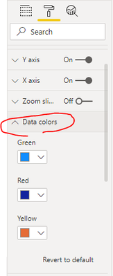
If drag the ChanceColor to Legend field, you need to manually change the data colors :
For your first question, you may try to click two visuals and then "Group" them.
Best Regards,
Eyelyn Qin
If this post helps, then please consider Accept it as the solution to help the other members find it more quickly.
- Mark as New
- Bookmark
- Subscribe
- Mute
- Subscribe to RSS Feed
- Permalink
- Report Inappropriate Content
@linebergeras , You can not have a date on the value axis. You can have them as legend max
Microsoft Power BI Learning Resources, 2023 !!
Learn Power BI - Full Course with Dec-2022, with Window, Index, Offset, 100+ Topics !!
Did I answer your question? Mark my post as a solution! Appreciate your Kudos !! Proud to be a Super User! !!
- Mark as New
- Bookmark
- Subscribe
- Mute
- Subscribe to RSS Feed
- Permalink
- Report Inappropriate Content
@amitchandak if the data is only available in the legend, can I still color code the stack bar chart by the chance color column? How would I go about doing this?
Helpful resources

Microsoft Fabric Learn Together
Covering the world! 9:00-10:30 AM Sydney, 4:00-5:30 PM CET (Paris/Berlin), 7:00-8:30 PM Mexico City

Power BI Monthly Update - April 2024
Check out the April 2024 Power BI update to learn about new features.

| User | Count |
|---|---|
| 111 | |
| 97 | |
| 80 | |
| 69 | |
| 59 |
| User | Count |
|---|---|
| 150 | |
| 119 | |
| 104 | |
| 87 | |
| 67 |


