- Power BI forums
- Updates
- News & Announcements
- Get Help with Power BI
- Desktop
- Service
- Report Server
- Power Query
- Mobile Apps
- Developer
- DAX Commands and Tips
- Custom Visuals Development Discussion
- Health and Life Sciences
- Power BI Spanish forums
- Translated Spanish Desktop
- Power Platform Integration - Better Together!
- Power Platform Integrations (Read-only)
- Power Platform and Dynamics 365 Integrations (Read-only)
- Training and Consulting
- Instructor Led Training
- Dashboard in a Day for Women, by Women
- Galleries
- Community Connections & How-To Videos
- COVID-19 Data Stories Gallery
- Themes Gallery
- Data Stories Gallery
- R Script Showcase
- Webinars and Video Gallery
- Quick Measures Gallery
- 2021 MSBizAppsSummit Gallery
- 2020 MSBizAppsSummit Gallery
- 2019 MSBizAppsSummit Gallery
- Events
- Ideas
- Custom Visuals Ideas
- Issues
- Issues
- Events
- Upcoming Events
- Community Blog
- Power BI Community Blog
- Custom Visuals Community Blog
- Community Support
- Community Accounts & Registration
- Using the Community
- Community Feedback
Register now to learn Fabric in free live sessions led by the best Microsoft experts. From Apr 16 to May 9, in English and Spanish.
- Power BI forums
- Forums
- Get Help with Power BI
- Desktop
- Matrix Visualization Multiple Columns & Rows of Da...
- Subscribe to RSS Feed
- Mark Topic as New
- Mark Topic as Read
- Float this Topic for Current User
- Bookmark
- Subscribe
- Printer Friendly Page
- Mark as New
- Bookmark
- Subscribe
- Mute
- Subscribe to RSS Feed
- Permalink
- Report Inappropriate Content
Matrix Visualization Multiple Columns & Rows of Data
I am using the Matrix visualization to present Revenue, COGS, Processing Cost, Gross Profit Margin Data.
I've changed the Matrix values to "Show on Rows" so that the headers are in the first column and the data is in the second column. However, I would like to have additional columns such as Amount, Per Ton, and % of Revenue. I've set up Measures in order to calculate the per ton and % of Revenue amount for each of the fields.
I would like to be able to have
multiple columns added to the Matrix in order to show the Amount, Per Ton, and % of Revenue. Below is a quick view of how I'd like to see the data. Thanks in advance, let me know if I can clarify or provide more information.
| Amount | Per Ton | % of Revenue | |
| Revenue | 2000 | 50 | 100% |
| COGS | -1000 | -25 | -50% |
| Processing Cost | -500 | -12 | -25% |
| Gross Profit Margin | 500 | 13 | 13% |
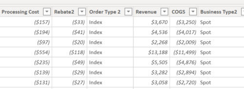
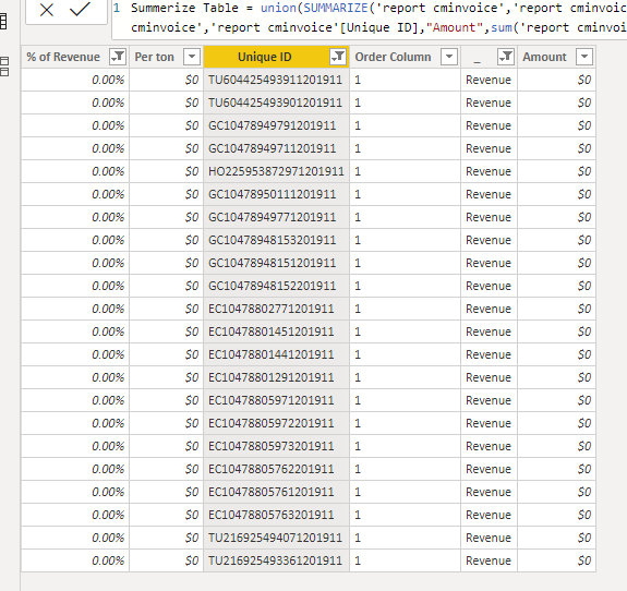
I've added two images to better show the source data. The first image is the main source of data. It is connected to our ERP system and it a table that list every invoice completed in the system. The data contains revenue and cost infomation for each invoice and I've added columns to add additonal calculations. The second image is an example of one of the measures that I've added and how it's calculated.
- Mark as New
- Bookmark
- Subscribe
- Mute
- Subscribe to RSS Feed
- Permalink
- Report Inappropriate Content
Can you post just a little sample of how your source data looks? Please see this post regarding How to Get Your Question Answered Quickly: https://community.powerbi.com/t5/Community-Blog/How-to-Get-Your-Question-Answered-Quickly/ba-p/38490
@ me in replies or I'll lose your thread!!!
Instead of a Kudo, please vote for this idea
Become an expert!: Enterprise DNA
External Tools: MSHGQM
YouTube Channel!: Microsoft Hates Greg
Latest book!: The Definitive Guide to Power Query (M)
DAX is easy, CALCULATE makes DAX hard...
- Mark as New
- Bookmark
- Subscribe
- Mute
- Subscribe to RSS Feed
- Permalink
- Report Inappropriate Content
Thanks for the feedback; I've added additional images of my data.
- Mark as New
- Bookmark
- Subscribe
- Mute
- Subscribe to RSS Feed
- Permalink
- Report Inappropriate Content
Hi @jaybi11 ,
It seems that you want to show result in Matrix, right? I think you could try to transform the data structure by choosing "product cost", "Revenue" and "amount" columns and click unpivot it. Then you could create measure and use this in Matrix.
If possible, could you please inform me more detailed information (your sample data and expected output, I didn't find "_amt" in your sample in image)?
Please do mask sensitive data before uploading.
Thanks for your understanding and support.
Best Regards,
Zoe Zhi
If this post helps, then please consider Accept it as the solution to help the other members find it more quickly.
- Mark as New
- Bookmark
- Subscribe
- Mute
- Subscribe to RSS Feed
- Permalink
- Report Inappropriate Content
You can search for a visual in the market place or try to create a table like this and display
union
(
 summarize(table,"Name","Revenue","Amount",[Revenue Amount],"per ton",[Revenue Per Ton],"% of Revenue",[ % of Revenue])
,summarize(table,"Name","COGS","Amount",[COGS Amount],"per ton",[COGS Per Ton],"% of Revenue",[COGS % of Revenue])
,summarize(table,"Name","Processing Cost","Amount",[Processing Cost Amount],"per ton",[Processing Cost Per Ton],"% of Revenue",[Processing Cost % of Revenue])
,summarize(table,"Name","Gross Profit Margin","Amount",[Gross Profit Margin Amount],"per ton",[Gross Profit Margin Per Ton],"% of Revenue",[Gross Profit Margin % of Revenue])
)Microsoft Power BI Learning Resources, 2023 !!
Learn Power BI - Full Course with Dec-2022, with Window, Index, Offset, 100+ Topics !!
Did I answer your question? Mark my post as a solution! Appreciate your Kudos !! Proud to be a Super User! !!
- Mark as New
- Bookmark
- Subscribe
- Mute
- Subscribe to RSS Feed
- Permalink
- Report Inappropriate Content
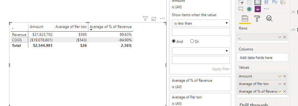
The suggestion of Union and Summerize is working well. I had to add an additional unique identifier in order to build a relationship with the other tables in the file. However, when I try to bring the data to the table it causes issues. In the matrix visual I brought over % of Revenue and Per Ton as an average and the Amount as a Sum. However, because not each identifier has a value it causes the % of Revenue to and per ton to not be exactly as expected. For example I would expect the % of Revenue to be 100%; it's not because there a few lines with no revenue thus there isn't a % of Revenue which causes the % of Revenue to be 99.63%.
Is there a way to resolve this issue either in the Matrix visual or in the table?
- Mark as New
- Bookmark
- Subscribe
- Mute
- Subscribe to RSS Feed
- Permalink
- Report Inappropriate Content
I will research this more to see if this provides what I need.
Helpful resources

Microsoft Fabric Learn Together
Covering the world! 9:00-10:30 AM Sydney, 4:00-5:30 PM CET (Paris/Berlin), 7:00-8:30 PM Mexico City

Power BI Monthly Update - April 2024
Check out the April 2024 Power BI update to learn about new features.

| User | Count |
|---|---|
| 114 | |
| 99 | |
| 83 | |
| 70 | |
| 60 |
| User | Count |
|---|---|
| 150 | |
| 115 | |
| 104 | |
| 89 | |
| 65 |


