- Power BI forums
- Updates
- News & Announcements
- Get Help with Power BI
- Desktop
- Service
- Report Server
- Power Query
- Mobile Apps
- Developer
- DAX Commands and Tips
- Custom Visuals Development Discussion
- Health and Life Sciences
- Power BI Spanish forums
- Translated Spanish Desktop
- Power Platform Integration - Better Together!
- Power Platform Integrations (Read-only)
- Power Platform and Dynamics 365 Integrations (Read-only)
- Training and Consulting
- Instructor Led Training
- Dashboard in a Day for Women, by Women
- Galleries
- Community Connections & How-To Videos
- COVID-19 Data Stories Gallery
- Themes Gallery
- Data Stories Gallery
- R Script Showcase
- Webinars and Video Gallery
- Quick Measures Gallery
- 2021 MSBizAppsSummit Gallery
- 2020 MSBizAppsSummit Gallery
- 2019 MSBizAppsSummit Gallery
- Events
- Ideas
- Custom Visuals Ideas
- Issues
- Issues
- Events
- Upcoming Events
- Community Blog
- Power BI Community Blog
- Custom Visuals Community Blog
- Community Support
- Community Accounts & Registration
- Using the Community
- Community Feedback
Register now to learn Fabric in free live sessions led by the best Microsoft experts. From Apr 16 to May 9, in English and Spanish.
- Power BI forums
- Forums
- Get Help with Power BI
- Desktop
- Market Share Calculation - Filtered value line cha...
- Subscribe to RSS Feed
- Mark Topic as New
- Mark Topic as Read
- Float this Topic for Current User
- Bookmark
- Subscribe
- Printer Friendly Page
- Mark as New
- Bookmark
- Subscribe
- Mute
- Subscribe to RSS Feed
- Permalink
- Report Inappropriate Content
Market Share Calculation - Filtered value line chart challenges (DAX)
Hi everyone, what seems to be such a simple calcualtion is causing us some issues with the line chart visual and I'm hoping that there might be a simple solution which we are overlooking.
We are trying to display market share by brand, (by month), in a line chart that can update when additional filters are applied. THe line chart is working fine when there are no filters applied (the values match the table and the line chart) but as soon as we filter the data (e,g, lets view share in regions a, b or c or within price point x, y or z) the values in the line chart go crazy, whereas the data in the table / matrix updates fine.
Sample Data
In reality, each month has hundreds of entries by brand with each sale being a unit (one row per sale), but for simplicity the same calculation should be able to work on the data set detailed below (I've simply added additioanl units per row to keep the data set small):
| Brand | MMYYY | Value ($) | Units | Region |
| Brand A | 01/2017 | 227093 | 2 | Region A |
| Brand A | 02/2017 | 374518 | 2 | Region A |
| Brand A | 03/2017 | 207575 | 5 | Region B |
| Brand A | 04/2017 | 79810 | 4 | Region A |
| Brand A | 05/2017 | 620000 | 2 | Region C |
| Brand B | 01/2017 | 364918 | 1 | Region A |
| Brand B | 02/2017 | 329148 | 1 | Region A |
| Brand B | 03/2017 | 425698 | 3 | Region B |
| Brand B | 04/2017 | 147856 | 2 | Region A |
| Brand B | 05/2017 | 298658 | 6 | Region C |
| Brand C | 01/2017 | 326852 | 1 | Region D |
| Brand C | 02/2017 | 745962 | 3 | Region C |
| Brand C | 03/2017 | 879651 | 4 | Region C |
| Brand C | 04/2017 | 199365 | 3 | Region D |
| Brand C | 05/2017 | 204567 | 2 | Region D |
| Brand D | 01/2017 | 236989 | 3 | Region A |
| Brand D | 02/2017 | 356612 | 1 | Region A |
| Brand D | 03/2017 | 654986 | 1 | Region B |
| Brand D | 04/2017 | 542589 | 5 | Region A |
| Brand D | 05/2017 | 452698 | 1 | Region C |
| Brand E | 01/2017 | 125365 | 2 | Region A |
| Brand E | 02/2017 | 965214 | 2 | Region A |
| Brand E | 03/2017 | 650004 | 1 | Region B |
| Brand E | 04/2017 | 458759 | 2 | Region A |
| Brand E | 05/2017 | 355788 | 3 | Region C |
| Brand F | 01/2017 | 842425 | 2 | Region D |
| Brand F | 02/2017 | 521245 | 1 | Region C |
| Brand F | 04/2017 | 545445 | 2 | Region D |
| Brand F | 05/2017 | 986452 | 1 | Region D |
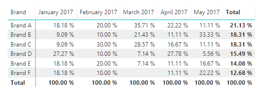
Using Our DAX, which is most likely wrong as you'll see where it fall down shortly, we get the following data in our matrix:
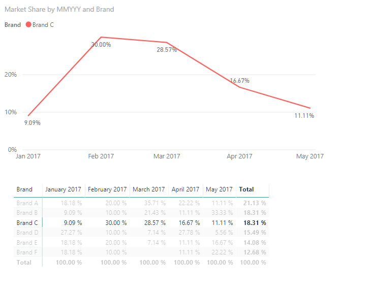
And the following line chart:
All good so far. Picking a single brand works fine too, the line chart updates accordingly and the values reflect what is shown in the table:
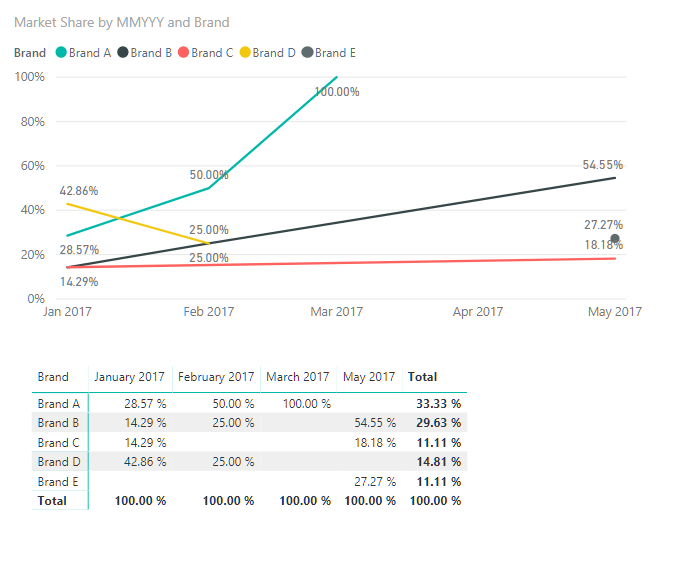
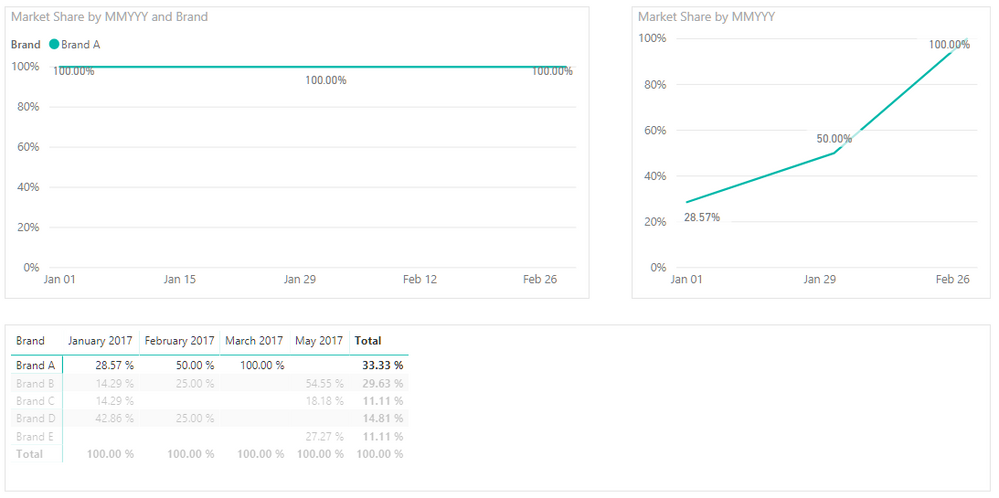
Now, the brands operate in different market segments (regions and price points) so if we want to see the market share where the price range is between (inclusive) 200,000-400,000 we simply apply that filter and the table and line chart behave fine, until you select a brand from the table:
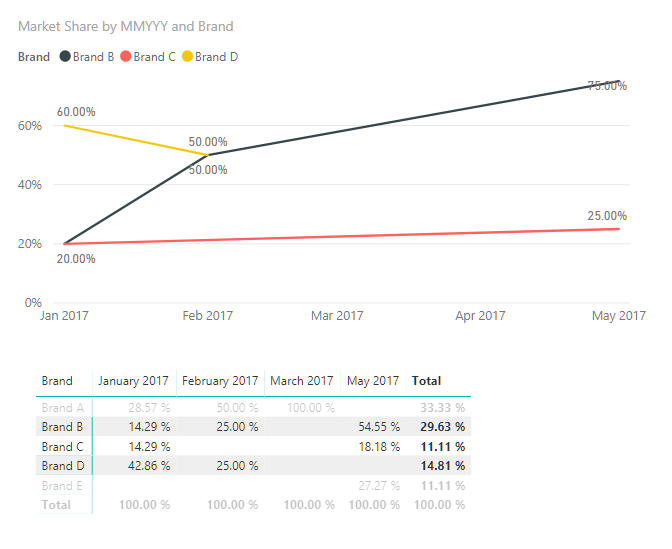
If we want to see Brand A and B plotted on the line chart and we either filter them or select them from the table, the line chart goes haywire (even tthough the table is showing the data as we want it):
If I load the same measure into a line / column chart combo (using just the line value) the visual matches the table, but I can;t chart multiple brands...
So my question is what would the correct DAX expression be to allow for market share to be calcualted and charted correctly (as per the first example) where no additioanl filters are applied, price filters are applied and or location filters are applied (or any combination of other filters)?
If it makes any difference. in the example given, all data resides in one table, where as in practice our date table is separate so the query would need to allow for that quirk too.
Thanks a lot for any help which can be provided!
- Mark as New
- Bookmark
- Subscribe
- Mute
- Subscribe to RSS Feed
- Permalink
- Report Inappropriate Content
Hi @AJ_Clark,
What measures did you use? How did you calculate the percentage values displayed in Matrix and line chart?
Regards,
Yuliana Gu
If this post helps, then please consider Accept it as the solution to help the other members find it more quickly.
- Mark as New
- Bookmark
- Subscribe
- Mute
- Subscribe to RSS Feed
- Permalink
- Report Inappropriate Content
- Mark as New
- Bookmark
- Subscribe
- Mute
- Subscribe to RSS Feed
- Permalink
- Report Inappropriate Content
@v-yulgu-msft, Thanks for your help! This really isn't my area of expertise, so excuse the laughable query (our developer is on leave for the week so I'm trying to self-serve).
The market share value is derrived by dividing two measures. Lets call them [sales] and [all sales] and presenting the value as a %
For [sales], it's just the sum of units
For [all sales] its the sum of all units, all brands (All Sales = CALCULATE(SUM(Sheet1[Units]),ALL(Sheet1[Brand]))- I'm aware that this is the measure which needs fixing. I need this value to be the sum of all sales in a specific month (the same number for all brands) but also have it adapt to both price point filters and location filters. I've tried a bunch of 'all' and 'all except' inclusions in my calculation but I'm yet to get a result that works...
Getting the value to work in the table / matrix is no problem. I just can't seem to get it to chart in a line chart (when I add a location or price point filter) As soon as I select a brand to highligh the individual trend I get 100% values for each month.
Helpful resources

Microsoft Fabric Learn Together
Covering the world! 9:00-10:30 AM Sydney, 4:00-5:30 PM CET (Paris/Berlin), 7:00-8:30 PM Mexico City

Power BI Monthly Update - April 2024
Check out the April 2024 Power BI update to learn about new features.

| User | Count |
|---|---|
| 113 | |
| 100 | |
| 78 | |
| 75 | |
| 51 |
| User | Count |
|---|---|
| 144 | |
| 109 | |
| 108 | |
| 88 | |
| 61 |
