- Power BI forums
- Updates
- News & Announcements
- Get Help with Power BI
- Desktop
- Service
- Report Server
- Power Query
- Mobile Apps
- Developer
- DAX Commands and Tips
- Custom Visuals Development Discussion
- Health and Life Sciences
- Power BI Spanish forums
- Translated Spanish Desktop
- Power Platform Integration - Better Together!
- Power Platform Integrations (Read-only)
- Power Platform and Dynamics 365 Integrations (Read-only)
- Training and Consulting
- Instructor Led Training
- Dashboard in a Day for Women, by Women
- Galleries
- Community Connections & How-To Videos
- COVID-19 Data Stories Gallery
- Themes Gallery
- Data Stories Gallery
- R Script Showcase
- Webinars and Video Gallery
- Quick Measures Gallery
- 2021 MSBizAppsSummit Gallery
- 2020 MSBizAppsSummit Gallery
- 2019 MSBizAppsSummit Gallery
- Events
- Ideas
- Custom Visuals Ideas
- Issues
- Issues
- Events
- Upcoming Events
- Community Blog
- Power BI Community Blog
- Custom Visuals Community Blog
- Community Support
- Community Accounts & Registration
- Using the Community
- Community Feedback
Register now to learn Fabric in free live sessions led by the best Microsoft experts. From Apr 16 to May 9, in English and Spanish.
- Power BI forums
- Forums
- Get Help with Power BI
- Desktop
- Mark periods in a combination chart or create an a...
- Subscribe to RSS Feed
- Mark Topic as New
- Mark Topic as Read
- Float this Topic for Current User
- Bookmark
- Subscribe
- Printer Friendly Page
- Mark as New
- Bookmark
- Subscribe
- Mute
- Subscribe to RSS Feed
- Permalink
- Report Inappropriate Content
Mark periods in a combination chart or create an additional axis
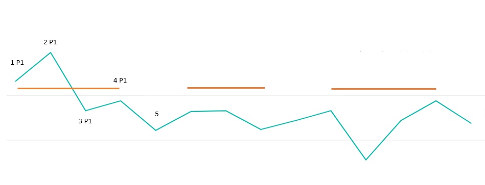
Hi, is there any way to create a chart as the one below, where I would have a chart for user engagement, and I could define what the key periods are within the chart using a separate table, like on image 1:
or alternatively, create a second axis for these periods like in image 2:
Or anything that might resolve this issue?
Solved! Go to Solution.
- Mark as New
- Bookmark
- Subscribe
- Mute
- Subscribe to RSS Feed
- Permalink
- Report Inappropriate Content
Hi @ispajic,
Here we can create another measure like this and add it to the line chart.
Measure = IF(MAX(Table1[Per])= "P1",CALCULATE(SUM(Table1[Column1]),ALLEXCEPT(Table1,Table1[Per])),IF(MAX(Table1[Per])="P2",CALCULATE(SUM(Table1[Column1]),ALLEXCEPT(Table1,Table1[Per])),IF(MAX(Table1[Per])="P3",CALCULATE(SUM(Table1[Column1]),ALLEXCEPT(Table1,Table1[Per])))))
Here is the result for your reference.
For more details, please check the pbix as attached.
https://www.dropbox.com/s/aux0mikx96ilbh8/Mark%20periods%20in%20a%20combination2.pbix?dl=0
Regards,
Frank
If this post helps, then please consider Accept it as the solution to help the others find it more quickly.
- Mark as New
- Bookmark
- Subscribe
- Mute
- Subscribe to RSS Feed
- Permalink
- Report Inappropriate Content
Hi @ispajic,
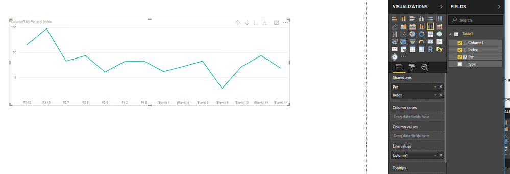
Could you please share sample data of your table and the logic you uses to mark the periods ? Based on my test, it is impossible to create the chart as your second image currently. Here we can only add hierarchy in the Aixs, then we can drill up / down like this. Here I group the type Column and create a calculate column using the formula as below.
Per = IF(Table1[Index]>1 && Table1[Index]<4,"P1",IF(Table1[Index]>6 && Table1[Index]<10 ,"P2", IF(Table1[Index]>11 && Table1[Index]<14,"P3")))
For more details, please check the pbix as attached. By the way, there is an idea about that, you can vote it up.
https://www.dropbox.com/s/aux0mikx96ilbh8/Mark%20periods%20in%20a%20combination2.pbix?dl=0
Regards,
Frank
If this post helps, then please consider Accept it as the solution to help the others find it more quickly.
- Mark as New
- Bookmark
- Subscribe
- Mute
- Subscribe to RSS Feed
- Permalink
- Report Inappropriate Content
Hi, thank you! Unfortunately, drilldown won't work.
As to tables I'm using, what I've shown is a mockup, to explain more easily.
As an alternative, is it possible to get a line chart with 2 lines, where the first one is your standard one and the second only shows up when there's a period. For example, if 1-5 are seconds and P1 is period 1:
- Mark as New
- Bookmark
- Subscribe
- Mute
- Subscribe to RSS Feed
- Permalink
- Report Inappropriate Content
Hi @ispajic,
Here we can create another measure like this and add it to the line chart.
Measure = IF(MAX(Table1[Per])= "P1",CALCULATE(SUM(Table1[Column1]),ALLEXCEPT(Table1,Table1[Per])),IF(MAX(Table1[Per])="P2",CALCULATE(SUM(Table1[Column1]),ALLEXCEPT(Table1,Table1[Per])),IF(MAX(Table1[Per])="P3",CALCULATE(SUM(Table1[Column1]),ALLEXCEPT(Table1,Table1[Per])))))
Here is the result for your reference.
For more details, please check the pbix as attached.
https://www.dropbox.com/s/aux0mikx96ilbh8/Mark%20periods%20in%20a%20combination2.pbix?dl=0
Regards,
Frank
If this post helps, then please consider Accept it as the solution to help the others find it more quickly.
- Mark as New
- Bookmark
- Subscribe
- Mute
- Subscribe to RSS Feed
- Permalink
- Report Inappropriate Content
This isn't a mindblowing solution, but yes, it should do 😄 Thank you!
Helpful resources

Microsoft Fabric Learn Together
Covering the world! 9:00-10:30 AM Sydney, 4:00-5:30 PM CET (Paris/Berlin), 7:00-8:30 PM Mexico City

Power BI Monthly Update - April 2024
Check out the April 2024 Power BI update to learn about new features.

| User | Count |
|---|---|
| 109 | |
| 98 | |
| 77 | |
| 66 | |
| 54 |
| User | Count |
|---|---|
| 144 | |
| 104 | |
| 101 | |
| 86 | |
| 64 |


