- Power BI forums
- Updates
- News & Announcements
- Get Help with Power BI
- Desktop
- Service
- Report Server
- Power Query
- Mobile Apps
- Developer
- DAX Commands and Tips
- Custom Visuals Development Discussion
- Health and Life Sciences
- Power BI Spanish forums
- Translated Spanish Desktop
- Power Platform Integration - Better Together!
- Power Platform Integrations (Read-only)
- Power Platform and Dynamics 365 Integrations (Read-only)
- Training and Consulting
- Instructor Led Training
- Dashboard in a Day for Women, by Women
- Galleries
- Community Connections & How-To Videos
- COVID-19 Data Stories Gallery
- Themes Gallery
- Data Stories Gallery
- R Script Showcase
- Webinars and Video Gallery
- Quick Measures Gallery
- 2021 MSBizAppsSummit Gallery
- 2020 MSBizAppsSummit Gallery
- 2019 MSBizAppsSummit Gallery
- Events
- Ideas
- Custom Visuals Ideas
- Issues
- Issues
- Events
- Upcoming Events
- Community Blog
- Power BI Community Blog
- Custom Visuals Community Blog
- Community Support
- Community Accounts & Registration
- Using the Community
- Community Feedback
Register now to learn Fabric in free live sessions led by the best Microsoft experts. From Apr 16 to May 9, in English and Spanish.
- Power BI forums
- Forums
- Get Help with Power BI
- Desktop
- Re: Maps & Postal Codes [UK]
- Subscribe to RSS Feed
- Mark Topic as New
- Mark Topic as Read
- Float this Topic for Current User
- Bookmark
- Subscribe
- Printer Friendly Page
- Mark as New
- Bookmark
- Subscribe
- Mute
- Subscribe to RSS Feed
- Permalink
- Report Inappropriate Content
Maps & Postal Codes [UK]
Hi All
Need some help getting a basic list of names and addresses into a heat map of sorts based on the person's postal code?
Seems quite a simple task but none of the visuals i can find seem to support this without longtitude and latitude!?!?
Anyone know of a visual that supports UK Post Codes or areas similiar to this please?!
Thanks all!!!!
- Mark as New
- Bookmark
- Subscribe
- Mute
- Subscribe to RSS Feed
- Permalink
- Report Inappropriate Content
hi @Anonymous
you could just put [Postal Codes] field into Location value of visual.
Regards,
Lin
If this post helps, then please consider Accept it as the solution to help the other members find it more quickly.
- Mark as New
- Bookmark
- Subscribe
- Mute
- Subscribe to RSS Feed
- Permalink
- Report Inappropriate Content
Hi Lin
thanks for the reply but unfortaunly it is proving to be not as simple.
I have a list of 90k+ people and their postcode through the south west of the UK yet my heat map and other settings only show them within the area shown on the image below......?? Very confused.
- Mark as New
- Bookmark
- Subscribe
- Mute
- Subscribe to RSS Feed
- Permalink
- Report Inappropriate Content
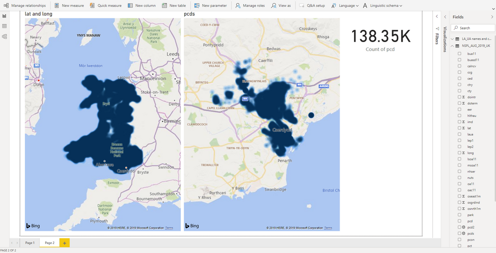
I'm not sure if this will help you or not @Anonymous , but I reckon there's some sort of unexpected behaviour (I won't call it a bug!) going on here - as I've recreated your issue using standard post code data with a dataset of just over 138,000 postcodes.
Filtering the dataset down to Wales, and using lat/long pairs as my location data - I get a reasonable map back. There's an i symbol at the top of the screen that states it's "Showing significant data points".
However, when I use postcodes as my location field (regardless of their format) then I get a limited number of post codes rendered on my map and the i symbol states that there are "too many pcds values". As you can see from the screenshot, it only renders Cardiff and then it gives up rather than providing a representative sample for Wales as in the previous map. So the visual behaves in an inconsitent and unexpected way depending on the data used for location - or i'm missing a setting. I don't think I am, as i copied the first visual and changed data source as well as scouring the visual settings looking for a reason.
What happens when you click on the i in you'r screen shot?
Helpful resources

Microsoft Fabric Learn Together
Covering the world! 9:00-10:30 AM Sydney, 4:00-5:30 PM CET (Paris/Berlin), 7:00-8:30 PM Mexico City

Power BI Monthly Update - April 2024
Check out the April 2024 Power BI update to learn about new features.

| User | Count |
|---|---|
| 105 | |
| 93 | |
| 75 | |
| 62 | |
| 50 |
| User | Count |
|---|---|
| 146 | |
| 109 | |
| 106 | |
| 88 | |
| 61 |


