- Power BI forums
- Updates
- News & Announcements
- Get Help with Power BI
- Desktop
- Service
- Report Server
- Power Query
- Mobile Apps
- Developer
- DAX Commands and Tips
- Custom Visuals Development Discussion
- Health and Life Sciences
- Power BI Spanish forums
- Translated Spanish Desktop
- Power Platform Integration - Better Together!
- Power Platform Integrations (Read-only)
- Power Platform and Dynamics 365 Integrations (Read-only)
- Training and Consulting
- Instructor Led Training
- Dashboard in a Day for Women, by Women
- Galleries
- Community Connections & How-To Videos
- COVID-19 Data Stories Gallery
- Themes Gallery
- Data Stories Gallery
- R Script Showcase
- Webinars and Video Gallery
- Quick Measures Gallery
- 2021 MSBizAppsSummit Gallery
- 2020 MSBizAppsSummit Gallery
- 2019 MSBizAppsSummit Gallery
- Events
- Ideas
- Custom Visuals Ideas
- Issues
- Issues
- Events
- Upcoming Events
- Community Blog
- Power BI Community Blog
- Custom Visuals Community Blog
- Community Support
- Community Accounts & Registration
- Using the Community
- Community Feedback
Register now to learn Fabric in free live sessions led by the best Microsoft experts. From Apr 16 to May 9, in English and Spanish.
- Power BI forums
- Forums
- Get Help with Power BI
- Desktop
- Mapping lines from Different Datasets to same char...
- Subscribe to RSS Feed
- Mark Topic as New
- Mark Topic as Read
- Float this Topic for Current User
- Bookmark
- Subscribe
- Printer Friendly Page
- Mark as New
- Bookmark
- Subscribe
- Mute
- Subscribe to RSS Feed
- Permalink
- Report Inappropriate Content
Mapping lines from Different Datasets to same chart
I am looking to create a line chart , showing a comparison against two lines from different datasets but can't seem to reach my required result.
I have one dataset which has a list of months with a target percentage of what is expected per month. This shows months 1-40 and the percentages are cumulating per month. This is just being pulled from and excel spreadsheet which will not change and is called required.
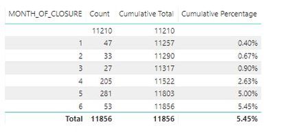
I then have another dataset which based on the start date , groups the number of closures per month of closure , and I am using a slicer to filter the start date to affect these numbers.
What I need to be able to do is plot all 40 months of the "Required" dataset , then plot only the months that are available from the other dataset (eg above months 1-6). I tried merging these but if there is no there is no record for a specific month between the slicer dates selected , the month doesnt pull into the report. Can anyone advise how this could be done. The "Month" and "Month of Closure" are what we are comparing against
- Mark as New
- Bookmark
- Subscribe
- Mute
- Subscribe to RSS Feed
- Permalink
- Report Inappropriate Content
Hi @Arranafc19 ,
>>What I need to be able to do is plot all 40 months of the "Required" dataset , then plot only the months that are available from the other dataset (eg above months 1-6). I tried merging these but if there is no there is no record for a specific month between the slicer dates selected , the month doesnt pull into the report. Can anyone advise how this could be done. The "Month" and "Month of Closure" are what we are comparing against .
I am not sure what desired result would you want, could you please share your sample data and desired output screenshots for further analysis? You can also upload sample pbix to OneDrive and post the link here. Do mask sensitive data before uploading.
Please read this post to get your answer quickly: How to Get Your Question Answered Quickly.
Best Regards,
Amy
- Mark as New
- Bookmark
- Subscribe
- Mute
- Subscribe to RSS Feed
- Permalink
- Report Inappropriate Content
Hi @v-xicai
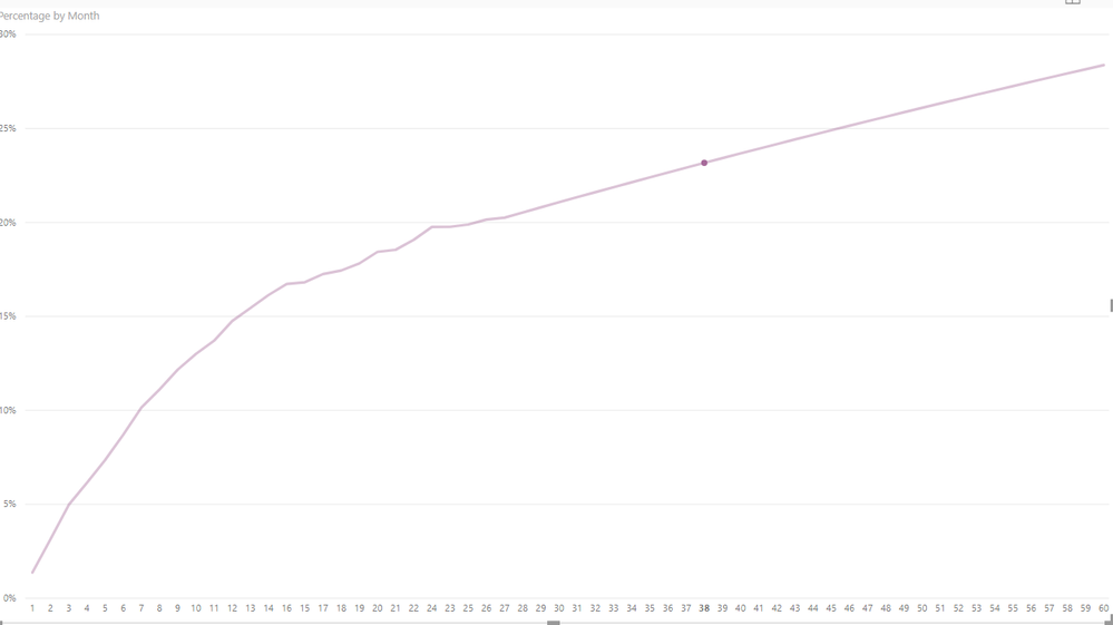
If I plot just the required dataset i get the below (Month 1-60)
I need the first line to plot all 60 months as shown below and my second month to only plot the months that exist once the slicers are applied ( From my above example 1-6). This will show me the total path of the required , and allow me to compare my existing to see if it is on the right track. Hope this makes sense
Helpful resources

Microsoft Fabric Learn Together
Covering the world! 9:00-10:30 AM Sydney, 4:00-5:30 PM CET (Paris/Berlin), 7:00-8:30 PM Mexico City

Power BI Monthly Update - April 2024
Check out the April 2024 Power BI update to learn about new features.

| User | Count |
|---|---|
| 110 | |
| 94 | |
| 80 | |
| 67 | |
| 59 |
| User | Count |
|---|---|
| 150 | |
| 119 | |
| 104 | |
| 87 | |
| 67 |


