- Power BI forums
- Updates
- News & Announcements
- Get Help with Power BI
- Desktop
- Service
- Report Server
- Power Query
- Mobile Apps
- Developer
- DAX Commands and Tips
- Custom Visuals Development Discussion
- Health and Life Sciences
- Power BI Spanish forums
- Translated Spanish Desktop
- Power Platform Integration - Better Together!
- Power Platform Integrations (Read-only)
- Power Platform and Dynamics 365 Integrations (Read-only)
- Training and Consulting
- Instructor Led Training
- Dashboard in a Day for Women, by Women
- Galleries
- Community Connections & How-To Videos
- COVID-19 Data Stories Gallery
- Themes Gallery
- Data Stories Gallery
- R Script Showcase
- Webinars and Video Gallery
- Quick Measures Gallery
- 2021 MSBizAppsSummit Gallery
- 2020 MSBizAppsSummit Gallery
- 2019 MSBizAppsSummit Gallery
- Events
- Ideas
- Custom Visuals Ideas
- Issues
- Issues
- Events
- Upcoming Events
- Community Blog
- Power BI Community Blog
- Custom Visuals Community Blog
- Community Support
- Community Accounts & Registration
- Using the Community
- Community Feedback
Register now to learn Fabric in free live sessions led by the best Microsoft experts. From Apr 16 to May 9, in English and Spanish.
- Power BI forums
- Forums
- Get Help with Power BI
- Desktop
- Map visuals: more data (bubbles) showing than expe...
- Subscribe to RSS Feed
- Mark Topic as New
- Mark Topic as Read
- Float this Topic for Current User
- Bookmark
- Subscribe
- Printer Friendly Page
- Mark as New
- Bookmark
- Subscribe
- Mute
- Subscribe to RSS Feed
- Permalink
- Report Inappropriate Content
Map visuals: more data (bubbles) showing than expected
Good day! I have a summary “Table” visual that shows some ‘Events’ for a ‘Scheduler’ [should be notified] for the ‘Pipelines’ they work on.. E.g. there are 3 events for a scheduler, XYZ. Now, I have a “Map” [regular map] that shows those events as bubbles in the map. For the ‘Map’: I have a slicer for date range, another slicer for the schedulers [drop down for all or a specific one], a slicer for pipelines [drop down list]. But, I see more bubbles (e.g. more than 3 for scheduler, XYZ) on the map. I am using 3 different data sources: DS1: events, DS2: pipeline locations & DS3: schedulers The relationships are:
Many to many between DS1 & DS2 [on pipeline name], Many to many between DS1 & DS3 [on pipeline name]
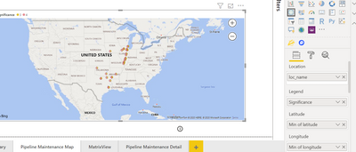
For the Map: For ‘Location’ field, I tried to use ‘loc_name’ or ‘location_id’ [from DS2] - but that probably is causing more bubbles to show up than the actual one. I changed the map to a ‘Table’ visual and found for same ‘loc_name’ or ‘location_id’ the events are calculated multiple times!
I changed ‘Location’ field to have ‘event summary’ from DS1. It shows less bubbles now but they are on top of each other and no map shows up [kinda a board with bubbles]! For map visual-> what should I do that I may have been missing?
Much appreciated in advance!
- Mark as New
- Bookmark
- Subscribe
- Mute
- Subscribe to RSS Feed
- Permalink
- Report Inappropriate Content
Hi @lbendlin
The many-to-many relationship between the events and schedulers [same for the other one] was selected by Power bI. When I try to change the relationship for events and schedulers to be many to 1 considering many events can happen to one pipeline [1 scheduler takes care of 1 or more pipeline(s) ], it doesn't let me change the relationship [PFB]
Thanks. ~Sohana
- Mark as New
- Bookmark
- Subscribe
- Mute
- Subscribe to RSS Feed
- Permalink
- Report Inappropriate Content
That means you either have a data quality issue in your data, or you may need to rethink the entire project. Generally you want to have a data model that is at least resembling a star or snowflake schema, with "dimensions" on the one side of a relationship and "facts" on the many side.
- Mark as New
- Bookmark
- Subscribe
- Mute
- Subscribe to RSS Feed
- Permalink
- Report Inappropriate Content
Hi all: I also have questions on 'Map' [regular map] visual:
1. what should i use for 'Location'?
2. for longitutde/ latitude: which one I use- min/max/average?
3. Do I have to make the category of latitude/longitude/county/state/ in 'Data' view-> Model-> Category-> right category e.g Latitude/Longitude/county/state etc. rahter than leaving those 'uncategorized'? I haven't seen any difference so far!
Thanks. ~Sohana
- Mark as New
- Bookmark
- Subscribe
- Mute
- Subscribe to RSS Feed
- Permalink
- Report Inappropriate Content
Hi , @sohananahid
It's better to recheck your data type, summarization and data category.
You may check if this tutorial helps.
https://radacad.com/how-to-do-power-bi-mapping-with-latitude-and-longitude-only
Best Regards,
Community Support Team _ Eason
- Mark as New
- Bookmark
- Subscribe
- Mute
- Subscribe to RSS Feed
- Permalink
- Report Inappropriate Content
Are you sure about your many-to-many relationships? can there be events across pipelines? Can multiple schedulers work on an event?
Helpful resources

Microsoft Fabric Learn Together
Covering the world! 9:00-10:30 AM Sydney, 4:00-5:30 PM CET (Paris/Berlin), 7:00-8:30 PM Mexico City

Power BI Monthly Update - April 2024
Check out the April 2024 Power BI update to learn about new features.

| User | Count |
|---|---|
| 117 | |
| 105 | |
| 69 | |
| 67 | |
| 43 |
| User | Count |
|---|---|
| 151 | |
| 103 | |
| 102 | |
| 87 | |
| 63 |


