- Power BI forums
- Updates
- News & Announcements
- Get Help with Power BI
- Desktop
- Service
- Report Server
- Power Query
- Mobile Apps
- Developer
- DAX Commands and Tips
- Custom Visuals Development Discussion
- Health and Life Sciences
- Power BI Spanish forums
- Translated Spanish Desktop
- Power Platform Integration - Better Together!
- Power Platform Integrations (Read-only)
- Power Platform and Dynamics 365 Integrations (Read-only)
- Training and Consulting
- Instructor Led Training
- Dashboard in a Day for Women, by Women
- Galleries
- Community Connections & How-To Videos
- COVID-19 Data Stories Gallery
- Themes Gallery
- Data Stories Gallery
- R Script Showcase
- Webinars and Video Gallery
- Quick Measures Gallery
- 2021 MSBizAppsSummit Gallery
- 2020 MSBizAppsSummit Gallery
- 2019 MSBizAppsSummit Gallery
- Events
- Ideas
- Custom Visuals Ideas
- Issues
- Issues
- Events
- Upcoming Events
- Community Blog
- Power BI Community Blog
- Custom Visuals Community Blog
- Community Support
- Community Accounts & Registration
- Using the Community
- Community Feedback
Register now to learn Fabric in free live sessions led by the best Microsoft experts. From Apr 16 to May 9, in English and Spanish.
- Power BI forums
- Forums
- Get Help with Power BI
- Desktop
- Map filter as slicer works different as map visual
- Subscribe to RSS Feed
- Mark Topic as New
- Mark Topic as Read
- Float this Topic for Current User
- Bookmark
- Subscribe
- Printer Friendly Page
- Mark as New
- Bookmark
- Subscribe
- Mute
- Subscribe to RSS Feed
- Permalink
- Report Inappropriate Content
Map filter as slicer works different as map visual
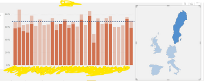
Hi. I've have a map visual(done by me as json file) and it should be used as filter. It works correct in numbers but shows it in ugly way.
Here, I've chosen sweden and it shows correct numbers and correct bars, but on the total background. Just to compare, here is how simple slicer of countries works:
I want my map visual work like county slicer, is there any posibilities?
Solved! Go to Solution.
- Mark as New
- Bookmark
- Subscribe
- Mute
- Subscribe to RSS Feed
- Permalink
- Report Inappropriate Content
Hi @Gleb ,
Yes you can have the same effect, just select the map visual and on the top bar go to Format -> Edit interactions.
Then you will see two icons above the column chart, select the other icon that it's not selected.
You can click again in Edit interactions to deactivate the option to change the type of interaction...
Regards,
Sérgio Silva
Sérgio Silva
If this post helps, then please consider Accept it as the solution to help the others find it more quickly.
Check out my blog for tips and tricks about Power BI: https://pbibits.wordpress.com/
- Mark as New
- Bookmark
- Subscribe
- Mute
- Subscribe to RSS Feed
- Permalink
- Report Inappropriate Content
Hi @Gleb ;
I realy like your map slicer, I would like to create something simular and therefore have 3 questions, maybe you can help out:
- how did you create your "map-slicer"?
- Do you know if its possible to show on the countries of this slicer some messure-numbers?
e.g. Sweden: +5,7% (5.000 k) - is it possible to use that slicer as an action as well: action -> click and sweden and open the dashboard for sweden.
Cheers
Pete
- Mark as New
- Bookmark
- Subscribe
- Mute
- Subscribe to RSS Feed
- Permalink
- Report Inappropriate Content
Hi @Gleb ,
Yes you can have the same effect, just select the map visual and on the top bar go to Format -> Edit interactions.
Then you will see two icons above the column chart, select the other icon that it's not selected.
You can click again in Edit interactions to deactivate the option to change the type of interaction...
Regards,
Sérgio Silva
Sérgio Silva
If this post helps, then please consider Accept it as the solution to help the others find it more quickly.
Check out my blog for tips and tricks about Power BI: https://pbibits.wordpress.com/
- Mark as New
- Bookmark
- Subscribe
- Mute
- Subscribe to RSS Feed
- Permalink
- Report Inappropriate Content
Yes, this is the solution! Thank you so much!
- Mark as New
- Bookmark
- Subscribe
- Mute
- Subscribe to RSS Feed
- Permalink
- Report Inappropriate Content
Glad i could help!
Sérgio Silva
If this post helps, then please consider Accept it as the solution to help the others find it more quickly.
Check out my blog for tips and tricks about Power BI: https://pbibits.wordpress.com/
Helpful resources

Microsoft Fabric Learn Together
Covering the world! 9:00-10:30 AM Sydney, 4:00-5:30 PM CET (Paris/Berlin), 7:00-8:30 PM Mexico City

Power BI Monthly Update - April 2024
Check out the April 2024 Power BI update to learn about new features.

| User | Count |
|---|---|
| 113 | |
| 100 | |
| 78 | |
| 76 | |
| 52 |
| User | Count |
|---|---|
| 144 | |
| 109 | |
| 108 | |
| 88 | |
| 61 |


