- Power BI forums
- Updates
- News & Announcements
- Get Help with Power BI
- Desktop
- Service
- Report Server
- Power Query
- Mobile Apps
- Developer
- DAX Commands and Tips
- Custom Visuals Development Discussion
- Health and Life Sciences
- Power BI Spanish forums
- Translated Spanish Desktop
- Power Platform Integration - Better Together!
- Power Platform Integrations (Read-only)
- Power Platform and Dynamics 365 Integrations (Read-only)
- Training and Consulting
- Instructor Led Training
- Dashboard in a Day for Women, by Women
- Galleries
- Community Connections & How-To Videos
- COVID-19 Data Stories Gallery
- Themes Gallery
- Data Stories Gallery
- R Script Showcase
- Webinars and Video Gallery
- Quick Measures Gallery
- 2021 MSBizAppsSummit Gallery
- 2020 MSBizAppsSummit Gallery
- 2019 MSBizAppsSummit Gallery
- Events
- Ideas
- Custom Visuals Ideas
- Issues
- Issues
- Events
- Upcoming Events
- Community Blog
- Power BI Community Blog
- Custom Visuals Community Blog
- Community Support
- Community Accounts & Registration
- Using the Community
- Community Feedback
Register now to learn Fabric in free live sessions led by the best Microsoft experts. From Apr 16 to May 9, in English and Spanish.
- Power BI forums
- Forums
- Get Help with Power BI
- Desktop
- Re: Map bubbles are in same size irrespective of t...
- Subscribe to RSS Feed
- Mark Topic as New
- Mark Topic as Read
- Float this Topic for Current User
- Bookmark
- Subscribe
- Printer Friendly Page
- Mark as New
- Bookmark
- Subscribe
- Mute
- Subscribe to RSS Feed
- Permalink
- Report Inappropriate Content
Map bubbles are in same size irrespective of the values
Hi
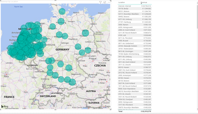
I have a location and sales revenue column. I plotted a map and it's working fine. However, the bubbles are the same size. My revenue has different values.
I need to show some change in bubble size as a user can get an idea. Is there any way?
Solved! Go to Solution.
- Mark as New
- Bookmark
- Subscribe
- Mute
- Subscribe to RSS Feed
- Permalink
- Report Inappropriate Content
Sorry @Anonymous - I missed this message.
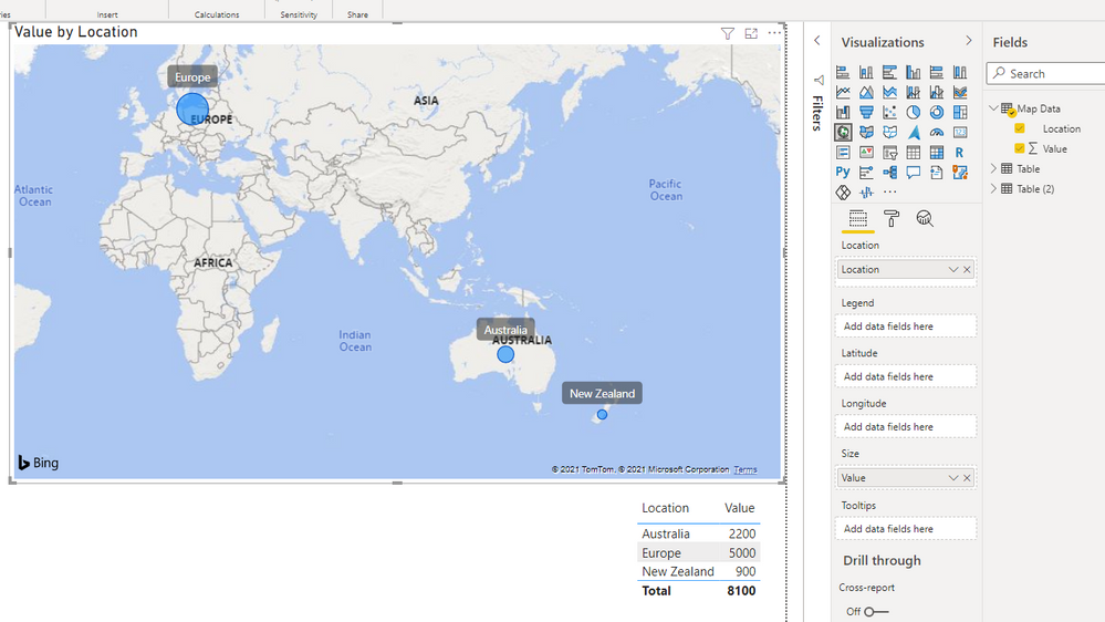
Azure Map is the one that gives more control over the bubbles.
| Have I solved your problem? Please click Accept as Solution so I don't keep coming back to this post, oh yeah, others may find it useful also ;). |
| If you found this post helpful, please give Kudos. It gives me a sense of instant gratification and, if you give me Kudos enough times, magical unicorns will appear on your screen. If you find my signature vaguely amusing, please give Kudos. | Proud to be a Super User! |
- Mark as New
- Bookmark
- Subscribe
- Mute
- Subscribe to RSS Feed
- Permalink
- Report Inappropriate Content
@Anonymous
Map visual works fine in my test, make sure you are using the latest desktop version. And what is that formula for the revenue measure?
Paul Zheng _ Community Support Team
- Mark as New
- Bookmark
- Subscribe
- Mute
- Subscribe to RSS Feed
- Permalink
- Report Inappropriate Content
- Mark as New
- Bookmark
- Subscribe
- Mute
- Subscribe to RSS Feed
- Permalink
- Report Inappropriate Content
I assume you have your measure/value in the 'Size' field?
If it is a value not measure, is the aggregation set correctly?
| Have I solved your problem? Please click Accept as Solution so I don't keep coming back to this post, oh yeah, others may find it useful also ;). |
| If you found this post helpful, please give Kudos. It gives me a sense of instant gratification and, if you give me Kudos enough times, magical unicorns will appear on your screen. If you find my signature vaguely amusing, please give Kudos. | Proud to be a Super User! |
- Mark as New
- Bookmark
- Subscribe
- Mute
- Subscribe to RSS Feed
- Permalink
- Report Inappropriate Content
Unless the aggregation is set incorrectly the size usually just works.
| Have I solved your problem? Please click Accept as Solution so I don't keep coming back to this post, oh yeah, others may find it useful also ;). |
| If you found this post helpful, please give Kudos. It gives me a sense of instant gratification and, if you give me Kudos enough times, magical unicorns will appear on your screen. If you find my signature vaguely amusing, please give Kudos. | Proud to be a Super User! |
- Mark as New
- Bookmark
- Subscribe
- Mute
- Subscribe to RSS Feed
- Permalink
- Report Inappropriate Content
Yes my revenue is a DAX measur and in the size
That means it's not aggregating? How to rectify it?
- Mark as New
- Bookmark
- Subscribe
- Mute
- Subscribe to RSS Feed
- Permalink
- Report Inappropriate Content
The measure should just work.
If you hover over the circles, do the values display correctly? (I suspect they do)
If so, my suggestion would be to use one of the other map visuals that provide more options for sizing.
| Have I solved your problem? Please click Accept as Solution so I don't keep coming back to this post, oh yeah, others may find it useful also ;). |
| If you found this post helpful, please give Kudos. It gives me a sense of instant gratification and, if you give me Kudos enough times, magical unicorns will appear on your screen. If you find my signature vaguely amusing, please give Kudos. | Proud to be a Super User! |
- Mark as New
- Bookmark
- Subscribe
- Mute
- Subscribe to RSS Feed
- Permalink
- Report Inappropriate Content
@KNP Which other map we can use? I don't see any other map with bubble for the sizes. please advise.
- Mark as New
- Bookmark
- Subscribe
- Mute
- Subscribe to RSS Feed
- Permalink
- Report Inappropriate Content
Sorry @Anonymous - I missed this message.
Azure Map is the one that gives more control over the bubbles.
| Have I solved your problem? Please click Accept as Solution so I don't keep coming back to this post, oh yeah, others may find it useful also ;). |
| If you found this post helpful, please give Kudos. It gives me a sense of instant gratification and, if you give me Kudos enough times, magical unicorns will appear on your screen. If you find my signature vaguely amusing, please give Kudos. | Proud to be a Super User! |
- Mark as New
- Bookmark
- Subscribe
- Mute
- Subscribe to RSS Feed
- Permalink
- Report Inappropriate Content
The Map Visual is very tricky and I have learned a but about it today.
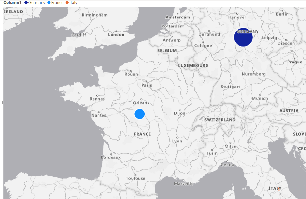
First of all, if all bubbles are the same size try this
- First of all, for some reason, the map settings overall can be turned off. So you have to go to File > Options and Settings >Options > Security > and check the Use Map and Filled Map visuals box.
- On the far left click on the Tables Icon which is under the Visuals icon.
- Click on the numerical value that you want to see in different size bubbles.
- Inspect settings: Check to see if the Data Type is a Whole Number and if Summarization is set to Sum. If it is, you should see a Sum Symbol next to the field. In my case it was annual sales.
- This is a good area to review as well. Play around a little.
- Now, if the relative sizes are off - go to the visualization column on the right and click from the add data field to the the Format your visual field which has a paintbrush on it.
- Click on Buttons and play with the Range Scaling settings. Sometimes, the options are grayed out so you have to isolate when of your numerical values. Data Range and Magnitude seem to change the size of the bubbles more than Auto setting.
- Mark as New
- Bookmark
- Subscribe
- Mute
- Subscribe to RSS Feed
- Permalink
- Report Inappropriate Content
If I may offer a suggestion.
When you answer a question, provide step by step instructions.
- I am having this problem now and it happens over and over again.
- No one seems to know why.
- And then I get here and I see a menu screen screenshot.
- How do I get to that menu screen?
- How do I find the Azure Map Visual?
- Mark as New
- Bookmark
- Subscribe
- Mute
- Subscribe to RSS Feed
- Permalink
- Report Inappropriate Content
And if I hadn't had an entire conversation with the OP leading up to my marked solution I would totally agree with you. I could already see that offering them another visual option based on the conversation was enough.
I'm not sure there's a lot of benefit to posting comments on a post from 2021.
| Have I solved your problem? Please click Accept as Solution so I don't keep coming back to this post, oh yeah, others may find it useful also ;). |
| If you found this post helpful, please give Kudos. It gives me a sense of instant gratification and, if you give me Kudos enough times, magical unicorns will appear on your screen. If you find my signature vaguely amusing, please give Kudos. | Proud to be a Super User! |
- Mark as New
- Bookmark
- Subscribe
- Mute
- Subscribe to RSS Feed
- Permalink
- Report Inappropriate Content
Hi @Anonymous - Which map visual are you using?
| Have I solved your problem? Please click Accept as Solution so I don't keep coming back to this post, oh yeah, others may find it useful also ;). |
| If you found this post helpful, please give Kudos. It gives me a sense of instant gratification and, if you give me Kudos enough times, magical unicorns will appear on your screen. If you find my signature vaguely amusing, please give Kudos. | Proud to be a Super User! |
Helpful resources

Microsoft Fabric Learn Together
Covering the world! 9:00-10:30 AM Sydney, 4:00-5:30 PM CET (Paris/Berlin), 7:00-8:30 PM Mexico City

Power BI Monthly Update - April 2024
Check out the April 2024 Power BI update to learn about new features.

| User | Count |
|---|---|
| 112 | |
| 99 | |
| 73 | |
| 72 | |
| 49 |
| User | Count |
|---|---|
| 145 | |
| 109 | |
| 109 | |
| 90 | |
| 64 |


