- Power BI forums
- Updates
- News & Announcements
- Get Help with Power BI
- Desktop
- Service
- Report Server
- Power Query
- Mobile Apps
- Developer
- DAX Commands and Tips
- Custom Visuals Development Discussion
- Health and Life Sciences
- Power BI Spanish forums
- Translated Spanish Desktop
- Power Platform Integration - Better Together!
- Power Platform Integrations (Read-only)
- Power Platform and Dynamics 365 Integrations (Read-only)
- Training and Consulting
- Instructor Led Training
- Dashboard in a Day for Women, by Women
- Galleries
- Community Connections & How-To Videos
- COVID-19 Data Stories Gallery
- Themes Gallery
- Data Stories Gallery
- R Script Showcase
- Webinars and Video Gallery
- Quick Measures Gallery
- 2021 MSBizAppsSummit Gallery
- 2020 MSBizAppsSummit Gallery
- 2019 MSBizAppsSummit Gallery
- Events
- Ideas
- Custom Visuals Ideas
- Issues
- Issues
- Events
- Upcoming Events
- Community Blog
- Power BI Community Blog
- Custom Visuals Community Blog
- Community Support
- Community Accounts & Registration
- Using the Community
- Community Feedback
Register now to learn Fabric in free live sessions led by the best Microsoft experts. From Apr 16 to May 9, in English and Spanish.
- Power BI forums
- Forums
- Get Help with Power BI
- Desktop
- Re: Map Visualization Legend Measure
- Subscribe to RSS Feed
- Mark Topic as New
- Mark Topic as Read
- Float this Topic for Current User
- Bookmark
- Subscribe
- Printer Friendly Page
- Mark as New
- Bookmark
- Subscribe
- Mute
- Subscribe to RSS Feed
- Permalink
- Report Inappropriate Content
Map Visualization Legend Measure
Hi guys, it is a pleasure to greet you.
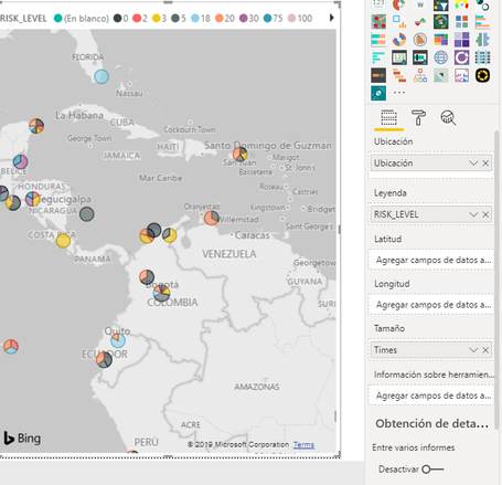
I really need your help with a problem that I am facing currently. I am using a map visualization to show the average risk in some places. However, when I add the specific column on the legend option, on the map appears a pie chart. However, I don´t really need the pie, I just need a circle that shows me the risk average. It would be easy to use a measure, but map visualization doesn’t allow measures on the legend field.
Anyone can help me please with this situation?
Thanks in advance.
| PLACE | RISK LEVEL | YEAR |
| Quito, Ecuador | 3 | 2019 |
| Santiago Chile | 5 | 2017 |
| Quito, Ecuador | 20 | 2019 |
| Galapagos, Ecuador | 30 | 2018 |
| Santa Cruz, Bolivia | 30 | 2017 |
| Galapagos, Ecuador | 100 | 2017 |
| Santiago Chile | 100 | 2017 |
| Galapagos, Ecuador | 100 | 2019 |
| Quito, Ecuador | 100 | 2018 |
| Santa Cruz, Bolivia | 30 | 2017 |
| Santa Cruz, Bolivia | 5 | 2017 |
| Galapagos, Ecuador | 18 | 2018 |
In the picture, you can see that appears a pie chart, but i reallyu need the average RISK. By the way, the map must be updated when I change the filters on the sheet.
- Mark as New
- Bookmark
- Subscribe
- Mute
- Subscribe to RSS Feed
- Permalink
- Report Inappropriate Content
I know this is an old post, but I recently ran into a similar situation. I think your issue is coming from the fact that your data is on a lower level (state, region, city, etc) but your map looks to be using country.
I don't have time to play with this and test it right now, but one option would be to open the Queries in the Power Query Editor and do the following:
- Right-click the query with your data and click Duplicate.
- Select the new query, then on the Transform tab, click Group By.
- Choose Country or the field you want to show the averages by in the top drop-down list.
- Name your new Averages column, select Average in the operation, and then pick your risk level.
- Use the Advanced radio button if you want to add additional aggregations, like a count of the years.
- Rename the query appropriately.
- Click Close & Apply on the Home or File menus.
@eorjuelad if this works, please let me know.
- Mark as New
- Bookmark
- Subscribe
- Mute
- Subscribe to RSS Feed
- Permalink
- Report Inappropriate Content
Hi @eorjuelad ,
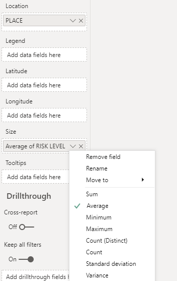
According to your description, my understanding is that you want to display the average of RISK LEVEL for each PLACE, in this scenario, we can drag the RISK LEVEL column to the size field, and select the Average like below:
The result will like below:
Best Regards,
Teige
- Mark as New
- Bookmark
- Subscribe
- Mute
- Subscribe to RSS Feed
- Permalink
- Report Inappropriate Content
Hi @TeigeGao.
Thanks for your answer. However, I didn´t mention before that I am using another information on size field that show me how many times, I have checked the RISK LEVEL in a specific place. The idea to use the RISK LEVEL on Legend Field is because I need to give a specific color to the bubble depending on the RISK LEVEL. By the way, you helped me to realize that I don´t need the average calculation, I really need the Median Calculation.
The size will be changed depending on how many times I have checked the place.
The color will be changed depending on the risk level Median
Thanks in advance.
Eder.
- Mark as New
- Bookmark
- Subscribe
- Mute
- Subscribe to RSS Feed
- Permalink
- Report Inappropriate Content
Hi everybody,
Please someone who can help me with this post. Although I Have tried to get a solution, I haven´t been able to do it.
@TeigeGao has given me a solution that could works, but the scenery that I have is completely different.
Thanks in advance.
Helpful resources

Microsoft Fabric Learn Together
Covering the world! 9:00-10:30 AM Sydney, 4:00-5:30 PM CET (Paris/Berlin), 7:00-8:30 PM Mexico City

Power BI Monthly Update - April 2024
Check out the April 2024 Power BI update to learn about new features.

| User | Count |
|---|---|
| 109 | |
| 96 | |
| 77 | |
| 66 | |
| 54 |
| User | Count |
|---|---|
| 144 | |
| 104 | |
| 102 | |
| 88 | |
| 63 |


