- Power BI forums
- Updates
- News & Announcements
- Get Help with Power BI
- Desktop
- Service
- Report Server
- Power Query
- Mobile Apps
- Developer
- DAX Commands and Tips
- Custom Visuals Development Discussion
- Health and Life Sciences
- Power BI Spanish forums
- Translated Spanish Desktop
- Power Platform Integration - Better Together!
- Power Platform Integrations (Read-only)
- Power Platform and Dynamics 365 Integrations (Read-only)
- Training and Consulting
- Instructor Led Training
- Dashboard in a Day for Women, by Women
- Galleries
- Community Connections & How-To Videos
- COVID-19 Data Stories Gallery
- Themes Gallery
- Data Stories Gallery
- R Script Showcase
- Webinars and Video Gallery
- Quick Measures Gallery
- 2021 MSBizAppsSummit Gallery
- 2020 MSBizAppsSummit Gallery
- 2019 MSBizAppsSummit Gallery
- Events
- Ideas
- Custom Visuals Ideas
- Issues
- Issues
- Events
- Upcoming Events
- Community Blog
- Power BI Community Blog
- Custom Visuals Community Blog
- Community Support
- Community Accounts & Registration
- Using the Community
- Community Feedback
Register now to learn Fabric in free live sessions led by the best Microsoft experts. From Apr 16 to May 9, in English and Spanish.
- Power BI forums
- Forums
- Get Help with Power BI
- Desktop
- Re: Making shadowed stacked column chart with slic...
- Subscribe to RSS Feed
- Mark Topic as New
- Mark Topic as Read
- Float this Topic for Current User
- Bookmark
- Subscribe
- Printer Friendly Page
- Mark as New
- Bookmark
- Subscribe
- Mute
- Subscribe to RSS Feed
- Permalink
- Report Inappropriate Content
Making shadowed stacked column chart with slicers
Hello guys,
I am trying to figure out how to create a stacked column chart reflecting a shadow connected dynamically with slicers ? I've seen it in the Gartner Life Expectancy dashboard which is as below. Any idea how to create this kind of dynamic column chart without using selection pane ?
Link as follows (Gartner Analytics and BI Virtual Bake-Off 2020: world population health analysis with Power BI - You...)
Thank you.
Solved! Go to Solution.
- Mark as New
- Bookmark
- Subscribe
- Mute
- Subscribe to RSS Feed
- Permalink
- Report Inappropriate Content
Hi @GrimReaperX ,
You can apply different colors on the chart based on your condition, for example in my sample, I modify the color formula like this:
Measure =
IF (
    MAX ( 'Table'[Column1] ) >= MAX ( 'Table 2'[Column1] ),
    "Grey",
    IF (
        MAX ( 'Table'[Column1] )
            >= MAX ( 'Table 2'[Column1] ) - 5,
        "Orange",
        "Blue"
    )
)
Get the result. But in the slicer, the text can't be hided, it's by design.
I attach my sample below for reference.
Best Regards,
Community Support Team _ kalyj
If this post helps, then please consider Accept it as the solution to help the other members find it more quickly.
- Mark as New
- Bookmark
- Subscribe
- Mute
- Subscribe to RSS Feed
- Permalink
- Report Inappropriate Content
Hi @GrimReaperX ,
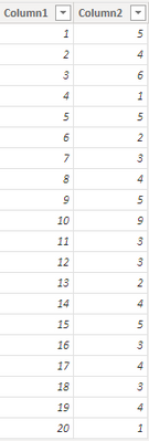
According to your description, I create a sample.
In the column chart, Column1 is in the Axis. Here's my solution.
1.Create a new table, don't make relationship between the two tables.
Table 2 = VALUES('Table'[Column1])
2.Create a measure.
Measure = IF(MAX('Table'[Column1])>= MAX('Table 2'[Column1]),"Grey","Blue")
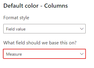
3.In the column chart formatting pane>Columns>Colors, click the fx button.
Select the new measure in the color formatting based on field.
4.Put the column from the new table in a slicer, get the result.
I attach my sample below for reference.
Best Regards,
Community Support Team _ kalyj
If this post helps, then please consider Accept it as the solution to help the other members find it more quickly.
- Mark as New
- Bookmark
- Subscribe
- Mute
- Subscribe to RSS Feed
- Permalink
- Report Inappropriate Content
Hi @v-yanjiang-msft ,
Thanks for your answer, i greatly appreciate that. Is it also possible to apply different colors on the chart based on different buckets? As you can see from the picture that i shared in first post, there is different colors for specific range.
Moreover, is it possible to hide section below in the slicer? I just want to have slicer itself without any text.
Thank you very much.
- Mark as New
- Bookmark
- Subscribe
- Mute
- Subscribe to RSS Feed
- Permalink
- Report Inappropriate Content
Hi @GrimReaperX ,
You can apply different colors on the chart based on your condition, for example in my sample, I modify the color formula like this:
Measure =
IF (
    MAX ( 'Table'[Column1] ) >= MAX ( 'Table 2'[Column1] ),
    "Grey",
    IF (
        MAX ( 'Table'[Column1] )
            >= MAX ( 'Table 2'[Column1] ) - 5,
        "Orange",
        "Blue"
    )
)
Get the result. But in the slicer, the text can't be hided, it's by design.
I attach my sample below for reference.
Best Regards,
Community Support Team _ kalyj
If this post helps, then please consider Accept it as the solution to help the other members find it more quickly.
Helpful resources

Microsoft Fabric Learn Together
Covering the world! 9:00-10:30 AM Sydney, 4:00-5:30 PM CET (Paris/Berlin), 7:00-8:30 PM Mexico City

Power BI Monthly Update - April 2024
Check out the April 2024 Power BI update to learn about new features.

| User | Count |
|---|---|
| 110 | |
| 95 | |
| 76 | |
| 65 | |
| 51 |
| User | Count |
|---|---|
| 146 | |
| 109 | |
| 106 | |
| 88 | |
| 61 |


