- Power BI forums
- Updates
- News & Announcements
- Get Help with Power BI
- Desktop
- Service
- Report Server
- Power Query
- Mobile Apps
- Developer
- DAX Commands and Tips
- Custom Visuals Development Discussion
- Health and Life Sciences
- Power BI Spanish forums
- Translated Spanish Desktop
- Power Platform Integration - Better Together!
- Power Platform Integrations (Read-only)
- Power Platform and Dynamics 365 Integrations (Read-only)
- Training and Consulting
- Instructor Led Training
- Dashboard in a Day for Women, by Women
- Galleries
- Community Connections & How-To Videos
- COVID-19 Data Stories Gallery
- Themes Gallery
- Data Stories Gallery
- R Script Showcase
- Webinars and Video Gallery
- Quick Measures Gallery
- 2021 MSBizAppsSummit Gallery
- 2020 MSBizAppsSummit Gallery
- 2019 MSBizAppsSummit Gallery
- Events
- Ideas
- Custom Visuals Ideas
- Issues
- Issues
- Events
- Upcoming Events
- Community Blog
- Power BI Community Blog
- Custom Visuals Community Blog
- Community Support
- Community Accounts & Registration
- Using the Community
- Community Feedback
Register now to learn Fabric in free live sessions led by the best Microsoft experts. From Apr 16 to May 9, in English and Spanish.
- Power BI forums
- Forums
- Get Help with Power BI
- Desktop
- Making null a zero when using 'Count' of a column
- Subscribe to RSS Feed
- Mark Topic as New
- Mark Topic as Read
- Float this Topic for Current User
- Bookmark
- Subscribe
- Printer Friendly Page
- Mark as New
- Bookmark
- Subscribe
- Mute
- Subscribe to RSS Feed
- Permalink
- Report Inappropriate Content
Making null a zero when using 'Count' of a column
Hi All!
What I am trying to achieve as an end goal is a line chart where the nulls are treated as zeros so lines remail consitant.
I unfortunatley can not show the data I am working with, as it is company data.
Overview:
I have a lot of data consititng of the export of a specific mailbox. My main activity is measuring the occurances of specific subject lines in the data.
I have managed to get it showing me the top 10 most received emails by subject, however, I want trend graphs for this data based on count per month of said subjects.
The issue is that if there are no instances of the specific subject it of course is null, and I need it to be zero so line doesent just stop on the line graph, but drops to zero.
Again apologies for the lack of data, here is an attempt at simulated data.
Month Subject
| Jan | Oranges |
| Jan | Apples |
| Jan | Oranges |
| Jan | Apples |
| Jan | Grape |
| Jan | Grape |
| Feb | Oranges |
| Feb | Apples |
| Feb | Apples |
| Feb | Oranges |
| Feb | Apples |
| Feb | Oranges |
| Feb | Grape |
| Mar | Apples |
| Mar | Oranges |
| Mar | Oranges |
| Mar | Apples |
| Mar | Oranges |
As you can see the 'Grape' subject does not appear in march. This obviously represents a null for 'Grape' in march when using count. What I want is for the lack of said subject to be represented by zero and not null so the line graph doesnt just stop lines 'mid air'
Solved! Go to Solution.
- Mark as New
- Bookmark
- Subscribe
- Mute
- Subscribe to RSS Feed
- Permalink
- Report Inappropriate Content
Hi @Anonymous ,
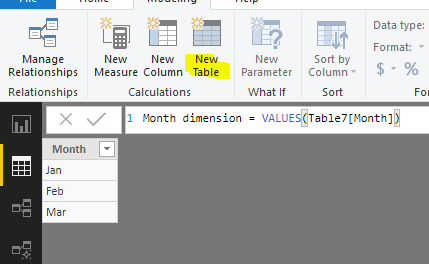
Create a Month dimension table which is linked to fact data table based on [Month] field.
Month dimension = VALUES(Table7[Month])
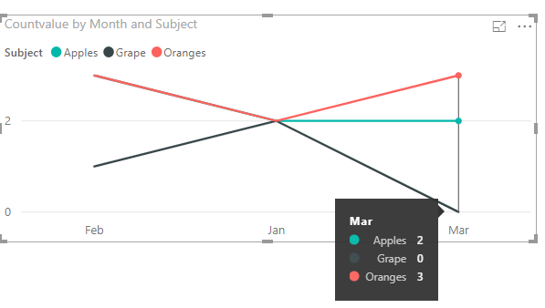
Add [Subject] into chart legend. Add below measure to line chart rather than using Count for Subject column.
Countvalue = COUNT(Table7[Subject])+0
Best regards,
Yuliana Gu
If this post helps, then please consider Accept it as the solution to help the other members find it more quickly.
- Mark as New
- Bookmark
- Subscribe
- Mute
- Subscribe to RSS Feed
- Permalink
- Report Inappropriate Content
In general, you use a line like this in your measure:
Measure =

...


RETURN
IF(ISBLANK(__var),0,__var)
@ me in replies or I'll lose your thread!!!
Instead of a Kudo, please vote for this idea
Become an expert!: Enterprise DNA
External Tools: MSHGQM
YouTube Channel!: Microsoft Hates Greg
Latest book!: The Definitive Guide to Power Query (M)
DAX is easy, CALCULATE makes DAX hard...
- Mark as New
- Bookmark
- Subscribe
- Mute
- Subscribe to RSS Feed
- Permalink
- Report Inappropriate Content
Thanks for the input! trouble is I am not using a measure, I am using the count [Column] in the vizulaization editor.
I am happy to write a measure to do this, however, the top subjects will change as more data is added, or as date slicers are applied, so I cant make subject specific measures.
Kind Regards
Matt
- Mark as New
- Bookmark
- Subscribe
- Mute
- Subscribe to RSS Feed
- Permalink
- Report Inappropriate Content
Can you give me a sense of your data? Just make up data that emulates your real data using "apple", "orange" or "foo" and "bar", etc.
@ me in replies or I'll lose your thread!!!
Instead of a Kudo, please vote for this idea
Become an expert!: Enterprise DNA
External Tools: MSHGQM
YouTube Channel!: Microsoft Hates Greg
Latest book!: The Definitive Guide to Power Query (M)
DAX is easy, CALCULATE makes DAX hard...
- Mark as New
- Bookmark
- Subscribe
- Mute
- Subscribe to RSS Feed
- Permalink
- Report Inappropriate Content
Hi!
Thanks for looking at this. I have posted a very small dataset as an exmple in the body of the message. Also a small extra bit to try and help explain.
Kind Regards
Matt
Helpful resources

Microsoft Fabric Learn Together
Covering the world! 9:00-10:30 AM Sydney, 4:00-5:30 PM CET (Paris/Berlin), 7:00-8:30 PM Mexico City

Power BI Monthly Update - April 2024
Check out the April 2024 Power BI update to learn about new features.

| User | Count |
|---|---|
| 114 | |
| 98 | |
| 86 | |
| 70 | |
| 62 |
| User | Count |
|---|---|
| 151 | |
| 120 | |
| 103 | |
| 87 | |
| 68 |


