- Power BI forums
- Updates
- News & Announcements
- Get Help with Power BI
- Desktop
- Service
- Report Server
- Power Query
- Mobile Apps
- Developer
- DAX Commands and Tips
- Custom Visuals Development Discussion
- Health and Life Sciences
- Power BI Spanish forums
- Translated Spanish Desktop
- Power Platform Integration - Better Together!
- Power Platform Integrations (Read-only)
- Power Platform and Dynamics 365 Integrations (Read-only)
- Training and Consulting
- Instructor Led Training
- Dashboard in a Day for Women, by Women
- Galleries
- Community Connections & How-To Videos
- COVID-19 Data Stories Gallery
- Themes Gallery
- Data Stories Gallery
- R Script Showcase
- Webinars and Video Gallery
- Quick Measures Gallery
- 2021 MSBizAppsSummit Gallery
- 2020 MSBizAppsSummit Gallery
- 2019 MSBizAppsSummit Gallery
- Events
- Ideas
- Custom Visuals Ideas
- Issues
- Issues
- Events
- Upcoming Events
- Community Blog
- Power BI Community Blog
- Custom Visuals Community Blog
- Community Support
- Community Accounts & Registration
- Using the Community
- Community Feedback
Register now to learn Fabric in free live sessions led by the best Microsoft experts. From Apr 16 to May 9, in English and Spanish.
- Power BI forums
- Forums
- Get Help with Power BI
- Desktop
- Re: Making a Simple Yield Curve Line Chart in Powe...
- Subscribe to RSS Feed
- Mark Topic as New
- Mark Topic as Read
- Float this Topic for Current User
- Bookmark
- Subscribe
- Printer Friendly Page
- Mark as New
- Bookmark
- Subscribe
- Mute
- Subscribe to RSS Feed
- Permalink
- Report Inappropriate Content
Making a Simple Yield Curve Line Chart in Power BI
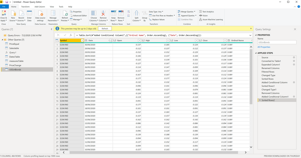
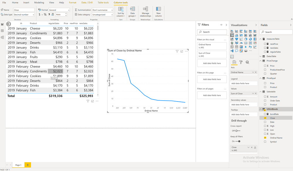
I'm trying to create a simple yield curve line chart in Power BI using bond rates that I have compiled in a table as seen in the screenshot 1. The X-axis needs to be the name of the bond and the Y-axis needs to be the ACTUAL VALUE of the bond rate as it is entered exactly in the "close column" from the table in screenshot 2, NOT A SUM, COUNT, etc. I have searched for 2 days to find a solution that works and I have yet to understand how to solve for this. The data in the table I have now is only for the United States, but I need to be able to find a solution to use for over 30 countries I have data for.
Is there something I'm missing?
Any help would be amazing. Thanks.


Solved! Go to Solution.
- Mark as New
- Bookmark
- Subscribe
- Mute
- Subscribe to RSS Feed
- Permalink
- Report Inappropriate Content
@AllisonKennedyThanks for replying so soon, I appreciate it.
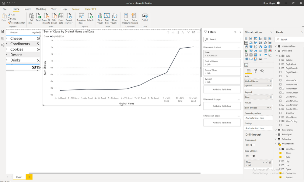
The "close" values are the price for each gov't bond at the end of each day, so every date will have a "close value" for each individual bond. I just want to be able to see the yield curve line for each single day, or the latest day, which I'm guessing means I need to add the date column to the x-axis (as you mentioned).
I just tried to add additional information as you said and it works as I need it to. The lack of additional data (date, symbol, etc.) was the problem. After adding "date" to the x-axis and filtering data for the latest single day, it works perfectly. Thank you very much for helping me solve this. Seems so simple in hindsight.
- Mark as New
- Bookmark
- Subscribe
- Mute
- Subscribe to RSS Feed
- Permalink
- Report Inappropriate Content
In your screenshot 1, you have LOTS of Close values for each Ordinal Name, if you can better describe which value you want graphed in the line chart, we can help you translate that into DAX or Power BI, but you must have some sort of formula or aggregation or filter to determine which value to choose for the line graph.
Hope that makes sense?
Please @mention me in your reply if you want a response.
Copying DAX from this post? Click here for a hack to quickly replace it with your own table names
Has this post solved your problem? Please Accept as Solution so that others can find it quickly and to let the community know your problem has been solved.
If you found this post helpful, please give Kudos C
I work as a Microsoft trainer and consultant, specialising in Power BI and Power Query.
www.excelwithallison.com
- Mark as New
- Bookmark
- Subscribe
- Mute
- Subscribe to RSS Feed
- Permalink
- Report Inappropriate Content
@AllisonKennedyThanks for replying so soon, I appreciate it.
The "close" values are the price for each gov't bond at the end of each day, so every date will have a "close value" for each individual bond. I just want to be able to see the yield curve line for each single day, or the latest day, which I'm guessing means I need to add the date column to the x-axis (as you mentioned).
I just tried to add additional information as you said and it works as I need it to. The lack of additional data (date, symbol, etc.) was the problem. After adding "date" to the x-axis and filtering data for the latest single day, it works perfectly. Thank you very much for helping me solve this. Seems so simple in hindsight.
Helpful resources

Microsoft Fabric Learn Together
Covering the world! 9:00-10:30 AM Sydney, 4:00-5:30 PM CET (Paris/Berlin), 7:00-8:30 PM Mexico City

Power BI Monthly Update - April 2024
Check out the April 2024 Power BI update to learn about new features.

| User | Count |
|---|---|
| 113 | |
| 100 | |
| 78 | |
| 76 | |
| 52 |
| User | Count |
|---|---|
| 146 | |
| 109 | |
| 106 | |
| 88 | |
| 61 |

