Go To
- Power BI forums
- Updates
- News & Announcements
- Get Help with Power BI
- Desktop
- Service
- Report Server
- Power Query
- Mobile Apps
- Developer
- DAX Commands and Tips
- Custom Visuals Development Discussion
- Health and Life Sciences
- Power BI Spanish forums
- Translated Spanish Desktop
- Power Platform Integration - Better Together!
- Power Platform Integrations (Read-only)
- Power Platform and Dynamics 365 Integrations (Read-only)
- Training and Consulting
- Instructor Led Training
- Dashboard in a Day for Women, by Women
- Galleries
- Community Connections & How-To Videos
- COVID-19 Data Stories Gallery
- Themes Gallery
- Data Stories Gallery
- R Script Showcase
- Webinars and Video Gallery
- Quick Measures Gallery
- 2021 MSBizAppsSummit Gallery
- 2020 MSBizAppsSummit Gallery
- 2019 MSBizAppsSummit Gallery
- Events
- Ideas
- Custom Visuals Ideas
- Issues
- Issues
- Events
- Upcoming Events
- Community Blog
- Power BI Community Blog
- Custom Visuals Community Blog
- Community Support
- Community Accounts & Registration
- Using the Community
- Community Feedback
Turn on suggestions
Auto-suggest helps you quickly narrow down your search results by suggesting possible matches as you type.
Showing results for
Register now to learn Fabric in free live sessions led by the best Microsoft experts. From Apr 16 to May 9, in English and Spanish.
- Power BI forums
- Forums
- Get Help with Power BI
- Desktop
- Looking to create a Span Chart on Power BI. What's...
Reply
Topic Options
- Subscribe to RSS Feed
- Mark Topic as New
- Mark Topic as Read
- Float this Topic for Current User
- Bookmark
- Subscribe
- Printer Friendly Page
- Mark as New
- Bookmark
- Subscribe
- Mute
- Subscribe to RSS Feed
- Permalink
- Report Inappropriate Content
Looking to create a Span Chart on Power BI. What's the best way to do so?
05-28-2019
08:04 AM
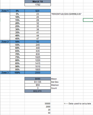
Currently use a span chart updated manually on Excel to track percentiles along with other statistics (median, STD, etc.) -- looking to replicate this in Power BI so it's automatically updates.
screenshot attached for reference.
1 REPLY 1
- Mark as New
- Bookmark
- Subscribe
- Mute
- Subscribe to RSS Feed
- Permalink
- Report Inappropriate Content
05-29-2019
12:56 AM
Hi @mj1996 ,
Power bi not allow you to create this chart, maybe you can try to create calculated table based on raw table records.
Calculated Table =
UNION (
    ROW ( "Calculate", "Median", "Result", MEDIANX ( 'Sample', 'Sample'[Amount] ) ),
    ROW ( "Calculate", "STD", "Result", STDEVX.S ( 'Sample', 'Sample'[Amount] ) ),
    ROW ( "Calculate", "Total", "Result", SUMX ( 'Sample', 'Sample'[Amount] ) )
)
Above table result will change based on sample table records.
Regards,
Xiaoxin Sheng
Community Support Team _ Xiaoxin
If this post helps, please consider accept as solution to help other members find it more quickly.
If this post helps, please consider accept as solution to help other members find it more quickly.
Helpful resources
Announcements

Microsoft Fabric Learn Together
Covering the world! 9:00-10:30 AM Sydney, 4:00-5:30 PM CET (Paris/Berlin), 7:00-8:30 PM Mexico City

Power BI Monthly Update - April 2024
Check out the April 2024 Power BI update to learn about new features.

Featured Topics
Top Solution Authors
| User | Count |
|---|---|
| 109 | |
| 95 | |
| 77 | |
| 65 | |
| 53 |
Top Kudoed Authors
| User | Count |
|---|---|
| 144 | |
| 105 | |
| 102 | |
| 89 | |
| 63 |

