- Power BI forums
- Updates
- News & Announcements
- Get Help with Power BI
- Desktop
- Service
- Report Server
- Power Query
- Mobile Apps
- Developer
- DAX Commands and Tips
- Custom Visuals Development Discussion
- Health and Life Sciences
- Power BI Spanish forums
- Translated Spanish Desktop
- Power Platform Integration - Better Together!
- Power Platform Integrations (Read-only)
- Power Platform and Dynamics 365 Integrations (Read-only)
- Training and Consulting
- Instructor Led Training
- Dashboard in a Day for Women, by Women
- Galleries
- Community Connections & How-To Videos
- COVID-19 Data Stories Gallery
- Themes Gallery
- Data Stories Gallery
- R Script Showcase
- Webinars and Video Gallery
- Quick Measures Gallery
- 2021 MSBizAppsSummit Gallery
- 2020 MSBizAppsSummit Gallery
- 2019 MSBizAppsSummit Gallery
- Events
- Ideas
- Custom Visuals Ideas
- Issues
- Issues
- Events
- Upcoming Events
- Community Blog
- Power BI Community Blog
- Custom Visuals Community Blog
- Community Support
- Community Accounts & Registration
- Using the Community
- Community Feedback
Register now to learn Fabric in free live sessions led by the best Microsoft experts. From Apr 16 to May 9, in English and Spanish.
- Power BI forums
- Forums
- Get Help with Power BI
- Desktop
- Re: Looking for advice to choice a suitable visual
- Subscribe to RSS Feed
- Mark Topic as New
- Mark Topic as Read
- Float this Topic for Current User
- Bookmark
- Subscribe
- Printer Friendly Page
- Mark as New
- Bookmark
- Subscribe
- Mute
- Subscribe to RSS Feed
- Permalink
- Report Inappropriate Content
Looking for advice to choice a suitable visual
The visual below contains stock value data since summer 2016.
To make it more readable I would like to combine for each line
- the value available at the end of FY 16 17 as single data
- the line that represent the value for the current FY
I do not have any idea how to achieve that.
Is there some suggestion?
Regards
- Mark as New
- Bookmark
- Subscribe
- Mute
- Subscribe to RSS Feed
- Permalink
- Report Inappropriate Content
You may try dragging date from a calendar table and add an appropriate measure to Visual level filters.
If this post helps, then please consider Accept it as the solution to help the other members find it more quickly.
- Mark as New
- Bookmark
- Subscribe
- Mute
- Subscribe to RSS Feed
- Permalink
- Report Inappropriate Content
Thanks for your feedback.
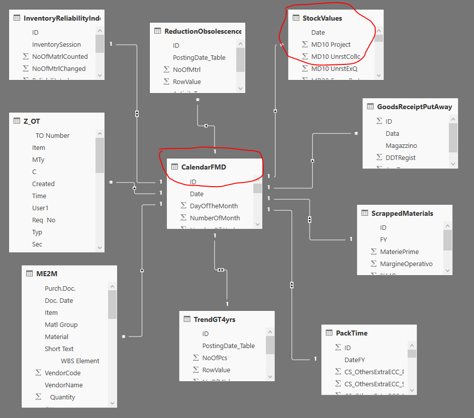
I think I did not catch the point. I have already in my dataset dates and join among tables.
What is not clear to me is how to combine a single data (for example MAX or AVERAGE at end of FY for each of those value) in a line chart.
Regards
gpiero
- Mark as New
- Bookmark
- Subscribe
- Mute
- Subscribe to RSS Feed
- Permalink
- Report Inappropriate Content
Hi,
Maybe you can create a calculated measure or column in the stock table, with a calculation of the MAX(value) (highest price) or the value on date=MAX(date) (latest value). Then add these to your visual.
Regards,
Jelle
- Mark as New
- Bookmark
- Subscribe
- Mute
- Subscribe to RSS Feed
- Permalink
- Report Inappropriate Content
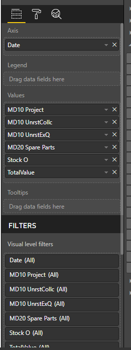
The following measure works perfectly. I check the calculation and it is ok. No problem at this stage.
TotalStockAtDate = CALCULATE(AVERAGE(StockValues[TotalValue]);FILTER(StockValues;StockValues[Date] >= DATEVALUE("01/07/2016"));FILTER(StockValues;StockValues[Date] <= DATEVALUE("30/06/2017")))What I am not able to do is adding this value in the chart in a proper way.
Pheraps I am wrong but I think that a Line chart does not allow to combine correctly as I would like to do.
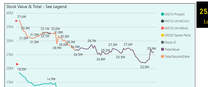
Look what happens below if I add the measure above:
Line TotalStockAtDate overlapped to TotalValue till to the Date specified in the measure above.
I would like to represent TotalStockAtDate as a single point or circle or someting else at the left of the visual. Look at two red circles and imagine them will represent MAX or AVERAGE or last value of each stock at the end of previous FY.
It could be a simple way to compare last FY vs current trend.
Is there some other visual better than that?
Many thansk for any help.
Regards
gpiero
Helpful resources

Microsoft Fabric Learn Together
Covering the world! 9:00-10:30 AM Sydney, 4:00-5:30 PM CET (Paris/Berlin), 7:00-8:30 PM Mexico City

Power BI Monthly Update - April 2024
Check out the April 2024 Power BI update to learn about new features.

| User | Count |
|---|---|
| 109 | |
| 98 | |
| 77 | |
| 66 | |
| 54 |
| User | Count |
|---|---|
| 144 | |
| 104 | |
| 101 | |
| 86 | |
| 64 |


