- Power BI forums
- Updates
- News & Announcements
- Get Help with Power BI
- Desktop
- Service
- Report Server
- Power Query
- Mobile Apps
- Developer
- DAX Commands and Tips
- Custom Visuals Development Discussion
- Health and Life Sciences
- Power BI Spanish forums
- Translated Spanish Desktop
- Power Platform Integration - Better Together!
- Power Platform Integrations (Read-only)
- Power Platform and Dynamics 365 Integrations (Read-only)
- Training and Consulting
- Instructor Led Training
- Dashboard in a Day for Women, by Women
- Galleries
- Community Connections & How-To Videos
- COVID-19 Data Stories Gallery
- Themes Gallery
- Data Stories Gallery
- R Script Showcase
- Webinars and Video Gallery
- Quick Measures Gallery
- 2021 MSBizAppsSummit Gallery
- 2020 MSBizAppsSummit Gallery
- 2019 MSBizAppsSummit Gallery
- Events
- Ideas
- Custom Visuals Ideas
- Issues
- Issues
- Events
- Upcoming Events
- Community Blog
- Power BI Community Blog
- Custom Visuals Community Blog
- Community Support
- Community Accounts & Registration
- Using the Community
- Community Feedback
Register now to learn Fabric in free live sessions led by the best Microsoft experts. From Apr 16 to May 9, in English and Spanish.
- Power BI forums
- Forums
- Get Help with Power BI
- Desktop
- Looking for a visual or hint how to make one like ...
- Subscribe to RSS Feed
- Mark Topic as New
- Mark Topic as Read
- Float this Topic for Current User
- Bookmark
- Subscribe
- Printer Friendly Page
- Mark as New
- Bookmark
- Subscribe
- Mute
- Subscribe to RSS Feed
- Permalink
- Report Inappropriate Content
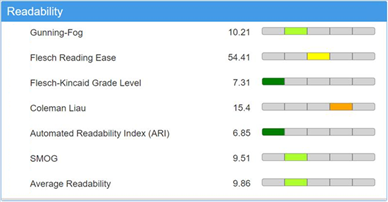
Looking for a visual or hint how to make one like this
Hi,
Using sample JSON data I need to build a visual most like screen below. Have you seen something like this or could you advice how can i make it?
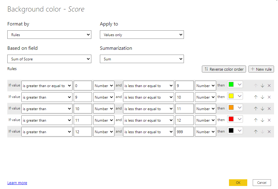
Green <=9, Yellow >9 and <=10,
Orange >10 and <=11, Red >11 and <=12, Black >12
The JSON file is like this if it is needed to help me:
{
  "Statistics": {
    "Segments": {
      "Readability_Indexes": {
        "row": [
          {
            "@name": "Gunning-Fog Index",
            "@value": "11.85",
            "@percent": "-1",
            "@hvalue": "12.18",
            "@hpercent": "-1"
          },
          {
            "@name": "Flesch Reading Ease score",
            "@value": "51.98",
            "@percent": "-1",
            "@hvalue": "52.32",
            "@hpercent": "-1"
          },
          {
            "@name": "Flesch-Kincaid Grade Level score",
            "@value": "8.14",
            "@percent": "-1",
            "@hvalue": "8.88",
            "@hpercent": "-1"
          },
          {
            "@name": "Automated Readability Index (ARI)",
            "@value": "8.59",
            "@percent": "-1",
            "@hvalue": "16.58",
            "@hpercent": "-1"
          },
          {
            "@name": "SMOG Index",
            "@value": "10.8",
            "@percent": "-1",
            "@hvalue": "11.58",
            "@hpercent": "-1"
          },
          {
            "@name": "Average Readability Index",
            "@value": "11.15",
            "@percent": "-1",
            "@hvalue": "14.724",
            "@hpercent": "-1"
          }
        ]
      }
    }
  }
}
- Mark as New
- Bookmark
- Subscribe
- Mute
- Subscribe to RSS Feed
- Permalink
- Report Inappropriate Content
Hi @Anonymous ,
Can you accept changing the icon? Maybe you can choose something similar like this. You can change the color of each bar and use it like what mentioned here: Power BI RAG Icons Custom Conditional Formatting (mssqltips.com).
Best Regards,
Icey
If this post helps, then please consider Accept it as the solution to help the other members find it more quickly.
- Mark as New
- Bookmark
- Subscribe
- Mute
- Subscribe to RSS Feed
- Permalink
- Report Inappropriate Content
How close does it have to be to the example you provided?
You can do conditional formatting without needing extra visuals.
- Mark as New
- Bookmark
- Subscribe
- Mute
- Subscribe to RSS Feed
- Permalink
- Report Inappropriate Content
As close as possible.
I did the formatting as you did above. The problem is to create the visual. I used matrix and got close enough but it is not the same. Plus i can not get a second column with data live above in rows as in matrix it creates this [+] and it adds another row ;/
Helpful resources

Microsoft Fabric Learn Together
Covering the world! 9:00-10:30 AM Sydney, 4:00-5:30 PM CET (Paris/Berlin), 7:00-8:30 PM Mexico City

Power BI Monthly Update - April 2024
Check out the April 2024 Power BI update to learn about new features.

| User | Count |
|---|---|
| 114 | |
| 99 | |
| 83 | |
| 70 | |
| 60 |
| User | Count |
|---|---|
| 150 | |
| 115 | |
| 104 | |
| 89 | |
| 65 |


