- Power BI forums
- Updates
- News & Announcements
- Get Help with Power BI
- Desktop
- Service
- Report Server
- Power Query
- Mobile Apps
- Developer
- DAX Commands and Tips
- Custom Visuals Development Discussion
- Health and Life Sciences
- Power BI Spanish forums
- Translated Spanish Desktop
- Power Platform Integration - Better Together!
- Power Platform Integrations (Read-only)
- Power Platform and Dynamics 365 Integrations (Read-only)
- Training and Consulting
- Instructor Led Training
- Dashboard in a Day for Women, by Women
- Galleries
- Community Connections & How-To Videos
- COVID-19 Data Stories Gallery
- Themes Gallery
- Data Stories Gallery
- R Script Showcase
- Webinars and Video Gallery
- Quick Measures Gallery
- 2021 MSBizAppsSummit Gallery
- 2020 MSBizAppsSummit Gallery
- 2019 MSBizAppsSummit Gallery
- Events
- Ideas
- Custom Visuals Ideas
- Issues
- Issues
- Events
- Upcoming Events
- Community Blog
- Power BI Community Blog
- Custom Visuals Community Blog
- Community Support
- Community Accounts & Registration
- Using the Community
- Community Feedback
Register now to learn Fabric in free live sessions led by the best Microsoft experts. From Apr 16 to May 9, in English and Spanish.
- Power BI forums
- Forums
- Get Help with Power BI
- Desktop
- Re: Linking Table
- Subscribe to RSS Feed
- Mark Topic as New
- Mark Topic as Read
- Float this Topic for Current User
- Bookmark
- Subscribe
- Printer Friendly Page
- Mark as New
- Bookmark
- Subscribe
- Mute
- Subscribe to RSS Feed
- Permalink
- Report Inappropriate Content
Linking Table
Struggling to figure this one out, but im sure there is a simple way im not seeing!
Im trying to link a large data set from a survey of various things.
On one part of the dataset im asking to rate satisfaction of 3 services. The columns are headered up as "Service 1" "Service 2" "Service 3" "Service 4". All these columns have "Very Satisfied" "satisfied" "Dissatisfied" "Very Dissatisfied" depending on what the user inserted.
I created a seperate sheet within same excel dataset, and created a table which I used the Countif function to count how many of each rating was in the columns (see table)
I have taken this into Power Bi and it works great in clustered graph, however I want to use a slicer to filter the results to show how many of these people using each service are from "area 1", "area 2" or "area 3" (column "Area" in main dataset). There is also an ID column which has unique numbers in each row to use as an identification.
I can't get the slicer to work as Power Bi doesnt recognise there is a relationship between the two tables.
Can someone explain to a newbie how to go about this? I cant figure out how to get a relationship to enable the
thank you 🙂
Solved! Go to Solution.
- Mark as New
- Bookmark
- Subscribe
- Mute
- Subscribe to RSS Feed
- Permalink
- Report Inappropriate Content
I make a test with your example dataset.
1. in Edit Queries
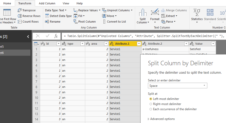
(1)select "Service1 a-Usefulness " to "Service1 e-Website and online resources" five columns, then select "Unpivot columns" (under "Transform" tab)
(2) split columns
click on column [Attribute], select split columns by delimeter
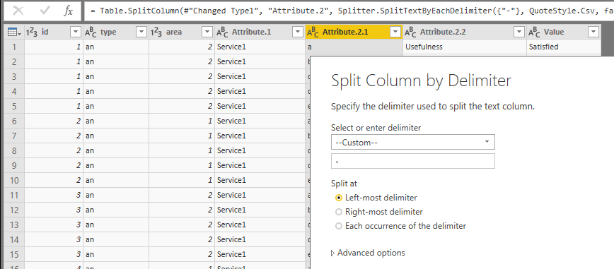
click on column [Attribute.2], select split columns by delimeter
then rename columns
[Attribute.1]->[service]
[Attribute.2.2]->[service-sub]
close&apply
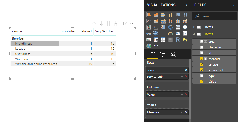
2. create a measure
Measure = COUNT(Sheet6[Value])
add columns and measure in a matrix visual
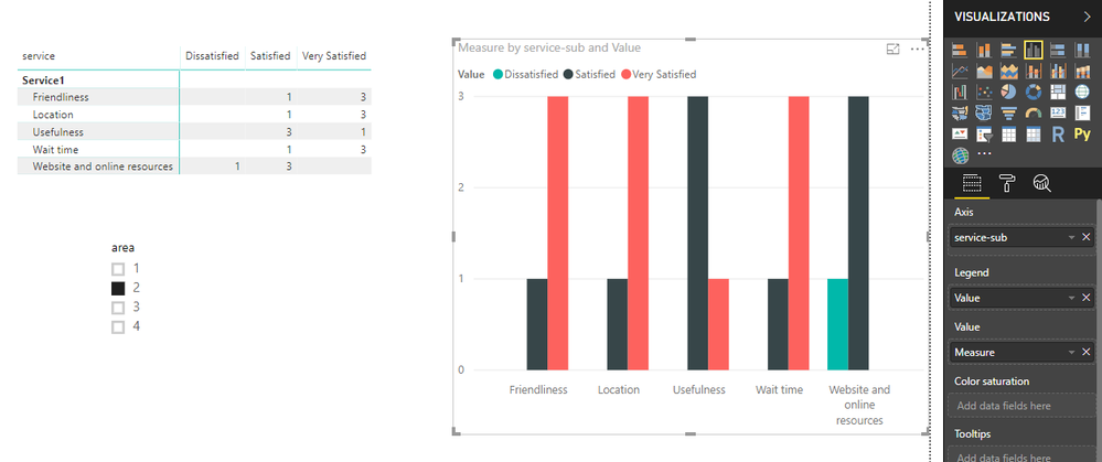
3. add columns and measures in the column chart as below, you will see
Best Regards
Maggie
- Mark as New
- Bookmark
- Subscribe
- Mute
- Subscribe to RSS Feed
- Permalink
- Report Inappropriate Content
Thank you VERY much v-juanli-msft 🙂
This is amazing and would never be able to figure that out by myself.
- Mark as New
- Bookmark
- Subscribe
- Mute
- Subscribe to RSS Feed
- Permalink
- Report Inappropriate Content
Hi,
I cannot visualise your entire table. Show the entire/all Tables and show the expected result.
Regards,
Ashish Mathur
http://www.ashishmathur.com
https://www.linkedin.com/in/excelenthusiasts/
- Mark as New
- Bookmark
- Subscribe
- Mute
- Subscribe to RSS Feed
- Permalink
- Report Inappropriate Content
Large dataset (a section of it)
Countif Table in another tab of excel (Just an example - i know the amounts dont equate to the table above!):
And the result I want in Power Bi is:
The dataset is absolutlely massive as this was a large survey - this section is only one small part of it. If i can filter by area (Campus type on this visual) then i'll be able to pull this into the rest of the service results/graphs (100+ of them).
Any guidance would be greatly appreciated!
- Mark as New
- Bookmark
- Subscribe
- Mute
- Subscribe to RSS Feed
- Permalink
- Report Inappropriate Content
Hi,
In the Query Editor, select the first 3 columns and select "Unpivot other columns". Now build your visual.
Regards,
Ashish Mathur
http://www.ashishmathur.com
https://www.linkedin.com/in/excelenthusiasts/
Helpful resources

Microsoft Fabric Learn Together
Covering the world! 9:00-10:30 AM Sydney, 4:00-5:30 PM CET (Paris/Berlin), 7:00-8:30 PM Mexico City

Power BI Monthly Update - April 2024
Check out the April 2024 Power BI update to learn about new features.

| User | Count |
|---|---|
| 110 | |
| 94 | |
| 80 | |
| 67 | |
| 59 |
| User | Count |
|---|---|
| 150 | |
| 119 | |
| 104 | |
| 87 | |
| 67 |


