- Power BI forums
- Updates
- News & Announcements
- Get Help with Power BI
- Desktop
- Service
- Report Server
- Power Query
- Mobile Apps
- Developer
- DAX Commands and Tips
- Custom Visuals Development Discussion
- Health and Life Sciences
- Power BI Spanish forums
- Translated Spanish Desktop
- Power Platform Integration - Better Together!
- Power Platform Integrations (Read-only)
- Power Platform and Dynamics 365 Integrations (Read-only)
- Training and Consulting
- Instructor Led Training
- Dashboard in a Day for Women, by Women
- Galleries
- Community Connections & How-To Videos
- COVID-19 Data Stories Gallery
- Themes Gallery
- Data Stories Gallery
- R Script Showcase
- Webinars and Video Gallery
- Quick Measures Gallery
- 2021 MSBizAppsSummit Gallery
- 2020 MSBizAppsSummit Gallery
- 2019 MSBizAppsSummit Gallery
- Events
- Ideas
- Custom Visuals Ideas
- Issues
- Issues
- Events
- Upcoming Events
- Community Blog
- Power BI Community Blog
- Custom Visuals Community Blog
- Community Support
- Community Accounts & Registration
- Using the Community
- Community Feedback
Register now to learn Fabric in free live sessions led by the best Microsoft experts. From Apr 16 to May 9, in English and Spanish.
- Power BI forums
- Forums
- Get Help with Power BI
- Desktop
- Line value not coming as expected
- Subscribe to RSS Feed
- Mark Topic as New
- Mark Topic as Read
- Float this Topic for Current User
- Bookmark
- Subscribe
- Printer Friendly Page
- Mark as New
- Bookmark
- Subscribe
- Mute
- Subscribe to RSS Feed
- Permalink
- Report Inappropriate Content
Line value not coming as expected

Hi,
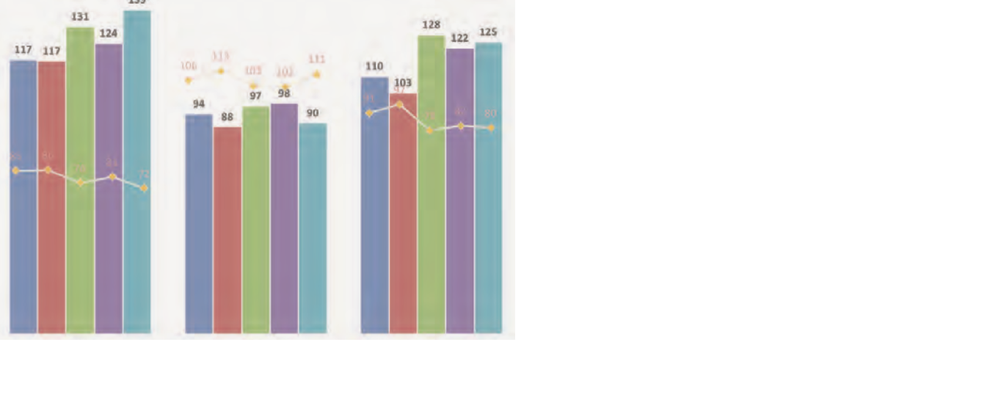
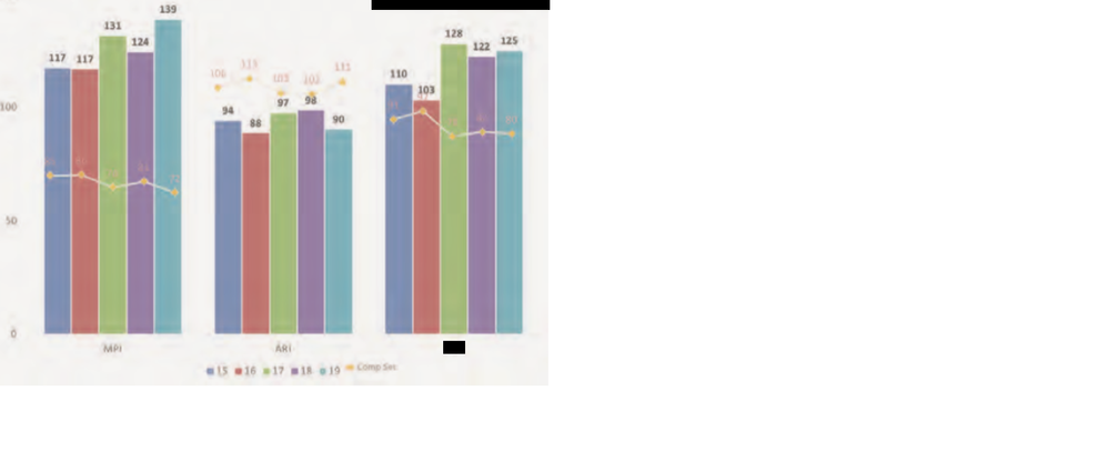
This is line and clustered column chart, 2 issues please help
a. The blue line (line values) is not starting from the first chart (blue one)
b. The pink and blue bar need a gap.
Any suggestions would be appreciated.
Thanks,
- Mark as New
- Bookmark
- Subscribe
- Mute
- Subscribe to RSS Feed
- Permalink
- Report Inappropriate Content
Hi @YashikaAgrawal,
a. The blue line (line values) is not starting from the first chart (blue one)
It is normal that the line is not starting from the first bar if you mean bar and not chart, because it is a group so the line will start in the middle.
b. The pink and blue bar need a gap.
I don't get why you need a space between them but as I stated above, you are delaring it as a group that's why. If you need a gap between them or between pink and blue, you need to elaborate your x axis.
Hope this helps.
- Mark as New
- Bookmark
- Subscribe
- Mute
- Subscribe to RSS Feed
- Permalink
- Report Inappropriate Content
Thanks for the reply.
I have attached the expected report, please let me know what changes has be done.

- Mark as New
- Bookmark
- Subscribe
- Mute
- Subscribe to RSS Feed
- Permalink
- Report Inappropriate Content
HI @YashikaAgrawal,
You can write multiple measure formals with if statements to check current range and skip calculate on unmatched records, then you can use these measure formula on 'line value' field to achieve your requirement.
If you confused about coding formula, please share some dummy data with the expected results to test and coding formula.
Regard,
Xiaoxin Sheng
If this post helps, please consider accept as solution to help other members find it more quickly.
- Mark as New
- Bookmark
- Subscribe
- Mute
- Subscribe to RSS Feed
- Permalink
- Report Inappropriate Content
Thank you for the replies.
Attached the source data and the expected output, please let me know the formula to be used to get this, Thank you.

Excel could not attached here, below is the source data.
| PropertyID | Year | Type | Description | Chart Value | Compset |
| 11 | 2015 | MPI | Message Passing Interface | 117 | 85 |
| 11 | 2016 | MPI | Message Passing Interface | 117 | 86 |
| 11 | 2017 | MPI | Message Passing Interface | 131 | 70 |
| 11 | 2018 | MPI | Message Passing Interface | 124 | 81 |
| 11 | 2019 | MPI | Message Passing Interface | 139 | 72 |
| 11 | 2015 | ARI | Agharkar Research Institute | 94 | 106 |
| 11 | 2016 | ARI | Agharkar Research Institute | 88 | 114 |
| 11 | 2017 | ARI | Agharkar Research Institute | 97 | 103 |
| 11 | 2018 | ARI | Agharkar Research Institute | 98 | 103 |
| 11 | 2019 | ARI | Agharkar Research Institute | 90 | 111
|
- Mark as New
- Bookmark
- Subscribe
- Mute
- Subscribe to RSS Feed
- Permalink
- Report Inappropriate Content
HI @YashikaAgrawal,
Based on my test, I found line value will be forced summarize by axis and legend field not works to split these on line graph. I'd like to suggest you to use r visual to draw clustered column chart graph and split line graph at the same time.
Regards,
Xiaoxin Sheng
If this post helps, please consider accept as solution to help other members find it more quickly.
- Mark as New
- Bookmark
- Subscribe
- Mute
- Subscribe to RSS Feed
- Permalink
- Report Inappropriate Content
Create 3 separate charts to achieve your desired output.
Helpful resources

Microsoft Fabric Learn Together
Covering the world! 9:00-10:30 AM Sydney, 4:00-5:30 PM CET (Paris/Berlin), 7:00-8:30 PM Mexico City

Power BI Monthly Update - April 2024
Check out the April 2024 Power BI update to learn about new features.

| User | Count |
|---|---|
| 112 | |
| 97 | |
| 78 | |
| 68 | |
| 55 |
| User | Count |
|---|---|
| 145 | |
| 105 | |
| 104 | |
| 90 | |
| 63 |
