- Power BI forums
- Updates
- News & Announcements
- Get Help with Power BI
- Desktop
- Service
- Report Server
- Power Query
- Mobile Apps
- Developer
- DAX Commands and Tips
- Custom Visuals Development Discussion
- Health and Life Sciences
- Power BI Spanish forums
- Translated Spanish Desktop
- Power Platform Integration - Better Together!
- Power Platform Integrations (Read-only)
- Power Platform and Dynamics 365 Integrations (Read-only)
- Training and Consulting
- Instructor Led Training
- Dashboard in a Day for Women, by Women
- Galleries
- Community Connections & How-To Videos
- COVID-19 Data Stories Gallery
- Themes Gallery
- Data Stories Gallery
- R Script Showcase
- Webinars and Video Gallery
- Quick Measures Gallery
- 2021 MSBizAppsSummit Gallery
- 2020 MSBizAppsSummit Gallery
- 2019 MSBizAppsSummit Gallery
- Events
- Ideas
- Custom Visuals Ideas
- Issues
- Issues
- Events
- Upcoming Events
- Community Blog
- Power BI Community Blog
- Custom Visuals Community Blog
- Community Support
- Community Accounts & Registration
- Using the Community
- Community Feedback
Register now to learn Fabric in free live sessions led by the best Microsoft experts. From Apr 16 to May 9, in English and Spanish.
- Power BI forums
- Forums
- Get Help with Power BI
- Desktop
- Line stype in the graph
- Subscribe to RSS Feed
- Mark Topic as New
- Mark Topic as Read
- Float this Topic for Current User
- Bookmark
- Subscribe
- Printer Friendly Page
- Mark as New
- Bookmark
- Subscribe
- Mute
- Subscribe to RSS Feed
- Permalink
- Report Inappropriate Content
Line stype in the graph
Hello,
please I need that the curve in green whenevr it is before the bar chart the type of the line is solid and when it is after the bar chart the type of the line should be a dotted line. because all what is before the bar chart is our actuals and after the bar chart is our forecast.
the bar char is our reporting week (in below case is 20W33).
Thanks for your support.
- Mark as New
- Bookmark
- Subscribe
- Mute
- Subscribe to RSS Feed
- Permalink
- Report Inappropriate Content
You could split the green line measure into two measure, then set line type separately.
for example:
Green measure 1=IF(MAX('Date'[Date])<=MAX('20W33'[Date]),[green line measure])
Green measure 2=IF(MAX('Date'[Date])>=MAX('20W33'[Date]),[green line measure])
Then use Green measure 1 and Green measure 2 in the line chart instead of green line measure. Now do formatting for these two new measure.
Regards,
Lin
If this post helps, then please consider Accept it as the solution to help the other members find it more quickly.
- Mark as New
- Bookmark
- Subscribe
- Mute
- Subscribe to RSS Feed
- Permalink
- Report Inappropriate Content
for the green line i don't have a measure but a column which is calculating the cumulative of my data
- Mark as New
- Bookmark
- Subscribe
- Mute
- Subscribe to RSS Feed
- Permalink
- Report Inappropriate Content
Please @mention me in your reply if you want a response.
Copying DAX from this post? Click here for a hack to quickly replace it with your own table names
Has this post solved your problem? Please Accept as Solution so that others can find it quickly and to let the community know your problem has been solved.
If you found this post helpful, please give Kudos C
I work as a Microsoft trainer and consultant, specialising in Power BI and Power Query.
www.excelwithallison.com
- Mark as New
- Bookmark
- Subscribe
- Mute
- Subscribe to RSS Feed
- Permalink
- Report Inappropriate Content
Table name: STC_Deploy Progress
Column that calculate cumulative of the green line: cumulative. ACT+ FCT
for the red bar chart i've already shared the measure that i've used + column with formula that i've used.
br,
- Mark as New
- Bookmark
- Subscribe
- Mute
- Subscribe to RSS Feed
- Permalink
- Report Inappropriate Content
- Mark as New
- Bookmark
- Subscribe
- Mute
- Subscribe to RSS Feed
- Permalink
- Report Inappropriate Content
If possible, please share your simple sample pbix file for us, that will be a great help.
Regards,
Lin
If this post helps, then please consider Accept it as the solution to help the other members find it more quickly.
- Mark as New
- Bookmark
- Subscribe
- Mute
- Subscribe to RSS Feed
- Permalink
- Report Inappropriate Content
Could you please share your sample pbix file for us have a test, that will be a great help.
Regards,
Lin
If this post helps, then please consider Accept it as the solution to help the other members find it more quickly.
- Mark as New
- Bookmark
- Subscribe
- Mute
- Subscribe to RSS Feed
- Permalink
- Report Inappropriate Content
https://docs.microsoft.com/en-us/power-bi/visuals/service-tips-and-tricks-for-color-formatting
Please provide sample data tables and your current calculations for the red and green lines if you would like more specific help.
Please @mention me in your reply if you want a response.
Copying DAX from this post? Click here for a hack to quickly replace it with your own table names
Has this post solved your problem? Please Accept as Solution so that others can find it quickly and to let the community know your problem has been solved.
If you found this post helpful, please give Kudos C
I work as a Microsoft trainer and consultant, specialising in Power BI and Power Query.
www.excelwithallison.com
- Mark as New
- Bookmark
- Subscribe
- Mute
- Subscribe to RSS Feed
- Permalink
- Report Inappropriate Content
@Zakaria_1980 , you need the red bar the green dotted line. Not very clear to me
Microsoft Power BI Learning Resources, 2023 !!
Learn Power BI - Full Course with Dec-2022, with Window, Index, Offset, 100+ Topics !!
Did I answer your question? Mark my post as a solution! Appreciate your Kudos !! Proud to be a Super User! !!
- Mark as New
- Bookmark
- Subscribe
- Mute
- Subscribe to RSS Feed
- Permalink
- Report Inappropriate Content
the red bar is shifted automatically from week to another based on the actual figures that i got. in the grapg i've shared with you, i got the actuals for W33 which means the red bar is plot automatically in the that week.
what i've asked is only on thu curve in green. in the graph i've sent i made the type of the line in dash. the team want that curve the type of the line should be solid before the red bar and then the type will change in dotted line after the red bar.
- Mark as New
- Bookmark
- Subscribe
- Mute
- Subscribe to RSS Feed
- Permalink
- Report Inappropriate Content
As a "quick and dirty" alternative to the solutions offered, you can use conditional formatting on a line chart (well, kind of...There isn't an option to apply conditional formatting in a line chart as a default option).
However...
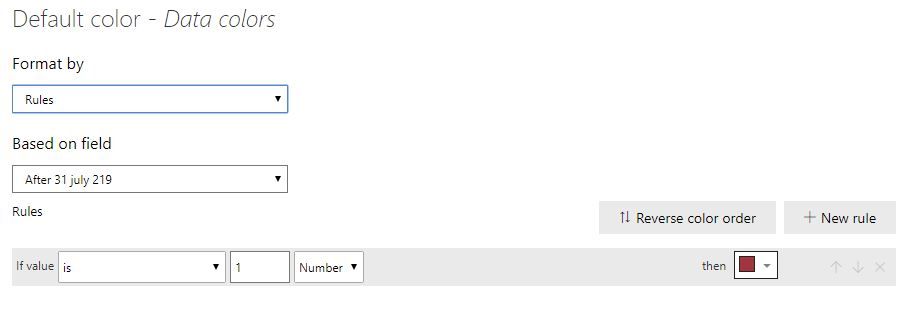
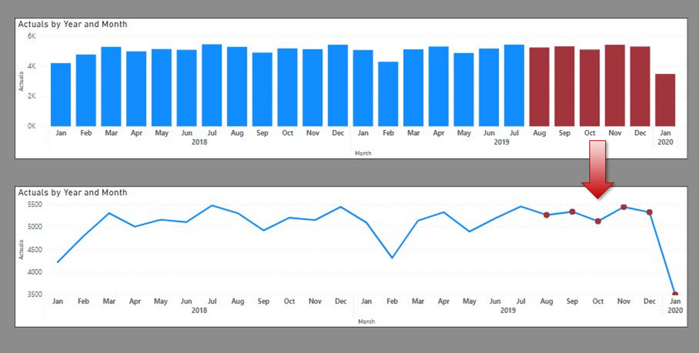
Start with a bar chart, and apply the conditional formatting (in this example, I've simply coloured the data points after july 2019 in the reddish colour, using a simple measure to set a rule in the conditional formatting interface):
After 31 july 219 = IF(MAX('Calendar Table'[Date])> DATE(2019, 07, 31), 1)
Once you have set the conditional colour on the bar chart, select the visual and change it by clicking on the line chart visual in the visuals pane, to get you something like this (not ideal, I know, but "quick and dirty"...)
However, that is about it as to the formatting options you get using this method.
If you need flexiblility, I would follow @AllisonKennedy suggestion.
Did I answer your question? Mark my post as a solution!
In doing so, you are also helping me. Thank you!
Proud to be a Super User!
Paul on Linkedin.
- Mark as New
- Bookmark
- Subscribe
- Mute
- Subscribe to RSS Feed
- Permalink
- Report Inappropriate Content
That picture you drew is exactly what I had in mind after your first post, just need to know what your raw data model looks like and what are you currently using for the values of the green and red lines? Is the red line a MEASURE? is the green line a column or measure?
To make the line change style, you will need to split the line into two MEASURES - so first calculate the green line for everything BEFORE week 33. Make this solid. Then calculate the green line for everything AFTER week 33. Make this dotted.
Does that make sense? Let us know how you get on and if you need more info we will need your specific table and column names and their relationships.
It can change colour at the red line using conditional formatting.
Please @mention me in your reply if you want a response.
Copying DAX from this post? Click here for a hack to quickly replace it with your own table names
Has this post solved your problem? Please Accept as Solution so that others can find it quickly and to let the community know your problem has been solved.
If you found this post helpful, please give Kudos C
I work as a Microsoft trainer and consultant, specialising in Power BI and Power Query.
www.excelwithallison.com
- Mark as New
- Bookmark
- Subscribe
- Mute
- Subscribe to RSS Feed
- Permalink
- Report Inappropriate Content
HI @Zakaria_1980 ,
I don't think this is possible to achieve as you want same metric to be shown as solid line before the bar and dotted line after the same bar.
Happy to know if someone in the community can tell a workaround for this.
Thanks,
Pragati
Helpful resources

Microsoft Fabric Learn Together
Covering the world! 9:00-10:30 AM Sydney, 4:00-5:30 PM CET (Paris/Berlin), 7:00-8:30 PM Mexico City

Power BI Monthly Update - April 2024
Check out the April 2024 Power BI update to learn about new features.

| User | Count |
|---|---|
| 118 | |
| 107 | |
| 70 | |
| 70 | |
| 43 |
| User | Count |
|---|---|
| 148 | |
| 106 | |
| 104 | |
| 89 | |
| 65 |


