- Power BI forums
- Updates
- News & Announcements
- Get Help with Power BI
- Desktop
- Service
- Report Server
- Power Query
- Mobile Apps
- Developer
- DAX Commands and Tips
- Custom Visuals Development Discussion
- Health and Life Sciences
- Power BI Spanish forums
- Translated Spanish Desktop
- Power Platform Integration - Better Together!
- Power Platform Integrations (Read-only)
- Power Platform and Dynamics 365 Integrations (Read-only)
- Training and Consulting
- Instructor Led Training
- Dashboard in a Day for Women, by Women
- Galleries
- Community Connections & How-To Videos
- COVID-19 Data Stories Gallery
- Themes Gallery
- Data Stories Gallery
- R Script Showcase
- Webinars and Video Gallery
- Quick Measures Gallery
- 2021 MSBizAppsSummit Gallery
- 2020 MSBizAppsSummit Gallery
- 2019 MSBizAppsSummit Gallery
- Events
- Ideas
- Custom Visuals Ideas
- Issues
- Issues
- Events
- Upcoming Events
- Community Blog
- Power BI Community Blog
- Custom Visuals Community Blog
- Community Support
- Community Accounts & Registration
- Using the Community
- Community Feedback
Register now to learn Fabric in free live sessions led by the best Microsoft experts. From Apr 16 to May 9, in English and Spanish.
- Power BI forums
- Forums
- Get Help with Power BI
- Desktop
- Re: Line is shrinking on Line Chart when many valu...
- Subscribe to RSS Feed
- Mark Topic as New
- Mark Topic as Read
- Float this Topic for Current User
- Bookmark
- Subscribe
- Printer Friendly Page
- Mark as New
- Bookmark
- Subscribe
- Mute
- Subscribe to RSS Feed
- Permalink
- Report Inappropriate Content
Line is shrinking on Line Chart when many values are included
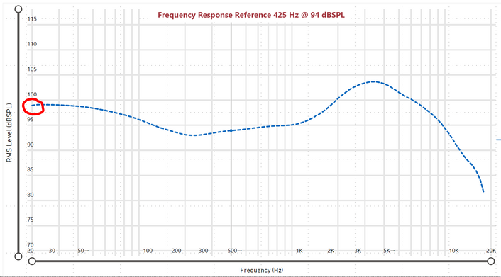
I have a line chart with a Reference curve where the default view only shows the Reference curve. Notice how the curve starts at 20 Hz:
When I add in additional lines to the chart, my Reference curve shrinks! Now it begins at ~23 Hz.

PBIX file can be downloaded from link below:
- Mark as New
- Bookmark
- Subscribe
- Mute
- Subscribe to RSS Feed
- Permalink
- Report Inappropriate Content
Hi @rcheskin ,
For a high-density visual, Power BI intelligently slices your data into high-resolution chunks, and then picks important points to represent each chunk. That process of slicing high-resolution data is specifically tuned to ensure that the resulting chart is visually indistinguishable from rendering all of the underlying data points, but much faster and more interactive.
You can learn more from https://docs.microsoft.com/en-gb/power-bi/create-reports/desktop-high-density-sampling
If this post helps, then please consider Accept it as the solution to help the other members find it more quickly.
Best Regards,
Dedmon Dai
- Mark as New
- Bookmark
- Subscribe
- Mute
- Subscribe to RSS Feed
- Permalink
- Report Inappropriate Content
Hi @v-deddai1-msft , if you read my post then you would know the resulting chart is obviously visually different because the minimum value is no longer represented.
- Mark as New
- Bookmark
- Subscribe
- Mute
- Subscribe to RSS Feed
- Permalink
- Report Inappropriate Content
Hi @rcheskin ,
In my understanding, for a high-density visual, Power BI intelligently slices your data into high-resolution chunks, and then picks important points to represent each chunk. The points picks in your situation is not the minium value. So it didn't show any more. It should be the default for Power BI, I didn't find any option for it.
Best Regards,
Dedmon Dai
- Mark as New
- Bookmark
- Subscribe
- Mute
- Subscribe to RSS Feed
- Permalink
- Report Inappropriate Content
@v-deddai1-msft It is the minimum value for the x-axis (20 Hz), not literally the minimum for the "Values" in the Power BI Line Chart.
- Mark as New
- Bookmark
- Subscribe
- Mute
- Subscribe to RSS Feed
- Permalink
- Report Inappropriate Content
@rcheskin at least we know the reason but I don't know the fix. I guess it is good to open a support case or put this on the ideas forum. Not a very common use case but something worth talking about with the support. Not sure what else to say or tell.
Subscribe to the @PowerBIHowTo YT channel for an upcoming video on List and Record functions in Power Query!!
Learn Power BI and Fabric - subscribe to our YT channel - Click here: @PowerBIHowTo
If my solution proved useful, I'd be delighted to receive Kudos. When you put effort into asking a question, it's equally thoughtful to acknowledge and give Kudos to the individual who helped you solve the problem. It's a small gesture that shows appreciation and encouragement! ❤
Did I answer your question? Mark my post as a solution. Proud to be a Super User! Appreciate your Kudos 🙂
Feel free to email me with any of your BI needs.
- Mark as New
- Bookmark
- Subscribe
- Mute
- Subscribe to RSS Feed
- Permalink
- Report Inappropriate Content
@parry2k Yeah I'll open a support ticket and then report back here. Not sure what to put on the ideas forum until I better understand how the sampling functions.
- Mark as New
- Bookmark
- Subscribe
- Mute
- Subscribe to RSS Feed
- Permalink
- Report Inappropriate Content
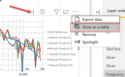
@rcheskin The problem is with the large data points, when you select multiple values from the slicer like brand 1 and brand 2, you will see an icon like i on the visual, and that explains it is showing sample data points and in that case, the starting point for reference line is getting removed. You can check that by clicking the show as a table as shown in the image below, and you will see in the table when multiple brands are selected the data point for 20hz for the reference line disappears. I hope it helps.
Check my latest blog post Comparing Selected Client With Other Top N Clients | PeryTUS I would ❤ Kudos if my solution helped. 👉 If you can spend time posting the question, you can also make efforts to give Kudos to whoever helped to solve your problem. It is a token of appreciation!
⚡Visit us at https://perytus.com, your one-stop-shop for Power BI-related projects/training/consultancy.⚡
Subscribe to the @PowerBIHowTo YT channel for an upcoming video on List and Record functions in Power Query!!
Learn Power BI and Fabric - subscribe to our YT channel - Click here: @PowerBIHowTo
If my solution proved useful, I'd be delighted to receive Kudos. When you put effort into asking a question, it's equally thoughtful to acknowledge and give Kudos to the individual who helped you solve the problem. It's a small gesture that shows appreciation and encouragement! ❤
Did I answer your question? Mark my post as a solution. Proud to be a Super User! Appreciate your Kudos 🙂
Feel free to email me with any of your BI needs.
- Mark as New
- Bookmark
- Subscribe
- Mute
- Subscribe to RSS Feed
- Permalink
- Report Inappropriate Content
Thanks for the insight - are there any workarounds other than modifying the underlying data for the Reference Curve? When I eyeball the table data, the Reference has significantly fewer data points compared to the other products, so it appears the sampling is favoring the other lines. I also find it strange that the sampling algorithm does not include the minium values in the data set by default.
Helpful resources

Microsoft Fabric Learn Together
Covering the world! 9:00-10:30 AM Sydney, 4:00-5:30 PM CET (Paris/Berlin), 7:00-8:30 PM Mexico City

Power BI Monthly Update - April 2024
Check out the April 2024 Power BI update to learn about new features.

| User | Count |
|---|---|
| 109 | |
| 98 | |
| 77 | |
| 66 | |
| 54 |
| User | Count |
|---|---|
| 144 | |
| 104 | |
| 102 | |
| 88 | |
| 63 |


