- Power BI forums
- Updates
- News & Announcements
- Get Help with Power BI
- Desktop
- Service
- Report Server
- Power Query
- Mobile Apps
- Developer
- DAX Commands and Tips
- Custom Visuals Development Discussion
- Health and Life Sciences
- Power BI Spanish forums
- Translated Spanish Desktop
- Power Platform Integration - Better Together!
- Power Platform Integrations (Read-only)
- Power Platform and Dynamics 365 Integrations (Read-only)
- Training and Consulting
- Instructor Led Training
- Dashboard in a Day for Women, by Women
- Galleries
- Community Connections & How-To Videos
- COVID-19 Data Stories Gallery
- Themes Gallery
- Data Stories Gallery
- R Script Showcase
- Webinars and Video Gallery
- Quick Measures Gallery
- 2021 MSBizAppsSummit Gallery
- 2020 MSBizAppsSummit Gallery
- 2019 MSBizAppsSummit Gallery
- Events
- Ideas
- Custom Visuals Ideas
- Issues
- Issues
- Events
- Upcoming Events
- Community Blog
- Power BI Community Blog
- Custom Visuals Community Blog
- Community Support
- Community Accounts & Registration
- Using the Community
- Community Feedback
Register now to learn Fabric in free live sessions led by the best Microsoft experts. From Apr 16 to May 9, in English and Spanish.
- Power BI forums
- Forums
- Get Help with Power BI
- Desktop
- Line graph - Multiple lines return toward X axes
- Subscribe to RSS Feed
- Mark Topic as New
- Mark Topic as Read
- Float this Topic for Current User
- Bookmark
- Subscribe
- Printer Friendly Page
- Mark as New
- Bookmark
- Subscribe
- Mute
- Subscribe to RSS Feed
- Permalink
- Report Inappropriate Content
Line graph - Multiple lines return toward X axes
Dear,
I want to compare different charts with PowerBI.
Now Excel is used. There are a lot of CSV files that contain data. The data is extracted from the desired files via script and then graphs are made in an overview in Excel to be able to compare them. The problem is that the desired files have to be sectioned and the data retrieved every time.
I would prefer to collect the data via power query. Then it is easy to manage via a Dashboard.
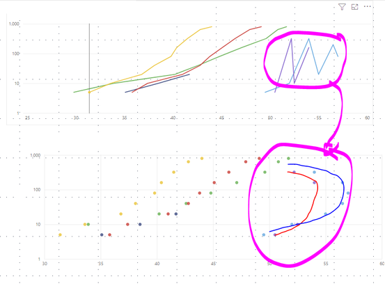
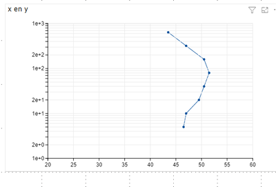
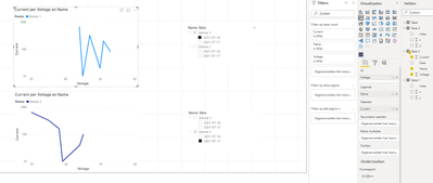
The problem is that the graph curves and tilts back toward the X axis. All this is plotted in a line graph then the points are connected from right to left. But it should be from bottom to top. On this forum I have already seen a solution with the Charticulator. This only works for one line. I would like multiple lines (6) on a graph.
I have tried with the table below. But on the Charticulator I only get one line and on the lingref the dots are not connected correctly.
| Name | Date | Current | Voltage |
| Device 1 | 16/07/2021 | 5 | 44 |
| Device 1 | 16/07/2021 | 10 | 45 |
| Device 1 | 16/07/2021 | 20 | 50 |
| Device 1 | 16/07/2021 | 40 | 51 |
| Device 1 | 16/07/2021 | 80 | 53 |
| Device 1 | 16/07/2021 | 160 | 51 |
| Device 1 | 16/07/2021 | 320 | 47 |
| Device 1 | 16/07/2021 | 640 | 44 |
| Device 2 | 16/07/2021 | 5 | 46 |
| Device 2 | 16/07/2021 | 10 | 49 |
| Device 2 | 16/07/2021 | 20 | 50 |
| Device 2 | 16/07/2021 | 40 | 51 |
| Device 2 | 16/07/2021 | 80 | 54 |
| Device 2 | 16/07/2021 | 160 | 52 |
| Device 2 | 16/07/2021 | 320 | 49 |
| Device 2 | 16/07/2021 | 640 | 45 |
| Device 1 | 17/07/2021 | 5 | 31 |
| Device 1 | 17/07/2021 | 10 | 35 |
| Device 1 | 17/07/2021 | 20 | 39 |
| Device 1 | 17/07/2021 | 40 | 40 |
| Device 1 | 17/07/2021 | 80 | 44 |
| Device 1 | 17/07/2021 | 160 | 42 |
| Device 1 | 17/07/2021 | 320 | 40 |
| Device 1 | 17/07/2021 | 640 | 38 |
| Device 2 | 17/07/2021 | 5 | 35 |
| Device 2 | 17/07/2021 | 10 | 39 |
| Device 2 | 17/07/2021 | 20 | 45 |
| Device 2 | 17/07/2021 | 40 | 44 |
| Device 2 | 17/07/2021 | 80 | 45 |
| Device 2 | 17/07/2021 | 160 | 38 |
| Device 2 | 17/07/2021 | 320 | 35 |
| Device 2 | 17/07/2021 | 640 | 30 |
Kind regard Koen
- Mark as New
- Bookmark
- Subscribe
- Mute
- Subscribe to RSS Feed
- Permalink
- Report Inappropriate Content
Hi @siddbrk ,
Could you tell me if your problem has been solved?
If it is, kindly Accept the useful reply as the solution. More people will benefit from it.
Or you are still confused about it, please provide me with more details about your problem.
Best Regards,
Stephen Tao
- Mark as New
- Bookmark
- Subscribe
- Mute
- Subscribe to RSS Feed
- Permalink
- Report Inappropriate Content
Helpful resources

Microsoft Fabric Learn Together
Covering the world! 9:00-10:30 AM Sydney, 4:00-5:30 PM CET (Paris/Berlin), 7:00-8:30 PM Mexico City

Power BI Monthly Update - April 2024
Check out the April 2024 Power BI update to learn about new features.

| User | Count |
|---|---|
| 110 | |
| 97 | |
| 77 | |
| 63 | |
| 55 |
| User | Count |
|---|---|
| 143 | |
| 109 | |
| 89 | |
| 84 | |
| 66 |


