- Power BI forums
- Updates
- News & Announcements
- Get Help with Power BI
- Desktop
- Service
- Report Server
- Power Query
- Mobile Apps
- Developer
- DAX Commands and Tips
- Custom Visuals Development Discussion
- Health and Life Sciences
- Power BI Spanish forums
- Translated Spanish Desktop
- Power Platform Integration - Better Together!
- Power Platform Integrations (Read-only)
- Power Platform and Dynamics 365 Integrations (Read-only)
- Training and Consulting
- Instructor Led Training
- Dashboard in a Day for Women, by Women
- Galleries
- Community Connections & How-To Videos
- COVID-19 Data Stories Gallery
- Themes Gallery
- Data Stories Gallery
- R Script Showcase
- Webinars and Video Gallery
- Quick Measures Gallery
- 2021 MSBizAppsSummit Gallery
- 2020 MSBizAppsSummit Gallery
- 2019 MSBizAppsSummit Gallery
- Events
- Ideas
- Custom Visuals Ideas
- Issues
- Issues
- Events
- Upcoming Events
- Community Blog
- Power BI Community Blog
- Custom Visuals Community Blog
- Community Support
- Community Accounts & Registration
- Using the Community
- Community Feedback
Register now to learn Fabric in free live sessions led by the best Microsoft experts. From Apr 16 to May 9, in English and Spanish.
- Power BI forums
- Forums
- Get Help with Power BI
- Desktop
- Line chart using a table that has multiple fields ...
- Subscribe to RSS Feed
- Mark Topic as New
- Mark Topic as Read
- Float this Topic for Current User
- Bookmark
- Subscribe
- Printer Friendly Page
- Mark as New
- Bookmark
- Subscribe
- Mute
- Subscribe to RSS Feed
- Permalink
- Report Inappropriate Content
Line chart using a table that has multiple fields for x axis
Hi - new Power BI adopter here!
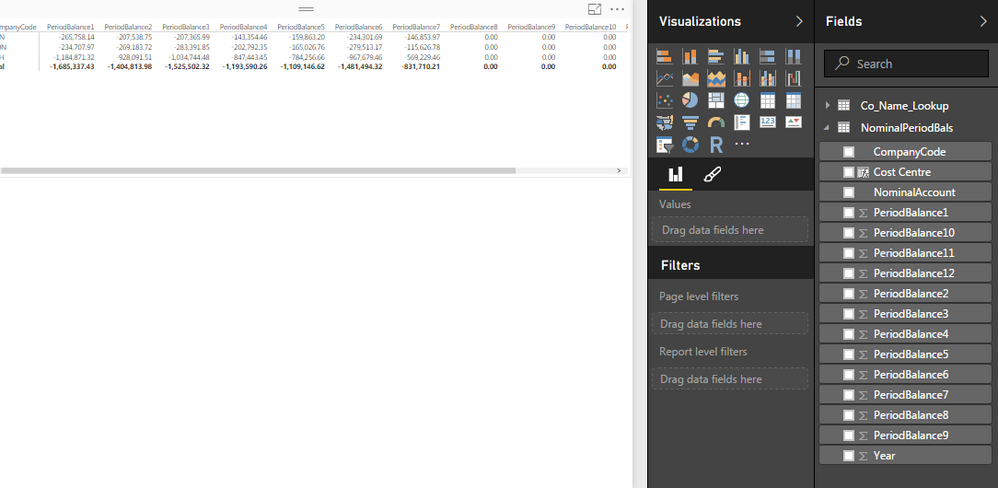
I have a table that I'd like a simple line graph for. The issue I have is that the values for the x axis are in individual fields in the table, e.g. PeriodBalance1, PeriodBalance2 etc. being Jan, Feb...
'Year' is in a single field though.
The requirement is x axis showing the months, Y axis is the value and legend being year.
The x-axis only accepts 1 field, is there a clever way round this in Power BI?
My description is probably not too clear, screen print below of the fields - thanks in advance:
Solved! Go to Solution.
- Mark as New
- Bookmark
- Subscribe
- Mute
- Subscribe to RSS Feed
- Permalink
- Report Inappropriate Content
Ya, the "shape" of your data is not helping you. In the query update window thingy (power query) -- check out the UNPIVOT feature, that would change your life.
- Mark as New
- Bookmark
- Subscribe
- Mute
- Subscribe to RSS Feed
- Permalink
- Report Inappropriate Content
Hi @megavic,
Create a calendar table and import it into Power BI Desktop, then create relationship between the calendar table and your current table using Date Key. This way, you are able to drag Month from calendar table to Line Chart. You can check the example in the attached PBIX file to get more details.
Thanks,
Lydia Zhang
If this post helps, then please consider Accept it as the solution to help the other members find it more quickly.
- Mark as New
- Bookmark
- Subscribe
- Mute
- Subscribe to RSS Feed
- Permalink
- Report Inappropriate Content
Hi @megavic,
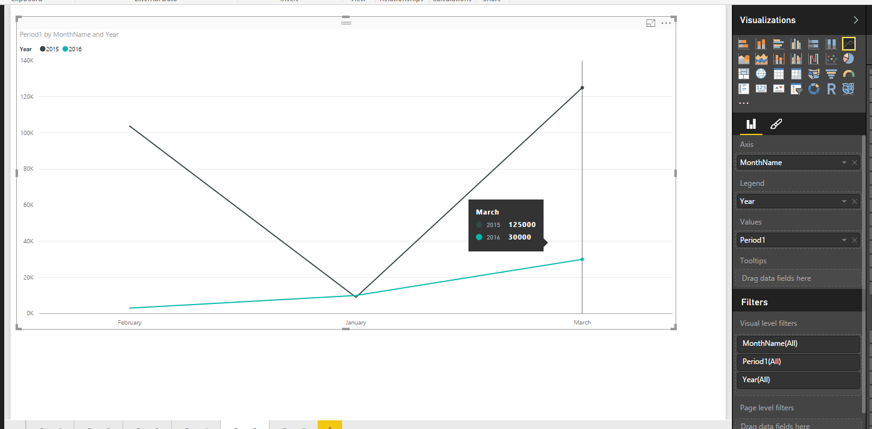
Based on your description, it seems that you want to display multiple fields’ values in different years and different months using Line chart. In Line chart, when you put Month into X-axis and put Year into Legend, you are only able to drag one field into Values. The visual will look like as follows.
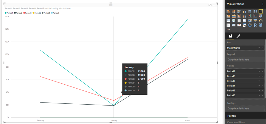
Moreover, in Line chart, when you put Month into X-axis and drag multiple fields into Values, you are not able to drag Year into Legend, please check the following example for more details.
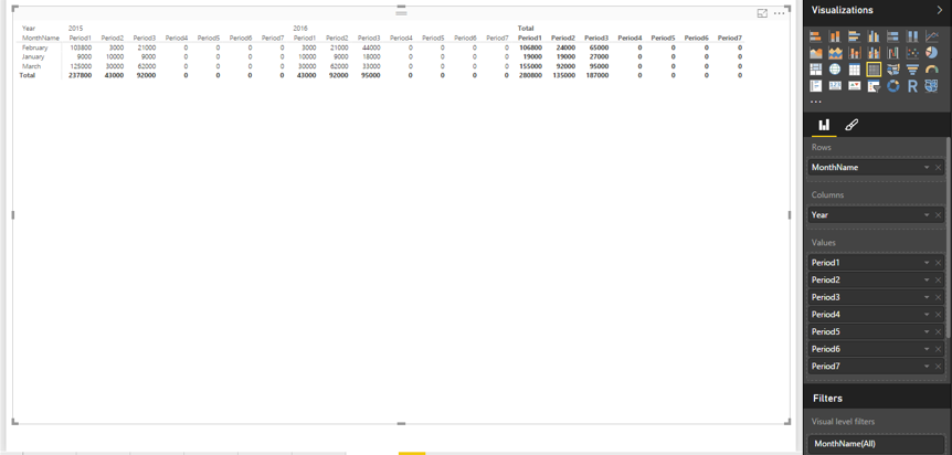
In your scenario, Matrix visual is more appropriate.
Thanks,
Lydia Zhang
If this post helps, then please consider Accept it as the solution to help the other members find it more quickly.
- Mark as New
- Bookmark
- Subscribe
- Mute
- Subscribe to RSS Feed
- Permalink
- Report Inappropriate Content
Hi Lydia,
Many thanks for your speedy response!
I understand everything you've said, and I am already showing the data in a matrix - I did however want to show the data at the same time in a simple line graph. I'm thinking I could perhaps pull all the data in to a single field in access. Is there anything I could do in power BI query to move the data in to a single field?
- Mark as New
- Bookmark
- Subscribe
- Mute
- Subscribe to RSS Feed
- Permalink
- Report Inappropriate Content
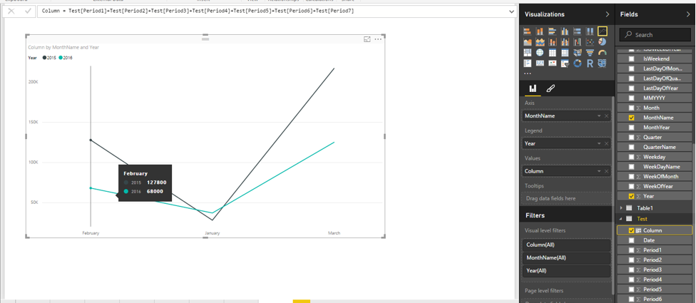
Hi @megavic,
You can consider to create a calculated column to sum the values of these fields, then create Line chart by putting Month into X-axis and dragging the new column into Values and dragging Year into Legend.
For example: column = Test[Period1]+Test[Period2]+Test[Period3]+Test[Period4]+Test[Period5]+Test[Period6]+Test[Period7]
Thanks,
Lydia Zhang
If this post helps, then please consider Accept it as the solution to help the other members find it more quickly.
- Mark as New
- Bookmark
- Subscribe
- Mute
- Subscribe to RSS Feed
- Permalink
- Report Inappropriate Content
Thanks @v-yuezhe-msft,
I think the issue with I have with that idea is that I don't have a 'month' field.
I'll have a look at what I can do to manipulate the data before it gets in to Power BI.
Thanks again,
Andy
- Mark as New
- Bookmark
- Subscribe
- Mute
- Subscribe to RSS Feed
- Permalink
- Report Inappropriate Content
Ya, the "shape" of your data is not helping you. In the query update window thingy (power query) -- check out the UNPIVOT feature, that would change your life.
- Mark as New
- Bookmark
- Subscribe
- Mute
- Subscribe to RSS Feed
- Permalink
- Report Inappropriate Content
Oh that is sooooo good ![]()
That completely reshapes the query table data and is so simple but powerful!
Thank you very much for the suggestion, this is working perfectly.
Much appreciated - kudos and accepted answer ![]()
- Mark as New
- Bookmark
- Subscribe
- Mute
- Subscribe to RSS Feed
- Permalink
- Report Inappropriate Content
When you flip to different visuals, you will see different value/filter/legend options. I suspect if you just click the line graph visual... you will see what you need?
- Mark as New
- Bookmark
- Subscribe
- Mute
- Subscribe to RSS Feed
- Permalink
- Report Inappropriate Content
Hi scottsen, thanks for your reply.
When I click the line graph visual I can't see how I can use each period balance field to appear as an entry on the x-axis.
Any help appreciated
Andy
Helpful resources

Microsoft Fabric Learn Together
Covering the world! 9:00-10:30 AM Sydney, 4:00-5:30 PM CET (Paris/Berlin), 7:00-8:30 PM Mexico City

Power BI Monthly Update - April 2024
Check out the April 2024 Power BI update to learn about new features.

| User | Count |
|---|---|
| 107 | |
| 98 | |
| 78 | |
| 65 | |
| 53 |
| User | Count |
|---|---|
| 144 | |
| 104 | |
| 100 | |
| 86 | |
| 64 |
