- Power BI forums
- Updates
- News & Announcements
- Get Help with Power BI
- Desktop
- Service
- Report Server
- Power Query
- Mobile Apps
- Developer
- DAX Commands and Tips
- Custom Visuals Development Discussion
- Health and Life Sciences
- Power BI Spanish forums
- Translated Spanish Desktop
- Power Platform Integration - Better Together!
- Power Platform Integrations (Read-only)
- Power Platform and Dynamics 365 Integrations (Read-only)
- Training and Consulting
- Instructor Led Training
- Dashboard in a Day for Women, by Women
- Galleries
- Community Connections & How-To Videos
- COVID-19 Data Stories Gallery
- Themes Gallery
- Data Stories Gallery
- R Script Showcase
- Webinars and Video Gallery
- Quick Measures Gallery
- 2021 MSBizAppsSummit Gallery
- 2020 MSBizAppsSummit Gallery
- 2019 MSBizAppsSummit Gallery
- Events
- Ideas
- Custom Visuals Ideas
- Issues
- Issues
- Events
- Upcoming Events
- Community Blog
- Power BI Community Blog
- Custom Visuals Community Blog
- Community Support
- Community Accounts & Registration
- Using the Community
- Community Feedback
Register now to learn Fabric in free live sessions led by the best Microsoft experts. From Apr 16 to May 9, in English and Spanish.
- Power BI forums
- Forums
- Get Help with Power BI
- Desktop
- Re: Line chart re-orders sales period
- Subscribe to RSS Feed
- Mark Topic as New
- Mark Topic as Read
- Float this Topic for Current User
- Bookmark
- Subscribe
- Printer Friendly Page
- Mark as New
- Bookmark
- Subscribe
- Mute
- Subscribe to RSS Feed
- Permalink
- Report Inappropriate Content
Line chart re-orders sales period
Hi all,
I'm sure this is a super quick fix but I'm new to Power BI so forgive the basic question!
I've made a line chart to show actual vs goal over time. We have 13 periods and I've made all the periods a 'number' in the data table. For whatever reason it's still re-ordering my data in this illogical way, which makes absolutely no sense in my brain.
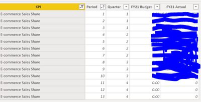
Here's a sample of the data I have in the background
And here is how the "Period" column is formatted:
Can someone please help?
Solved! Go to Solution.
- Mark as New
- Bookmark
- Subscribe
- Mute
- Subscribe to RSS Feed
- Permalink
- Report Inappropriate Content
It should take in ryt order but there is an other way.
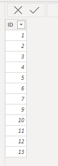
Click on Enter data and create a new table with these values:
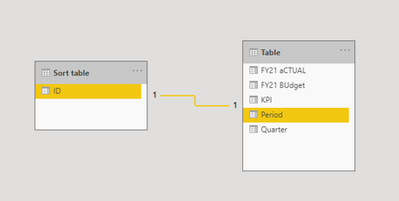
Join this ID field with Period column from your table.
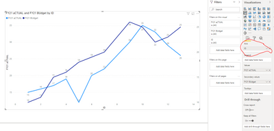
Now, use ID field in the axis and
If it is sorted then you are good to go, else click on the ID field and then Sort by ID.
Let me know if this works.
- Mark as New
- Bookmark
- Subscribe
- Mute
- Subscribe to RSS Feed
- Permalink
- Report Inappropriate Content
Ok, I *think* I followed all your directions correctly and it worked!
To clarify, I made the table as you suggested, and then I clicked "Manage Relationships" and made a relationship between the table and the Period column.
It reverted the Period column back to text, so I made it into a whole number.
Then I went back to the graph and changed it from Continuous to Categorical, and then that appeared to make the graph work! I hope anyway lol
I'm going to double check the data now to make sure it's lining up the right way but I think that did the trick.
Thank you!
- Mark as New
- Bookmark
- Subscribe
- Mute
- Subscribe to RSS Feed
- Permalink
- Report Inappropriate Content
I am glad it worked. Haha
Make sure to match the values in ID and the Period column. If any new records added to period field in future then you should add the same records to your ID field of sort table.
If this resolved your problem please give me kudos and accept my reply as a solution.
Kudos 🙂
- Mark as New
- Bookmark
- Subscribe
- Mute
- Subscribe to RSS Feed
- Permalink
- Report Inappropriate Content
Hi @Rachelbramos ,
Did you try clicking on the 3 dots on the top right of your line chart and sort by ascending order on x-axis column which is Period column?
Thanks,
Pragati
- Mark as New
- Bookmark
- Subscribe
- Mute
- Subscribe to RSS Feed
- Permalink
- Report Inappropriate Content
Hi Pragati,
Yes I did but it does this:
I thought it was treating the periods as text, so I changed it to a number thinking that was the issue, but it's still not working.
- Mark as New
- Bookmark
- Subscribe
- Mute
- Subscribe to RSS Feed
- Permalink
- Report Inappropriate Content
Hi @Rachelbramos ,
Can you check one thing on the your chart? Make sure the PERIOD column on x-axis is not summarised.
Thanks,
Pragati
- Mark as New
- Bookmark
- Subscribe
- Mute
- Subscribe to RSS Feed
- Permalink
- Report Inappropriate Content
Do you mean the column in the data? If so, it's not summarized (see below). Is there another place to check or change this?
- Mark as New
- Bookmark
- Subscribe
- Mute
- Subscribe to RSS Feed
- Permalink
- Report Inappropriate Content
Hi @Rachelbramos ,
Click on your line chart --> On the right under Visualisation Tab you will see Period column is moved to x-axis area. Check there and see if it is summarised or not. It should not be summarised.
Also under format options, try making your x-axis as Categorical and see if this fixes the issue.
Also I tried a similar scenario at my end and it works for me. See my Index column is sorted in ascending order:
If you still have issues try sharing your pbix file by removing any sensitive information.
Thanks,
Pragati
- Mark as New
- Bookmark
- Subscribe
- Mute
- Subscribe to RSS Feed
- Permalink
- Report Inappropriate Content
It actually doesn't even let me choose "continuous". If I try to click it, it defaults it back to "categorical". So I guess that's not the issue. It's for sure not summarized. Let me see if I can make a shareable version of the data so I'm not accidentally sharing company secrets 😉
Stay tuned...
Thanks again!
Helpful resources

Microsoft Fabric Learn Together
Covering the world! 9:00-10:30 AM Sydney, 4:00-5:30 PM CET (Paris/Berlin), 7:00-8:30 PM Mexico City

Power BI Monthly Update - April 2024
Check out the April 2024 Power BI update to learn about new features.

| User | Count |
|---|---|
| 118 | |
| 107 | |
| 70 | |
| 70 | |
| 43 |
| User | Count |
|---|---|
| 148 | |
| 105 | |
| 104 | |
| 89 | |
| 65 |


