- Power BI forums
- Updates
- News & Announcements
- Get Help with Power BI
- Desktop
- Service
- Report Server
- Power Query
- Mobile Apps
- Developer
- DAX Commands and Tips
- Custom Visuals Development Discussion
- Health and Life Sciences
- Power BI Spanish forums
- Translated Spanish Desktop
- Power Platform Integration - Better Together!
- Power Platform Integrations (Read-only)
- Power Platform and Dynamics 365 Integrations (Read-only)
- Training and Consulting
- Instructor Led Training
- Dashboard in a Day for Women, by Women
- Galleries
- Community Connections & How-To Videos
- COVID-19 Data Stories Gallery
- Themes Gallery
- Data Stories Gallery
- R Script Showcase
- Webinars and Video Gallery
- Quick Measures Gallery
- 2021 MSBizAppsSummit Gallery
- 2020 MSBizAppsSummit Gallery
- 2019 MSBizAppsSummit Gallery
- Events
- Ideas
- Custom Visuals Ideas
- Issues
- Issues
- Events
- Upcoming Events
- Community Blog
- Power BI Community Blog
- Custom Visuals Community Blog
- Community Support
- Community Accounts & Registration
- Using the Community
- Community Feedback
Register now to learn Fabric in free live sessions led by the best Microsoft experts. From Apr 16 to May 9, in English and Spanish.
- Power BI forums
- Forums
- Get Help with Power BI
- Desktop
- Re: Line chart marks from different tables
- Subscribe to RSS Feed
- Mark Topic as New
- Mark Topic as Read
- Float this Topic for Current User
- Bookmark
- Subscribe
- Printer Friendly Page
- Mark as New
- Bookmark
- Subscribe
- Mute
- Subscribe to RSS Feed
- Permalink
- Report Inappropriate Content
Line chart marks from different tables
Hello Guys,
I need to do a chart which shows if a medication is been effective. To do this i have two tables called Medication and Exams, the Exams table has 3 collums (pacient_id, membrane_thickness, date) which is populated based on the results of an exam. The Medication table has 3 collums too (pacient_id, medication, date). I made a line chart based on the membrane_thickness (Y-axis) and date (X-axis) filtered by pacient_id. And now i need to mark on the line of the chart the date which the pacient use the medication and the name of medication(collum medication of table medication). How can i do it?
EXAMS_TABLE
| pacient_id | membrane_thickness | data |
| 1 | 400 | 01/01/2020 |
| 1 | 350 | 01/02/2020 |
| 1 | 450 | 01/03/2020 |
| 1 | 200 | 01/04/2020 |
| 1 | 200 | 01/05/2020 |
| 1 | 425 | 01/06/2020 |
| 1 | 500 | 01/07/2020 |
| 2 | 400 | 01/11/2019 |
| 3 | 600 | 02/03/2018 |
MEDICATION_TABLE
paciente_id | medication | date |
| 1 | Eylia | 25/06/2020 |
| 1 | Ozurdex | 16/03/2020 |
| 1 | Luc | 20/02/2020 |
| 1 | Avastin | 20/05/2020 |
| 2 | Ozurdex | 02/11/2019 |
| 2 | Avastin | 09/11/2019 |
| 2 | Luc | 16/11/2019 |
| 3 | Avastin | 03/03/2018 |
| 3 | Avastin | 10/03/2018 |
See below the line chart with the drawn marks.
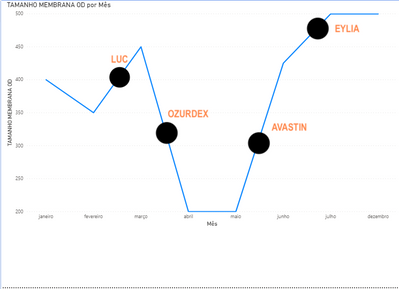
@Greg_Deckler, i put the tables with the data, thanks. I also saw you topic, and may the lookupvalue may work, but i can not do it work.
Thanks,
- Mark as New
- Bookmark
- Subscribe
- Mute
- Subscribe to RSS Feed
- Permalink
- Report Inappropriate Content
Hi @guerciobr ,
Based on my test, your requirement might not be achieved currently. We usually show value in Data Label instead of text,. So workaround is that you could view this in tooltip.
According to my understanding ,the value of the Y-axis is membrane_thickness filtered by the same pacient_id and the same date(Year+Month) in both tables, right?
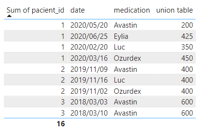
You could use the following formula after creating the relationship between two tables based on pacient_id:
union table =
CALCULATE (
SUM ( Exams[membrane_thickness] ),

    FILTER (
        Exams,
        Exams[pacient_id] = MIN ( Medication[pacient_id] )
            && FORMAT ( Exams[data], "MMM-YYYY" )
                = FORMAT ( MIN ( Medication[date] ), "MMM-YYYY" )
    )
)
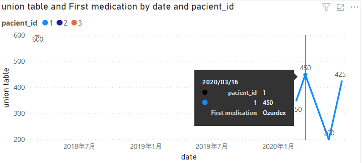
Then create a line chart and drop medication as tooltip like this:
Is the result what you want? If you have any questions, please upload some data samples and expected output.
Please do mask sensitive data before uploading.
Best Regards,
Eyelyn Qin
- Mark as New
- Bookmark
- Subscribe
- Mute
- Subscribe to RSS Feed
- Permalink
- Report Inappropriate Content
Hi @guerciobr
Ive been having a little look at your data. Thie first think I would do it to make sure you can see what you want as a table
It may mean having to do a bit of remodelling and I would definitely include a date table. I would have the membrane thickness in a fact table because its the metric you are looking at against the medication
But If you can see what you want for the line chart in a table you will be in a better position
Patient 1
Eg
Month membrane Thickness medication
March 400 LUC
April 200
May 300 orzudec
So I would try for that first before moving to the line chart. I have a feeling you cant at the moment change the line chart label to a descriptor but you may be able to ask for this on the Submit ideas area https://ideas.powerbi.com/ideas/
- Mark as New
- Bookmark
- Subscribe
- Mute
- Subscribe to RSS Feed
- Permalink
- Report Inappropriate Content
Hi Debbie,
I agree with you about the data model. But the main point is about the relation of the thickness with the medication. For example, you made an exam and your membrane thickness is 800, for the next 4 weeks you take the medication each week. After the 4 weeks, at week 5 you made the exam again and the membrane thickness was 400. So, the line chart has a line which in the Yaxis vary from 800 to 400 and in the Xaxis vary for the week 1 to week 5. How can i mark the day of the medication in the chart, considering that i do not have the membrane thickness in the day of the medication? So the mark will not be over the line, is it clear?
Thanks for the attetion.
- Mark as New
- Bookmark
- Subscribe
- Mute
- Subscribe to RSS Feed
- Permalink
- Report Inappropriate Content
Have you tried adding the data to a table visual? its easier to make sure that you are getting the correct results in a table visual before trying to create a line chart or other visual against it
In the case of what your trying to do, Overwrite the label with the Medication where that medication has been taken I dont think you can do that with a Line chart.
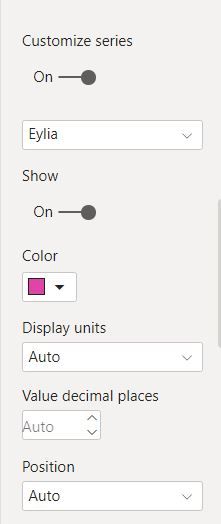
You might try to customise the series if you add in Medication into Series
And create a different colour for each medication. I dont have enough data to see if working but its worth a try. Thi still wouldnt show the medication on the line chart though. I would definitely add it as an idea but to support it you need to be able to produce a table with the date thickness(Metric) and Medication in power BI first
- Mark as New
- Bookmark
- Subscribe
- Mute
- Subscribe to RSS Feed
- Permalink
- Report Inappropriate Content
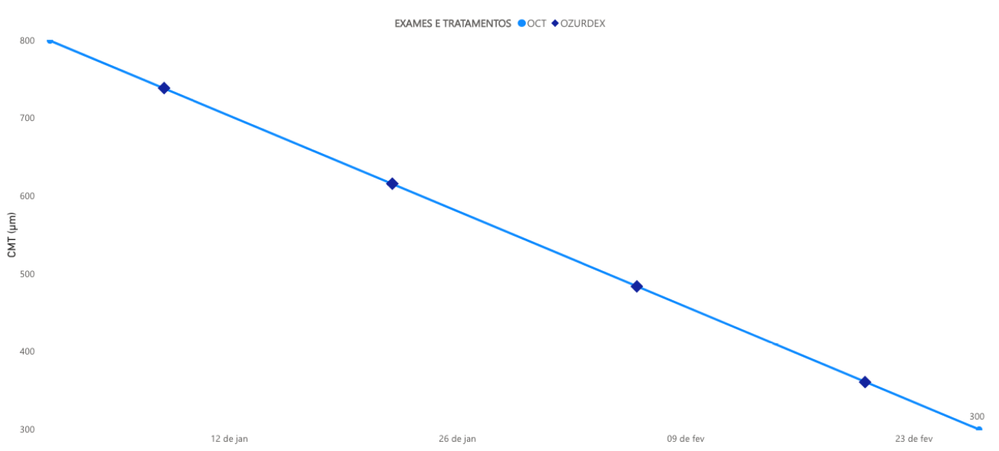
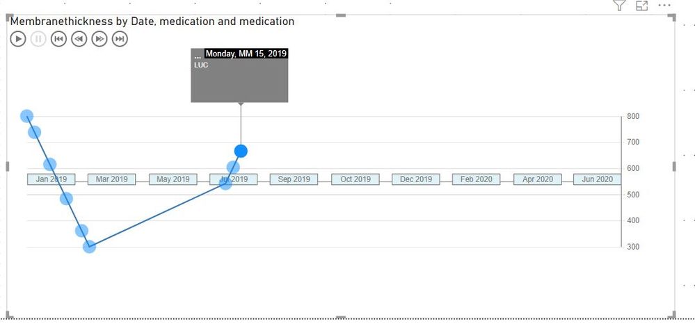
I made that customization in the line chart yesterday as you mentioned, and work fine without the name of medication. I joined all the data in a unique table like this
PACIENTE_ID MEMBRANE_THICKNESS MEDICATION DATE
| 1 | 400 | OCT | 15/06/2019 |
| 1 | 426,67 | LUC | 18/06/2019 |
| 1 | 488,89 | LUC | 25/06/2019 |
| 1 | 542,22 | LUC | 01/07/2019 |
| 1 | 604,44 | LUC | 08/07/2019 |
| 1 | 666,67 | LUC | 15/07/2019 |
| 1 | 800 | OCT | 30/07/2019 |
| 1 | 800 | OCT | 01/01/2020 |
| 1 | 738,6 | OZURDEX | 08/01/2020 |
| 1 | 615,78 | OZURDEX | 22/01/2020 |
| 1 | 484,21 | OZURDEX | 06/02/2020 |
| 1 | 361,4 | OZURDEX | 20/02/2020 |
| 1 | 300 | OCT | 27/02/2020 |
OCT is the exam, if you see all the membrane_thickness between OCTs are calculated to be exactly over the line chart (In the transactional system the membrane_thickness is 0 for OZURDEX, LUC, EYLIA and other medication), but this calculation is not simple i need to do line by line maybe it is not the smarter and simple way. But the result was:
Yesterday, i posted this topic looking for a smater and simple way to do it.
- Mark as New
- Bookmark
- Subscribe
- Mute
- Subscribe to RSS Feed
- Permalink
- Report Inappropriate Content
Might be worth having a look at some of the custom visuals.
The pulse chart is pretty nice but its very much a case of actually clicking on the visual, or running the visual to look at the medications
Its a pity the medication markers dont stay up until you click on them but its quite nice. Medication is in Event Description
- Mark as New
- Bookmark
- Subscribe
- Mute
- Subscribe to RSS Feed
- Permalink
- Report Inappropriate Content
@guerciobr - Are the words the medication names? Not really enough information to go on, please first check if your issue is a common issue listed here: https://community.powerbi.com/t5/Community-Blog/Before-You-Post-Read-This/ba-p/1116882
Also, please see this post regarding How to Get Your Question Answered Quickly: https://community.powerbi.com/t5/Community-Blog/How-to-Get-Your-Question-Answered-Quickly/ba-p/38490
The most important parts are:
1. Sample data as text, use the table tool in the editing bar
2. Expected output from sample data
3. Explanation in words of how to get from 1. to 2.
@ me in replies or I'll lose your thread!!!
Instead of a Kudo, please vote for this idea
Become an expert!: Enterprise DNA
External Tools: MSHGQM
YouTube Channel!: Microsoft Hates Greg
Latest book!: The Definitive Guide to Power Query (M)
DAX is easy, CALCULATE makes DAX hard...
Helpful resources

Microsoft Fabric Learn Together
Covering the world! 9:00-10:30 AM Sydney, 4:00-5:30 PM CET (Paris/Berlin), 7:00-8:30 PM Mexico City

Power BI Monthly Update - April 2024
Check out the April 2024 Power BI update to learn about new features.

| User | Count |
|---|---|
| 114 | |
| 100 | |
| 81 | |
| 70 | |
| 62 |
| User | Count |
|---|---|
| 148 | |
| 116 | |
| 104 | |
| 90 | |
| 65 |
