- Power BI forums
- Updates
- News & Announcements
- Get Help with Power BI
- Desktop
- Service
- Report Server
- Power Query
- Mobile Apps
- Developer
- DAX Commands and Tips
- Custom Visuals Development Discussion
- Health and Life Sciences
- Power BI Spanish forums
- Translated Spanish Desktop
- Power Platform Integration - Better Together!
- Power Platform Integrations (Read-only)
- Power Platform and Dynamics 365 Integrations (Read-only)
- Training and Consulting
- Instructor Led Training
- Dashboard in a Day for Women, by Women
- Galleries
- Community Connections & How-To Videos
- COVID-19 Data Stories Gallery
- Themes Gallery
- Data Stories Gallery
- R Script Showcase
- Webinars and Video Gallery
- Quick Measures Gallery
- 2021 MSBizAppsSummit Gallery
- 2020 MSBizAppsSummit Gallery
- 2019 MSBizAppsSummit Gallery
- Events
- Ideas
- Custom Visuals Ideas
- Issues
- Issues
- Events
- Upcoming Events
- Community Blog
- Power BI Community Blog
- Custom Visuals Community Blog
- Community Support
- Community Accounts & Registration
- Using the Community
- Community Feedback
Register now to learn Fabric in free live sessions led by the best Microsoft experts. From Apr 16 to May 9, in English and Spanish.
- Power BI forums
- Forums
- Get Help with Power BI
- Desktop
- Re: Line chart displaying last summarized value(no...
- Subscribe to RSS Feed
- Mark Topic as New
- Mark Topic as Read
- Float this Topic for Current User
- Bookmark
- Subscribe
- Printer Friendly Page
- Mark as New
- Bookmark
- Subscribe
- Mute
- Subscribe to RSS Feed
- Permalink
- Report Inappropriate Content
Line chart displaying last summarized value(no matter value is summarized or not)
Hi All,
I have a table of data that is populated using some calculated columns. I want to draw the line chart out of some specific values from this data but all I am seeing is the last summarized value in the form of dot only and not a proper trend line for every date I have in the tabular data.
Here is my tabular dataset:
| Total Scope (Pts) | Actual Burndown (Pts) | Theoretical Burndown (Pts) | Dev Complete (Pts) | Trending Date | Project Start of the Testline |
| 203 | 203 | 203 | 203 | 2/18/2018 | 6/15/2018 |
| 203 | 203 | 191 | 203 | 2/25/2018 | |
| 203 | 203 | 178 | 151 | 3/4/2018 | |
| 227 | 208 | 166 | 156 | 3/11/2018 | |
| 227 | 203 | 154 | 151 | 3/18/2018 | |
| 253 | 229 | 142 | 157 | 3/25/2018 | |
| 259 | 227 | 130 | 130 | 4/1/2018 | |
| 259 | 227 | 117 | 89 | 4/8/2018 | |
| 266 | 210 | 105 | 92 | 4/15/2018 | |
| 266 | 165 | 93 | 87 | 4/22/2018 | |
| 264 | 112 | 80 | 45 | 4/29/2018 | |
| 264 | 76 | 68 | 45 | 5/6/2018 | |
| 264 | 50 | 56 | 33 | 5/13/2018 | |
| 264 | 45 | 44 | 33 | 5/20/2018 | |
| 231 | 0 | 32 | 0 | 5/27/2018 | |
| 231 | 0 | 19 | 0 | 6/3/2018 | |
| 231 | 0 | 7 | 0 | 6/10/2018 | |
| 231 | 0 | 0 | 0 | 6/17/2018 | |
| 231 | 0 | 0 | 0 | 6/24/2018 | |
| 231 | 0 | 0 | 0 | 7/1/2018 | |
| 231 | 0 | 0 | 0 | 7/8/2018 |
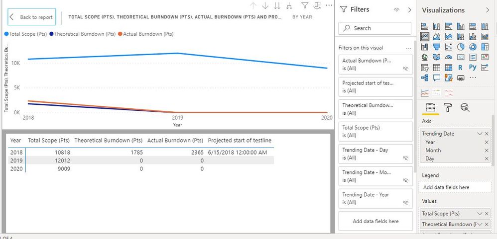
I want to display on line chart using Trending dates till the "Projected Start of the Testline" date and on Values I want the rest of the columns. The line chart what I am seeing from my visual is this:
From tabular display of line chart just below it, it is clear that line chart is not drawing individual values based upon trending dates. Instead, it is drawing just the Summarized values I guess.
However, In Excel, it is fairly simple and I could draw this figure using range of values:
So, this is clearly different one than what I see in Power BI. Is there any way I could draw and see the Excel Line chart(last figure) in Power BI?
Any help would be highly appreciated.
Thanks,
Nitin
Solved! Go to Solution.
- Mark as New
- Bookmark
- Subscribe
- Mute
- Subscribe to RSS Feed
- Permalink
- Report Inappropriate Content
@Anonymous :
It's because your 'Project Stat of The Testline' column is incorect.
Try to store this data in a separate Measure (eg.: Project_Start_of_The_Testline_Measure = Date(2018,03,15) )
And create another one which can be used as filter on the visual:
Filter_Measure =
if( min( Trending Date) > Project_Start_of_The_Testline_Measure, 1, 0)
Once you have the filter you can apply it on the visual:
See attached PBIX file if needed.
Please try to read and understand the data structure logic working behind PBI, it's different from Excel.
- Mark as New
- Bookmark
- Subscribe
- Mute
- Subscribe to RSS Feed
- Permalink
- Report Inappropriate Content
hi @Anonymous ,
As you can see the X axis values show a so called date hierarchy so you can easily sum it up by Day/Month/Quarter/Year.
If you remove Y, Q, M levels you will end up having a actual day level date on your chart.
Alternative solution, keeping the data hierarchy intact you can naviget thrugh the hierarchy using the following buttons on your line chart.
Hope it helps,
PDG
- Mark as New
- Bookmark
- Subscribe
- Mute
- Subscribe to RSS Feed
- Permalink
- Report Inappropriate Content
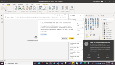
Drilling it down using arrows gives me error:
- Mark as New
- Bookmark
- Subscribe
- Mute
- Subscribe to RSS Feed
- Permalink
- Report Inappropriate Content
@Anonymous :
It's because your 'Project Stat of The Testline' column is incorect.
Try to store this data in a separate Measure (eg.: Project_Start_of_The_Testline_Measure = Date(2018,03,15) )
And create another one which can be used as filter on the visual:
Filter_Measure =
if( min( Trending Date) > Project_Start_of_The_Testline_Measure, 1, 0)
Once you have the filter you can apply it on the visual:
See attached PBIX file if needed.
Please try to read and understand the data structure logic working behind PBI, it's different from Excel.
- Mark as New
- Bookmark
- Subscribe
- Mute
- Subscribe to RSS Feed
- Permalink
- Report Inappropriate Content
Thanks @P_D_G . I think your solution will work for me :)... Creating another measure as a filter and use it on the visual. I will try this soon and once done will mark it as a solution. Thanks again for your nice help. You made my day 🙂
Best Regards,
Nitin
- Mark as New
- Bookmark
- Subscribe
- Mute
- Subscribe to RSS Feed
- Permalink
- Report Inappropriate Content
as Vanessa stated, click the little arrow in the visualization pane next to trending date and select date rather than heirarchy.
- Mark as New
- Bookmark
- Subscribe
- Mute
- Subscribe to RSS Feed
- Permalink
- Report Inappropriate Content
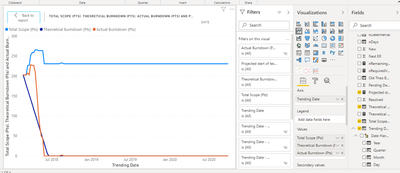
Selecting "Trending Date" instead of "Date Hierarchy" gives me the below figure:
This is still different than the one I wanted.
One point to reiterate here is that I wanted to plot data till "Projected Start of the Testline" date. I tried using filters but still I am not able to get even close to the one I get in Excel as attached in my original post. Any more ideas please? Thanks.
- Mark as New
- Bookmark
- Subscribe
- Mute
- Subscribe to RSS Feed
- Permalink
- Report Inappropriate Content
Is there any way to filter visual based upon a formula like: Where "Trending Date <= Projected Start of Testline"?
Because, In visual I just see the static values you can select for individual field like day, month, year etc.
- Mark as New
- Bookmark
- Subscribe
- Mute
- Subscribe to RSS Feed
- Permalink
- Report Inappropriate Content
the image you posted shows your power bi visual in the context of year.
There's a drill down button on the visual on the top right hand side. Looks like an upside down fork. Click that and it will take you to the date range in the visual which is at the bottom of the hierarchy.
If you don't want to view your visual in context of year or month then just. Go to the visualization pane on the right hand side of the screen and click the little x next to "Year" and "Month" in the axis field.
- Mark as New
- Bookmark
- Subscribe
- Mute
- Subscribe to RSS Feed
- Permalink
- Report Inappropriate Content
If I took the time to answer your question and I came up with a solution, please mark my post as a solution and /or give kudos freely for the effort 🙂 Thank you!
Proud to be a Super User!
- Mark as New
- Bookmark
- Subscribe
- Mute
- Subscribe to RSS Feed
- Permalink
- Report Inappropriate Content
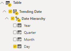
I don't see any Date field for "Trending Date". Just the "Date Hierarchy" is mentioned under "Trending Date". And drilling it down gives me "Error".
- Mark as New
- Bookmark
- Subscribe
- Mute
- Subscribe to RSS Feed
- Permalink
- Report Inappropriate Content
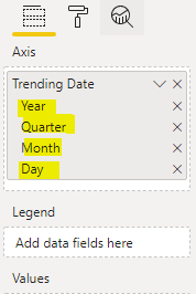
You can drag and drop Day values from this list, opening the Date Hierarchy:
- Mark as New
- Bookmark
- Subscribe
- Mute
- Subscribe to RSS Feed
- Permalink
- Report Inappropriate Content
If I took the time to answer your question and I came up with a solution, please mark my post as a solution and /or give kudos freely for the effort 🙂 Thank you!
Proud to be a Super User!
Helpful resources

Microsoft Fabric Learn Together
Covering the world! 9:00-10:30 AM Sydney, 4:00-5:30 PM CET (Paris/Berlin), 7:00-8:30 PM Mexico City

Power BI Monthly Update - April 2024
Check out the April 2024 Power BI update to learn about new features.

| User | Count |
|---|---|
| 114 | |
| 99 | |
| 82 | |
| 70 | |
| 60 |
| User | Count |
|---|---|
| 149 | |
| 114 | |
| 107 | |
| 89 | |
| 67 |
