- Power BI forums
- Updates
- News & Announcements
- Get Help with Power BI
- Desktop
- Service
- Report Server
- Power Query
- Mobile Apps
- Developer
- DAX Commands and Tips
- Custom Visuals Development Discussion
- Health and Life Sciences
- Power BI Spanish forums
- Translated Spanish Desktop
- Power Platform Integration - Better Together!
- Power Platform Integrations (Read-only)
- Power Platform and Dynamics 365 Integrations (Read-only)
- Training and Consulting
- Instructor Led Training
- Dashboard in a Day for Women, by Women
- Galleries
- Community Connections & How-To Videos
- COVID-19 Data Stories Gallery
- Themes Gallery
- Data Stories Gallery
- R Script Showcase
- Webinars and Video Gallery
- Quick Measures Gallery
- 2021 MSBizAppsSummit Gallery
- 2020 MSBizAppsSummit Gallery
- 2019 MSBizAppsSummit Gallery
- Events
- Ideas
- Custom Visuals Ideas
- Issues
- Issues
- Events
- Upcoming Events
- Community Blog
- Power BI Community Blog
- Custom Visuals Community Blog
- Community Support
- Community Accounts & Registration
- Using the Community
- Community Feedback
Register now to learn Fabric in free live sessions led by the best Microsoft experts. From Apr 16 to May 9, in English and Spanish.
- Power BI forums
- Forums
- Get Help with Power BI
- Desktop
- Line break in line chart
- Subscribe to RSS Feed
- Mark Topic as New
- Mark Topic as Read
- Float this Topic for Current User
- Bookmark
- Subscribe
- Printer Friendly Page
- Mark as New
- Bookmark
- Subscribe
- Mute
- Subscribe to RSS Feed
- Permalink
- Report Inappropriate Content
Line break in line chart
Hi,
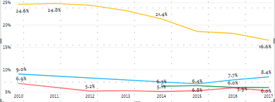
I have the following chart. For several lines, I do not have data points for certain years. For example, for the blue line, I only have the 2010 data point and then I have the data points from 2015-2017. Instead of a line, it would make much more sense to have a data point in 2010 and have the line from 2015-2017. Bascially, I need line breaks where I do not have data points.
I did not find such option in the line chart.
Solved! Go to Solution.
- Mark as New
- Bookmark
- Subscribe
- Mute
- Subscribe to RSS Feed
- Permalink
- Report Inappropriate Content
Hi @weilai0521 ,
Follow the steps below, then it will return the result you desired.
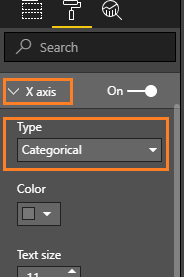
1.Set the X axis type to "Categorical" instead of "Continuous", which will make the "Show marker" button available.
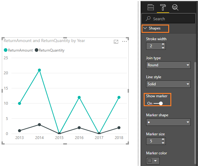
2.Turn on the "Show marker" button .Select the Marker shape you prefer from the drop down. For further customization => Turn On => Customize Series or other Customize shapes, size, color and so on.
Best Regards,
Amy
If this post helps, then please consider Accept it as the solution to help the other members find it more quickly.
- Mark as New
- Bookmark
- Subscribe
- Mute
- Subscribe to RSS Feed
- Permalink
- Report Inappropriate Content
I really appreciate the help.
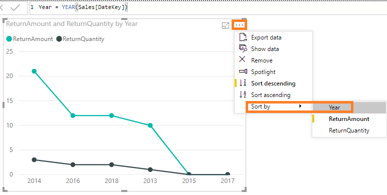
I tried the categorical option but it gives me a graph like this. The year order mess up. Is there a solution for that? I tried to create a year_order variable and sort the year by year_order, which does not solve the problem.
Thanks!
- Mark as New
- Bookmark
- Subscribe
- Mute
- Subscribe to RSS Feed
- Permalink
- Report Inappropriate Content
Hi @weilai0521 ,
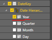
When I create the Year column from formula Year = YEAR(Sales[DateKey]), I can reproduce your scenario. I worked around this issue following steps below.
While if you get the Year column from a date field, it won't have the issue.
Best Regards,
Amy
If this post helps, then please consider Accept it as the solution to help the other members find it more quickly.
- Mark as New
- Bookmark
- Subscribe
- Mute
- Subscribe to RSS Feed
- Permalink
- Report Inappropriate Content
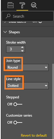
Hi @weilai0521 ,
You can make some settings in Format pane like picture below .
Best Regards,
Amy
If this post helps, then please consider Accept it as the solution to help the other members find it more quickly.
- Mark as New
- Bookmark
- Subscribe
- Mute
- Subscribe to RSS Feed
- Permalink
- Report Inappropriate Content
I changed the line to dotted line. It is not helping.
- Mark as New
- Bookmark
- Subscribe
- Mute
- Subscribe to RSS Feed
- Permalink
- Report Inappropriate Content
Hi @weilai0521 ,
Follow the steps below, then it will return the result you desired.
1.Set the X axis type to "Categorical" instead of "Continuous", which will make the "Show marker" button available.
2.Turn on the "Show marker" button .Select the Marker shape you prefer from the drop down. For further customization => Turn On => Customize Series or other Customize shapes, size, color and so on.
Best Regards,
Amy
If this post helps, then please consider Accept it as the solution to help the other members find it more quickly.
- Mark as New
- Bookmark
- Subscribe
- Mute
- Subscribe to RSS Feed
- Permalink
- Report Inappropriate Content
I really appreciate the help.
I tried the categorical option but it gives me a graph like this. The year order mess up. Is there a solution for that? I tried to create a year_order variable and sort the year by year_order, which does not solve the problem.
Thanks!
- Mark as New
- Bookmark
- Subscribe
- Mute
- Subscribe to RSS Feed
- Permalink
- Report Inappropriate Content
Hi @weilai0521 ,
When I create the Year column from formula Year = YEAR(Sales[DateKey]), I can reproduce your scenario. I worked around this issue following steps below.
While if you get the Year column from a date field, it won't have the issue.
Best Regards,
Amy
If this post helps, then please consider Accept it as the solution to help the other members find it more quickly.
Helpful resources

Microsoft Fabric Learn Together
Covering the world! 9:00-10:30 AM Sydney, 4:00-5:30 PM CET (Paris/Berlin), 7:00-8:30 PM Mexico City

Power BI Monthly Update - April 2024
Check out the April 2024 Power BI update to learn about new features.

| User | Count |
|---|---|
| 112 | |
| 97 | |
| 85 | |
| 67 | |
| 59 |
| User | Count |
|---|---|
| 150 | |
| 120 | |
| 99 | |
| 87 | |
| 68 |
