- Power BI forums
- Updates
- News & Announcements
- Get Help with Power BI
- Desktop
- Service
- Report Server
- Power Query
- Mobile Apps
- Developer
- DAX Commands and Tips
- Custom Visuals Development Discussion
- Health and Life Sciences
- Power BI Spanish forums
- Translated Spanish Desktop
- Power Platform Integration - Better Together!
- Power Platform Integrations (Read-only)
- Power Platform and Dynamics 365 Integrations (Read-only)
- Training and Consulting
- Instructor Led Training
- Dashboard in a Day for Women, by Women
- Galleries
- Community Connections & How-To Videos
- COVID-19 Data Stories Gallery
- Themes Gallery
- Data Stories Gallery
- R Script Showcase
- Webinars and Video Gallery
- Quick Measures Gallery
- 2021 MSBizAppsSummit Gallery
- 2020 MSBizAppsSummit Gallery
- 2019 MSBizAppsSummit Gallery
- Events
- Ideas
- Custom Visuals Ideas
- Issues
- Issues
- Events
- Upcoming Events
- Community Blog
- Power BI Community Blog
- Custom Visuals Community Blog
- Community Support
- Community Accounts & Registration
- Using the Community
- Community Feedback
Register now to learn Fabric in free live sessions led by the best Microsoft experts. From Apr 16 to May 9, in English and Spanish.
- Power BI forums
- Forums
- Get Help with Power BI
- Desktop
- Line and stackend column chart - Position Bars beh...
- Subscribe to RSS Feed
- Mark Topic as New
- Mark Topic as Read
- Float this Topic for Current User
- Bookmark
- Subscribe
- Printer Friendly Page
- Mark as New
- Bookmark
- Subscribe
- Mute
- Subscribe to RSS Feed
- Permalink
- Report Inappropriate Content
Line and stackend column chart - Position Bars behind each other
Hi Everyone,
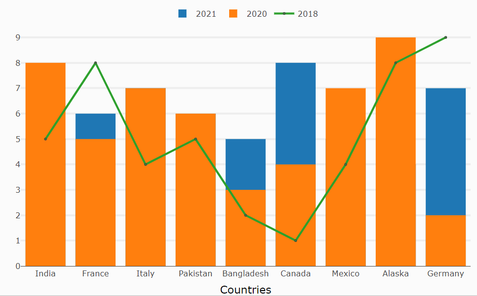
is it somehow possible to use the visual "Line and stackend column chart" and make the bar behind each other. Meaning, that they start from "zero" and show behind each other. The Bar charts need to be in a specific order and behind each other. NOT besides each other, as the "Line and clustered column chart" as it is not usable by our customer.
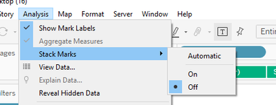
Background: They have the visual in tableau and there we have the option to deactive stack marks:
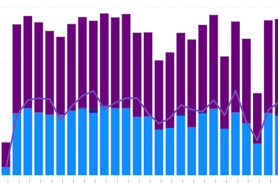
Question is now: How do we do it on PowerBI? Here is the visual:
Every bar needs to start at zero and shown behind each other. Any ideas?
Thanks for the help and ideas!
Solved! Go to Solution.
- Mark as New
- Bookmark
- Subscribe
- Mute
- Subscribe to RSS Feed
- Permalink
- Report Inappropriate Content
Good Morning,
@Mayank_Yavda thank you for the suggestion, but what i was searching for was some native way to use or a certified custom visual in the store. My company will not allow other means to use.
Anyway, i solve my problems kinda. In the End i had to transform the dataset in a way i can display the correct behavior via stacked columns + certain measures and use a custom tooltip to show the correct values.
Now it works. Not the best way, but at least i can show what i need to my customer
- Mark as New
- Bookmark
- Subscribe
- Mute
- Subscribe to RSS Feed
- Permalink
- Report Inappropriate Content
Hi @boboroo ,
Here is Line and clustered column chart With Custom Tooltip which will help you to get line visual with bars with bars overlay on each other. Just select overlay button to get right below chart. Hope this helps you.

Download link for the custom visual file in this page
https://pbivizedit.com/gallery/line-and-clustered-column-with-custom-tooltip
Youtube Link for the custom visual
https://www.youtube.com/watch?v=hJLbVBt9ne8
This was made with our Custom Visual creator tool
PBIVizEdit.com. With this tool,
- anyone, irrespective of technical skills, can create their own visuals
- 15 minutes to create a visual from scratch
- opens up many additional attributes to edit (for e.g. labels, tooltips, legends position, etc)
Give this a shot and let us know if you face any problem/errors.
You can use the editor to modify your visual further (some modifications cannot be done in Power BI window and have to be in editor).
Thanks,
Team PBIVizEdit
- Mark as New
- Bookmark
- Subscribe
- Mute
- Subscribe to RSS Feed
- Permalink
- Report Inappropriate Content
Good Morning,
@Mayank_Yavda thank you for the suggestion, but what i was searching for was some native way to use or a certified custom visual in the store. My company will not allow other means to use.
Anyway, i solve my problems kinda. In the End i had to transform the dataset in a way i can display the correct behavior via stacked columns + certain measures and use a custom tooltip to show the correct values.
Now it works. Not the best way, but at least i can show what i need to my customer
Helpful resources

Microsoft Fabric Learn Together
Covering the world! 9:00-10:30 AM Sydney, 4:00-5:30 PM CET (Paris/Berlin), 7:00-8:30 PM Mexico City

Power BI Monthly Update - April 2024
Check out the April 2024 Power BI update to learn about new features.

| User | Count |
|---|---|
| 111 | |
| 100 | |
| 80 | |
| 64 | |
| 58 |
| User | Count |
|---|---|
| 148 | |
| 111 | |
| 93 | |
| 84 | |
| 66 |


