- Power BI forums
- Updates
- News & Announcements
- Get Help with Power BI
- Desktop
- Service
- Report Server
- Power Query
- Mobile Apps
- Developer
- DAX Commands and Tips
- Custom Visuals Development Discussion
- Health and Life Sciences
- Power BI Spanish forums
- Translated Spanish Desktop
- Power Platform Integration - Better Together!
- Power Platform Integrations (Read-only)
- Power Platform and Dynamics 365 Integrations (Read-only)
- Training and Consulting
- Instructor Led Training
- Dashboard in a Day for Women, by Women
- Galleries
- Community Connections & How-To Videos
- COVID-19 Data Stories Gallery
- Themes Gallery
- Data Stories Gallery
- R Script Showcase
- Webinars and Video Gallery
- Quick Measures Gallery
- 2021 MSBizAppsSummit Gallery
- 2020 MSBizAppsSummit Gallery
- 2019 MSBizAppsSummit Gallery
- Events
- Ideas
- Custom Visuals Ideas
- Issues
- Issues
- Events
- Upcoming Events
- Community Blog
- Power BI Community Blog
- Custom Visuals Community Blog
- Community Support
- Community Accounts & Registration
- Using the Community
- Community Feedback
Register now to learn Fabric in free live sessions led by the best Microsoft experts. From Apr 16 to May 9, in English and Spanish.
- Power BI forums
- Forums
- Get Help with Power BI
- Desktop
- Re: [Line and stacked column chart] group the data...
- Subscribe to RSS Feed
- Mark Topic as New
- Mark Topic as Read
- Float this Topic for Current User
- Bookmark
- Subscribe
- Printer Friendly Page
- Mark as New
- Bookmark
- Subscribe
- Mute
- Subscribe to RSS Feed
- Permalink
- Report Inappropriate Content
[Line and stacked column chart] group the data in the same bar but different color
Hi,
Hope someone here can advise me.
Here is the sample data :
Staff UserType Arrived Left
A1 External 22/03/2018 14/10/2019
A2 Internal 25/09/2017 24/10/2019
A3 External 25/09/2017 24/10/2019
A4 Internal 05/08/2019 31/12/2019
A5 External 19/02/2018 05/11/2018
A6 Internal 16/04/2018 02/09/2019
A7 External 01/10/2019 25/12/2019
A8 Internal 31/12/2019
A9 External 02/07/2018 25/09/2019
A10 Internal 28/05/2018 14/01/2020
A11 External 01/08/2018
A12 Internal 03/09/2018 04/01/2020
I would like to count :
- number of coming Internal / coming external
- number of leaving internal / leaving external
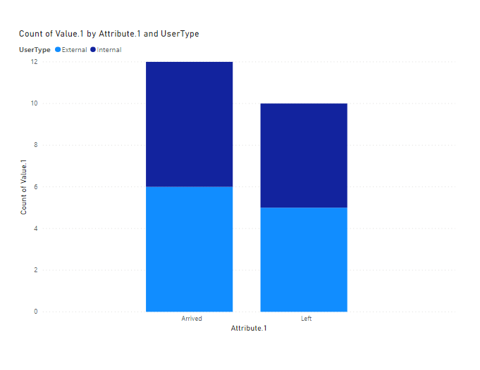
- The chart will have 1 bar for the leaving of internal and external employees, and one bar will be coming internal and external employees.
As the chart below, the blue and orange color must be in the same bar.
Many thanks in advance.
Trang
Solved! Go to Solution.
- Mark as New
- Bookmark
- Subscribe
- Mute
- Subscribe to RSS Feed
- Permalink
- Report Inappropriate Content
@Anonymous ,
Click arrived and left column, unpivot. You may refer to the pbix.

Community Support Team _ Jimmy Tao
If this post helps, then please consider Accept it as the solution to help the other members find it more quickly.
- Mark as New
- Bookmark
- Subscribe
- Mute
- Subscribe to RSS Feed
- Permalink
- Report Inappropriate Content
@Anonymous ,
In query editor, click on Staff column-> click unpivot, then you will achieve two columns [Attribute] and [Value]. Create two stacked bar chart like below.

You can also refer to the pbix file.
Community Support Team _ Jimmy Tao
If this post helps, then please consider Accept it as the solution to help the other members find it more quickly.
- Mark as New
- Bookmark
- Subscribe
- Mute
- Subscribe to RSS Feed
- Permalink
- Report Inappropriate Content
Hi v-yuta-msft,
thanks for your advise. Could you tell me if it's possible to have the 2 bars in the same chart ?
It means 1 bar of External/Internal arrived, and another bar of External/Internal left.
Thanks in advance.
Trang
- Mark as New
- Bookmark
- Subscribe
- Mute
- Subscribe to RSS Feed
- Permalink
- Report Inappropriate Content
Helpful resources

Microsoft Fabric Learn Together
Covering the world! 9:00-10:30 AM Sydney, 4:00-5:30 PM CET (Paris/Berlin), 7:00-8:30 PM Mexico City

Power BI Monthly Update - April 2024
Check out the April 2024 Power BI update to learn about new features.

| User | Count |
|---|---|
| 109 | |
| 99 | |
| 77 | |
| 66 | |
| 54 |
| User | Count |
|---|---|
| 144 | |
| 104 | |
| 102 | |
| 87 | |
| 64 |

